 kage
kage
cloudflare.com
Design analysis
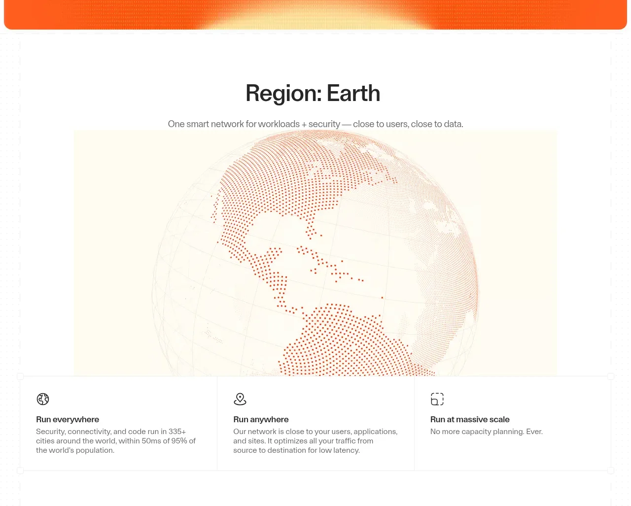
A centered section introduces a global-network concept with a large globe visual and three concise capability cards underneath.
Prompt preview
## Reference images

Study these alongside the description below: hierarchy, rhythm, spacing, colour. Build for the product you are asked about, using this design language.

- Component: https://kage-design-assets.t3.tigrisfiles.io/components/cloudflare-com/1ca6ff30-a094-43e2-8124-fd26c9356e55-1789213790-2.webp
- Full page it was cut from: https://kage-design-assets.t3.tigrisfiles.io/screenshots/cloudflare-com/1ca6ff30-a094-43e2-8124-fd26c9356e55-1789213761908-full.webp
- Component on Kage: https://kage.design/component/cloudflare-feature-grid

## Before you start
Ask what the user's product does globally, what capabilities deserve emphasis, and whether a map or diagram is genuinely useful. Apply these principles to that product.

Build a light, spacious network-overview section with a centered heading and short explanatory subtitle. Place a large contained visualization below—such as a responsive globe, map, system diagram, or abstract data field—with warm off-white and pale yellow surroundings and restrained orange detail around `#d95a3a`. Under or overlapping the visual, use a three-column feature grid with thin `#e8e8e8` borders, equal widths, compact line icons, bold 14–16px titles, and muted 13–14px descriptions. Preserve generous whitespace, make the visual decorative but semantically labeled, and stack cards on narrow screens.

### Never
- Never use logos, product names, copy, illustrations, or imagery from the reference.
- Never reuse the reference globe or its exact feature labels.
- Never add a map if the user's product has no geographic or distributed-system story.
More components

 Announcement and what’s-new feature list
DockFix 5.0 · Feature grid
Announcement and what’s-new feature list
DockFix 5.0 · Feature grid
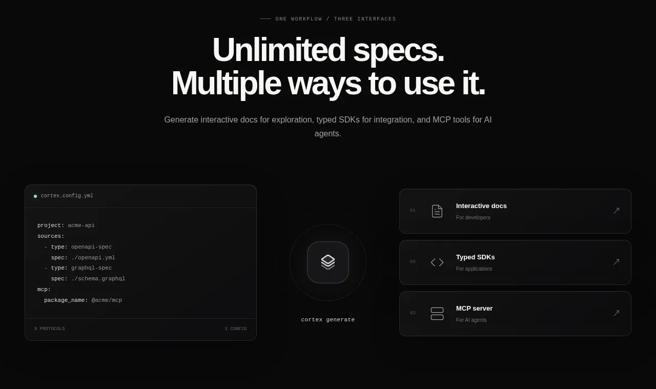
 Three interfaces workflow section
Cortex · Feature grid
Three interfaces workflow section
Cortex · Feature grid
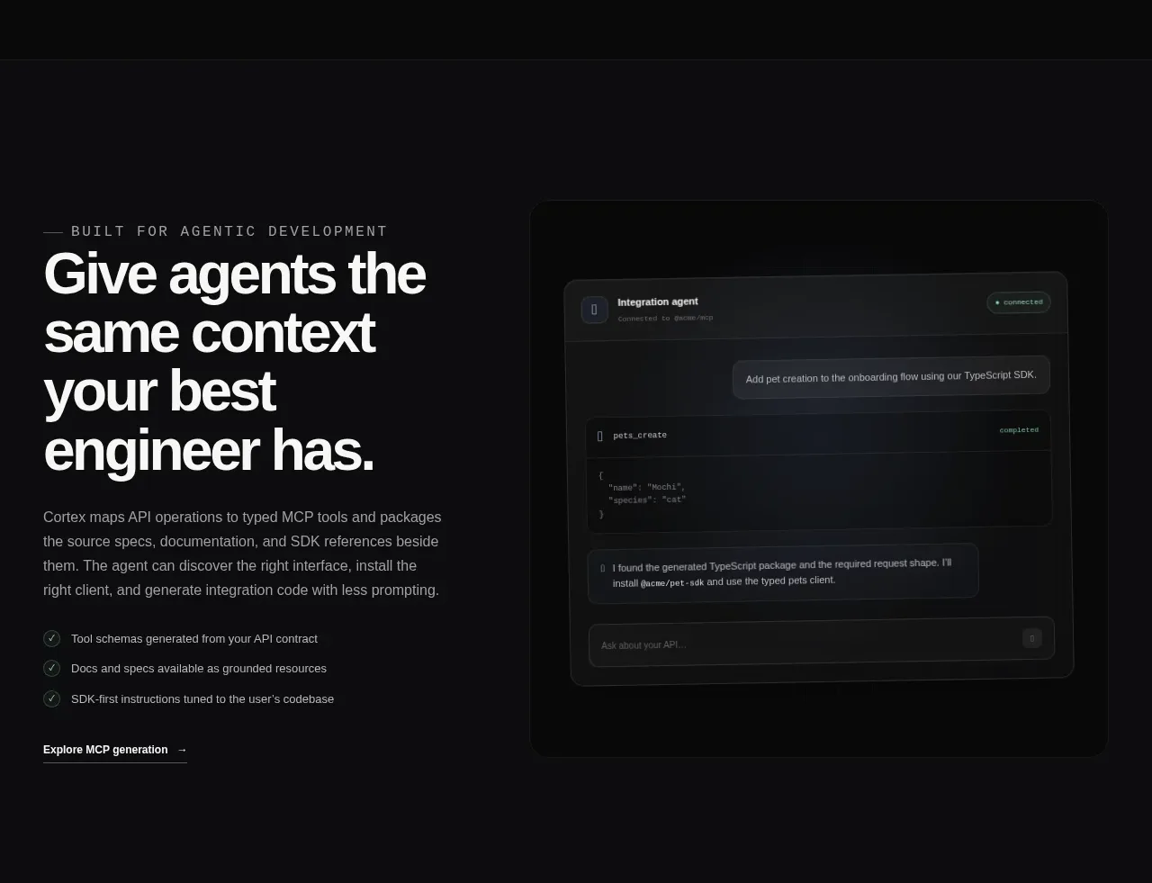 Agent context split feature
Cortex · Feature grid
Agent context split feature
Cortex · Feature grid
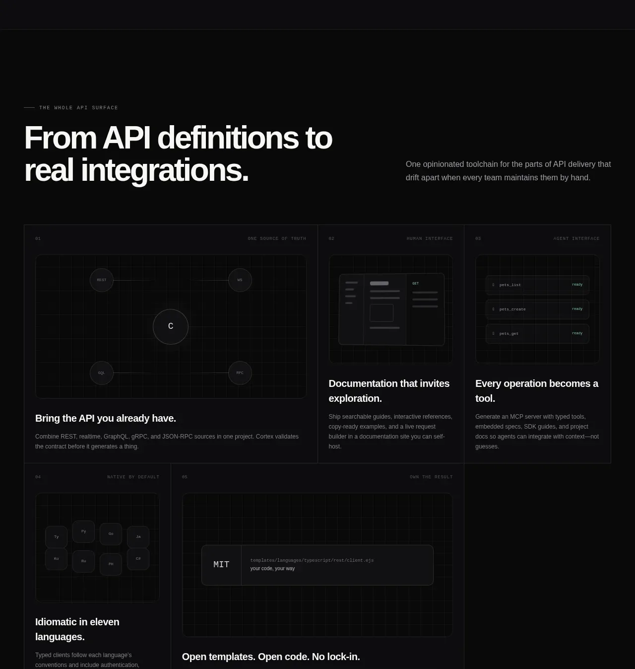 API surface capability cards
Cortex · Feature grid
API surface capability cards
Cortex · Feature grid
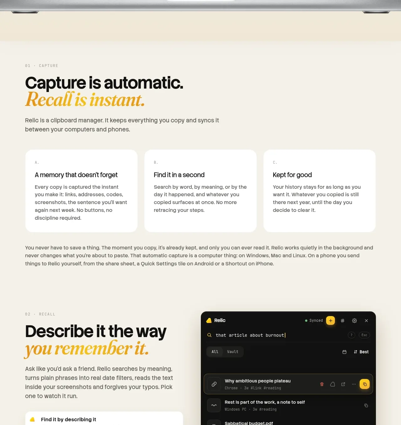
 Descriptive memory workflow
Relic · Feature grid
Descriptive memory workflow
Relic · Feature grid
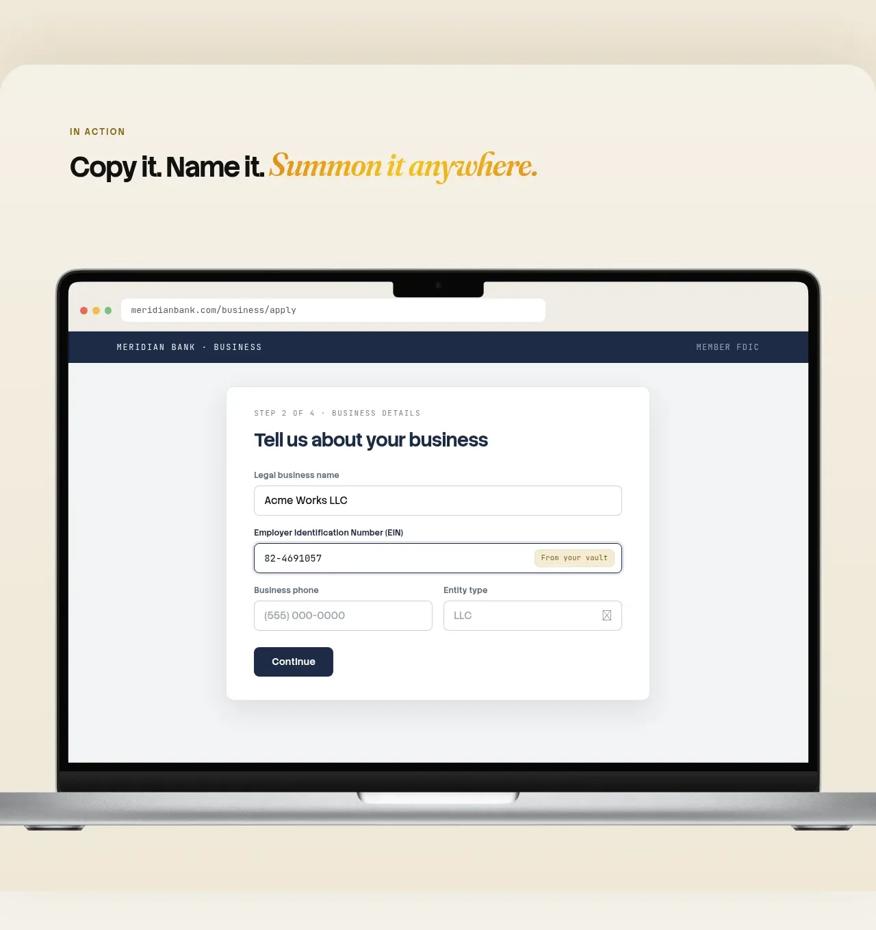 Automatic capture and search
Relic · Feature grid
Automatic capture and search
Relic · Feature grid