 kage
kage
cloudflare.com
Design analysis
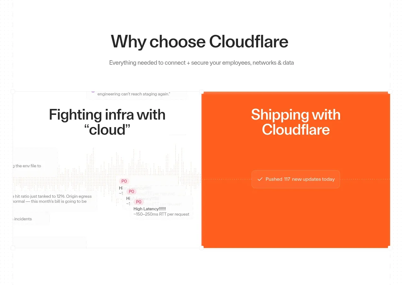
A benefit-led section frames two contrasting visual stories in a split layout, pairing a legacy pain point with a modern product workflow and a strong orange accent panel.
Prompt preview
## Reference images

Study these alongside the description below: hierarchy, rhythm, spacing, colour. Build for the product you are asked about, using this design language.

- Component: https://kage-design-assets.t3.tigrisfiles.io/components/cloudflare-com/1ca6ff30-a094-43e2-8124-fd26c9356e55-1789213791-4.webp
- Full page it was cut from: https://kage-design-assets.t3.tigrisfiles.io/screenshots/cloudflare-com/1ca6ff30-a094-43e2-8124-fd26c9356e55-1789213761908-full.webp
- Component on Kage: https://kage.design/component/cloudflare-feature-grid-2

## Before you start
Ask what the user's audience struggles with today and what transformation the product enables. Apply the contrast pattern to those real benefits.

Build a section with a centered heading and short subtitle, followed by two equal or intentionally asymmetric visual panels. One panel should represent the old problem state using a light neutral background, restrained diagrams, and dark text; the other should represent the improved state using a vivid brand accent such as orange (`#ff5a1f`) with reversed text and a simple status or workflow cue. Use a clear grid, 1px borders, 12px radius, and aligned panel heights. Keep visual storytelling subordinate to the benefit statement, and make the panels stack cleanly on mobile.

### Never
- Never use logos, product names, copy, illustrations, or imagery from the reference.
- Never imply a competitor comparison unless it is substantiated and legally appropriate.
- Never turn decorative screenshots into unreadable fake UI.
More components

 Announcement and what’s-new feature list
DockFix 5.0 · Feature grid
Announcement and what’s-new feature list
DockFix 5.0 · Feature grid
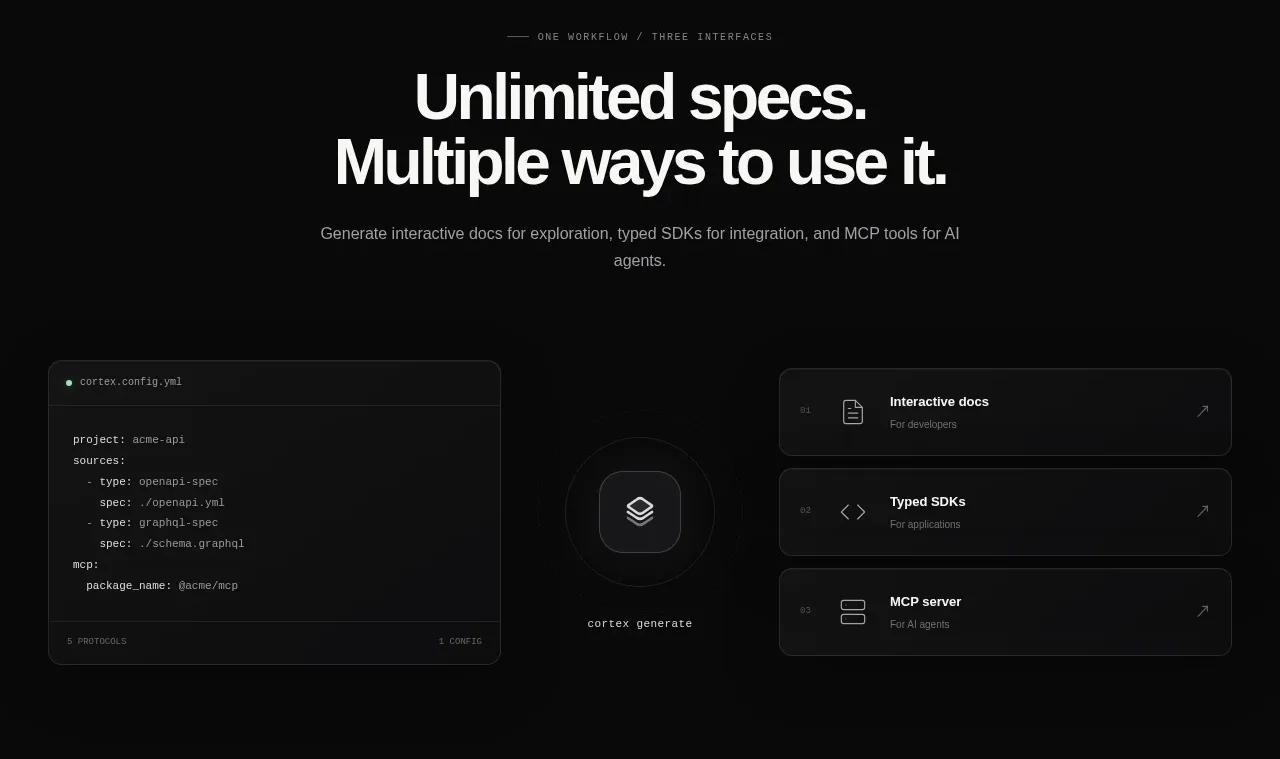
 Three interfaces workflow section
Cortex · Feature grid
Three interfaces workflow section
Cortex · Feature grid
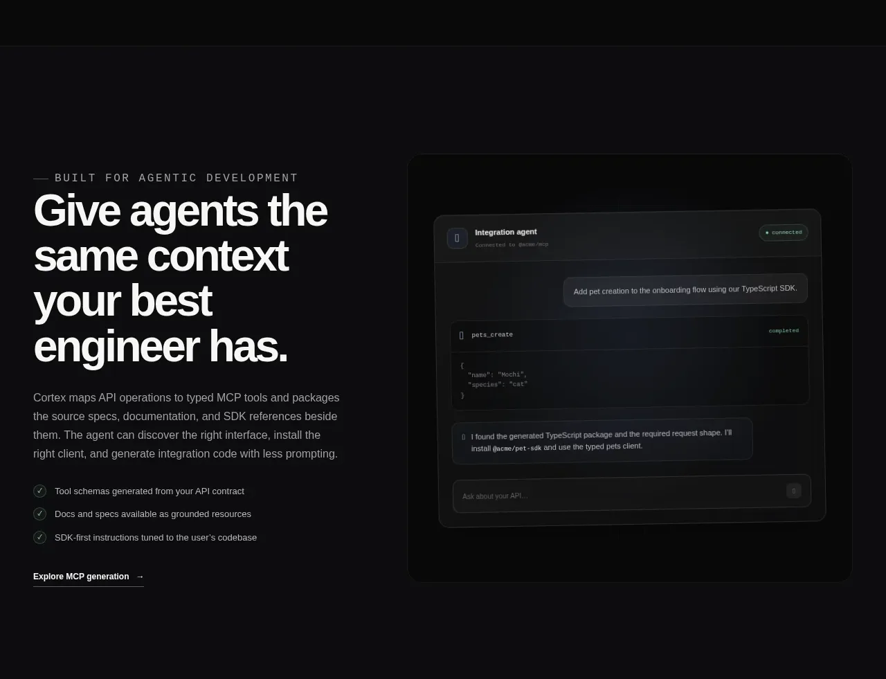 Agent context split feature
Cortex · Feature grid
Agent context split feature
Cortex · Feature grid
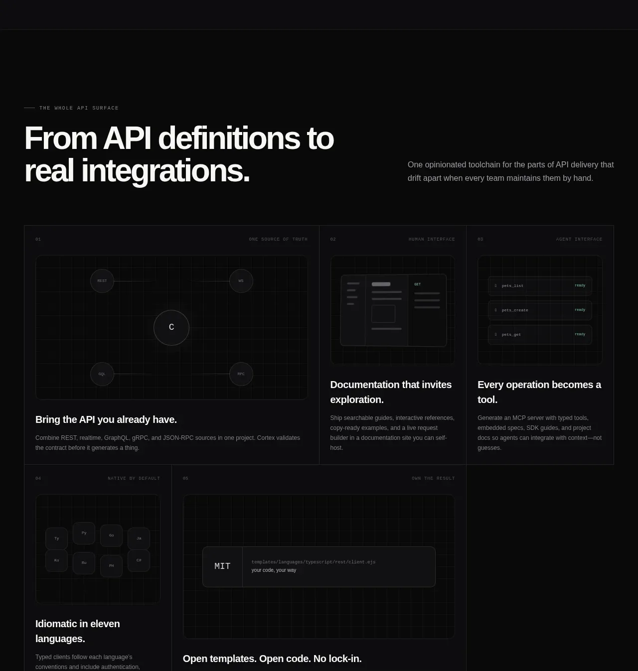 API surface capability cards
Cortex · Feature grid
API surface capability cards
Cortex · Feature grid
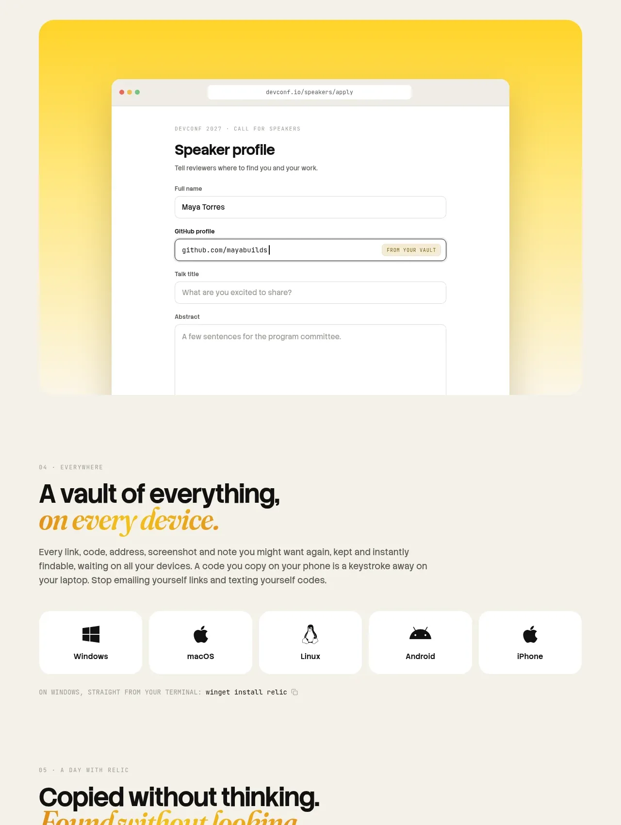
 Platform availability and everyday uses
Relic · Feature grid
Platform availability and everyday uses
Relic · Feature grid
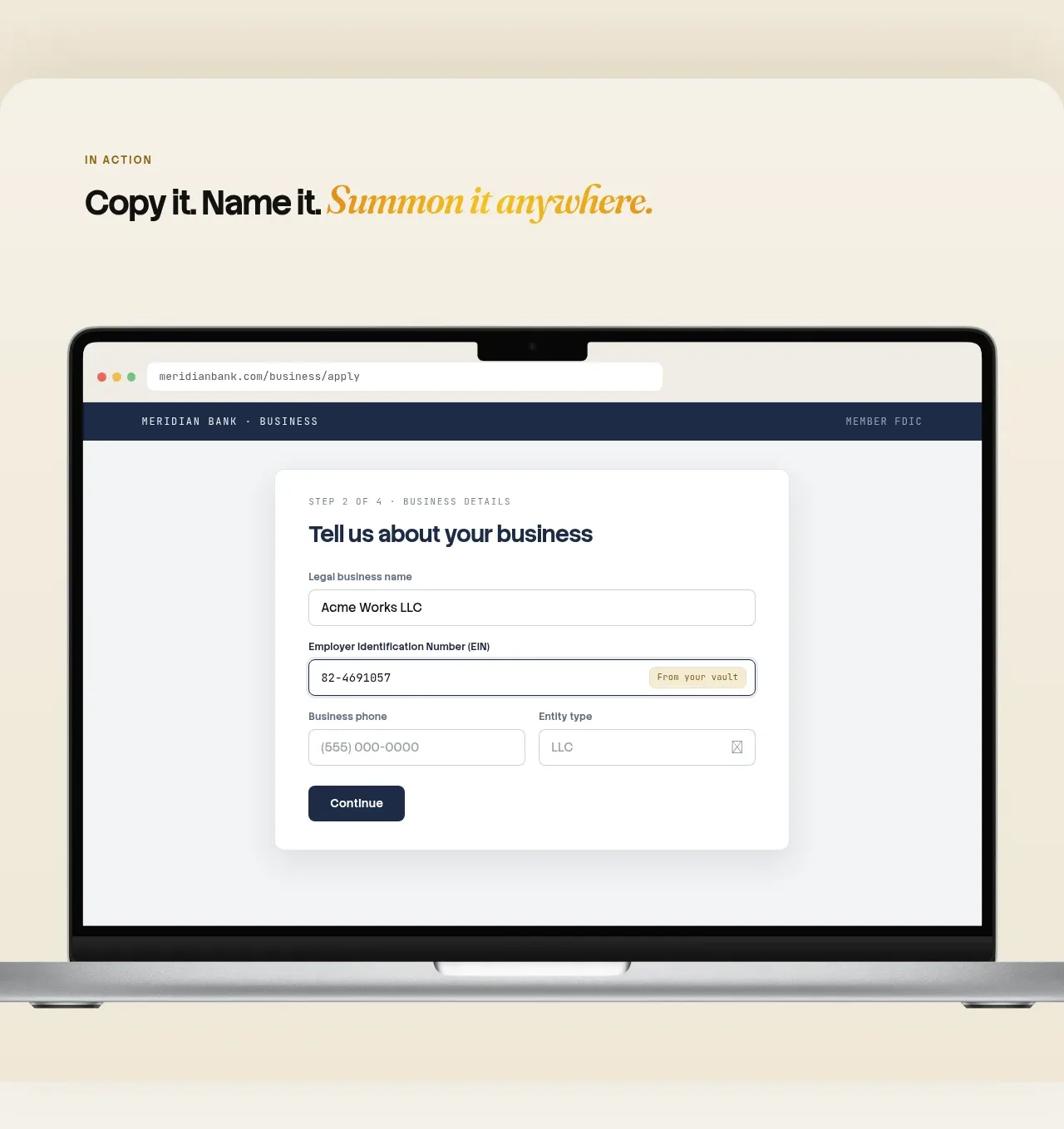 Automatic capture and search
Relic · Feature grid
Automatic capture and search
Relic · Feature grid