 kage
kage
cloudflare.com
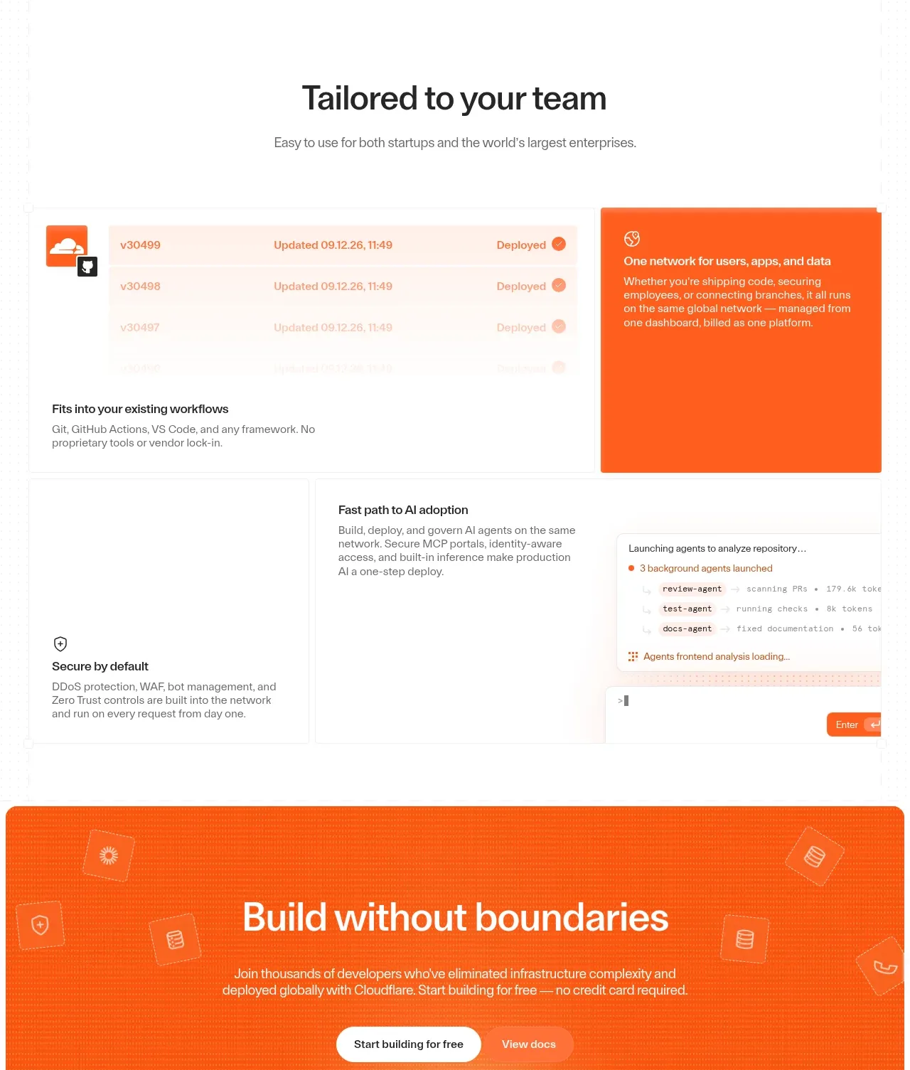
Design analysis
A dense modular capability section uses a large orange feature card alongside workflow panels, deployment/status details, and supporting security and adoption cards.
Prompt preview
## Reference images

Study these alongside the description below: hierarchy, rhythm, spacing, colour. Build for the product you are asked about, using this design language.

- Component: https://kage-design-assets.t3.tigrisfiles.io/components/cloudflare-com/1ca6ff30-a094-43e2-8124-fd26c9356e55-1789213792-6.webp
- Full page it was cut from: https://kage-design-assets.t3.tigrisfiles.io/screenshots/cloudflare-com/1ca6ff30-a094-43e2-8124-fd26c9356e55-1789213761908-full.webp
- Component on Kage: https://kage.design/component/cloudflare-feature-grid-3

## Before you start
Ask which teams use the user's product, their key workflows, and which capabilities deserve the strongest visual emphasis. Apply the system below to those workflows.

Build a modular capability section with a centered heading and subtitle followed by a responsive asymmetric grid. Give the primary capability a large saturated brand panel—orange around `#ff5a1f` is optional—with a short heading and explanatory copy in high contrast. Surround it with lighter cards that show realistic but abstract workflow states such as deployment history, automation, security defaults, or adoption progress. Use a 1px grid border, white or `#fafafa` backgrounds, 12px radius, compact icons, and small status chips. Make the information hierarchy clear: one dominant message, then evidence panels, then supporting benefits. Ensure cards have meaningful accessible labels and stack in a logical order on mobile.

### Never
- Never use logos, product names, copy, illustrations, or imagery from the reference.
- Never reproduce a recognizable dashboard or fabricated performance data.
- Never make every tile a different visual style.
More components

 Announcement and what’s-new feature list
DockFix 5.0 · Feature grid
Announcement and what’s-new feature list
DockFix 5.0 · Feature grid
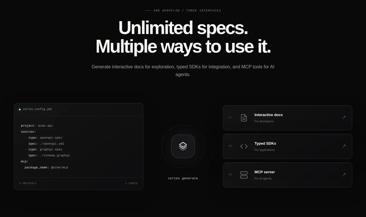
 Three interfaces workflow section
Cortex · Feature grid
Three interfaces workflow section
Cortex · Feature grid
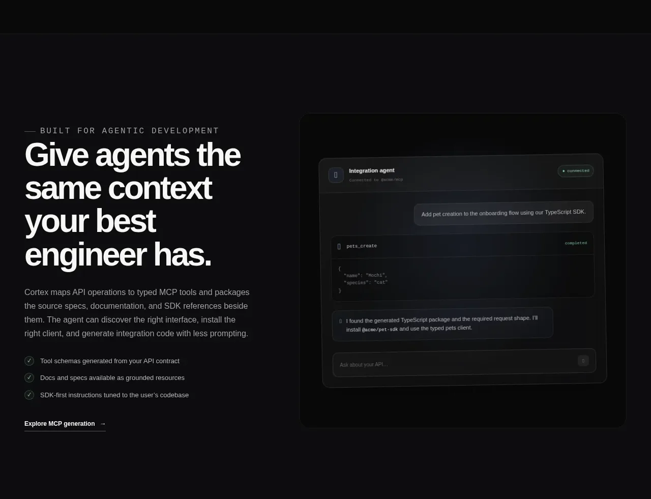 Agent context split feature
Cortex · Feature grid
Agent context split feature
Cortex · Feature grid
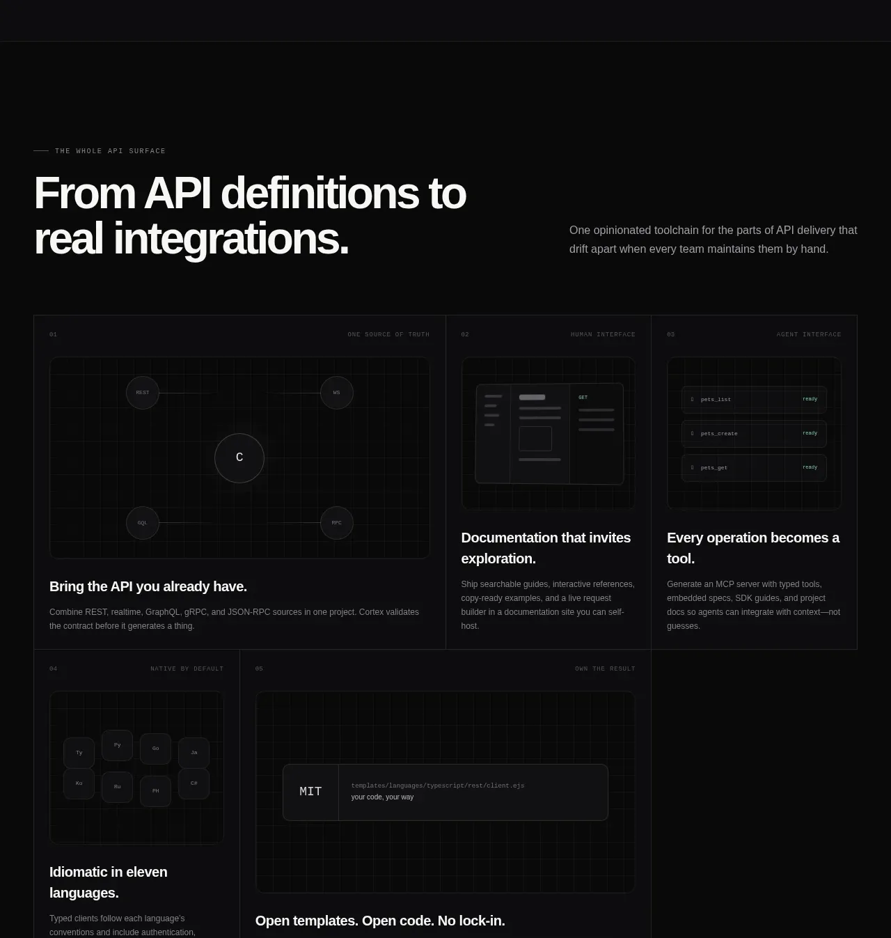 API surface capability cards
Cortex · Feature grid
API surface capability cards
Cortex · Feature grid
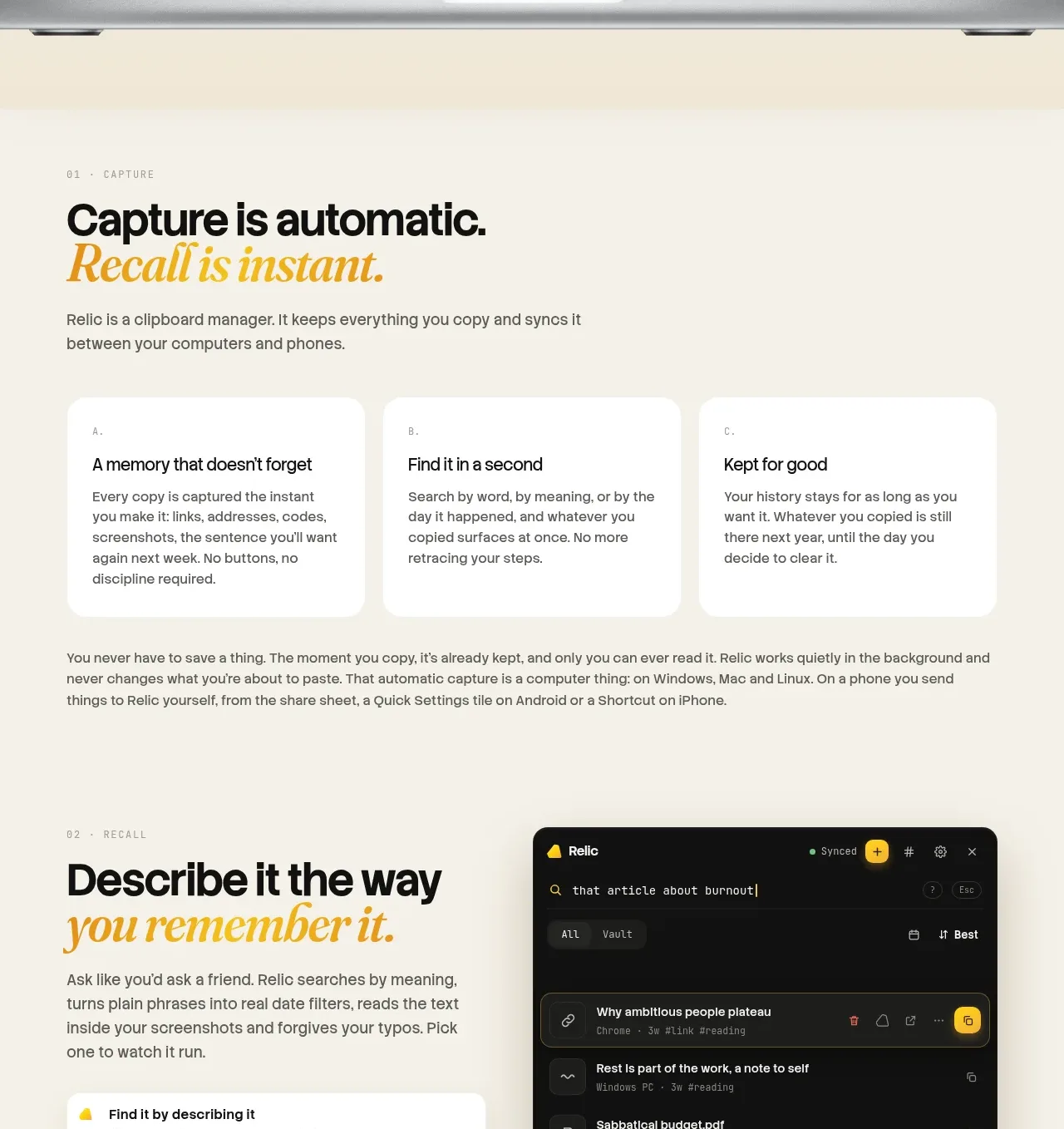
 Descriptive memory workflow
Relic · Feature grid
Descriptive memory workflow
Relic · Feature grid
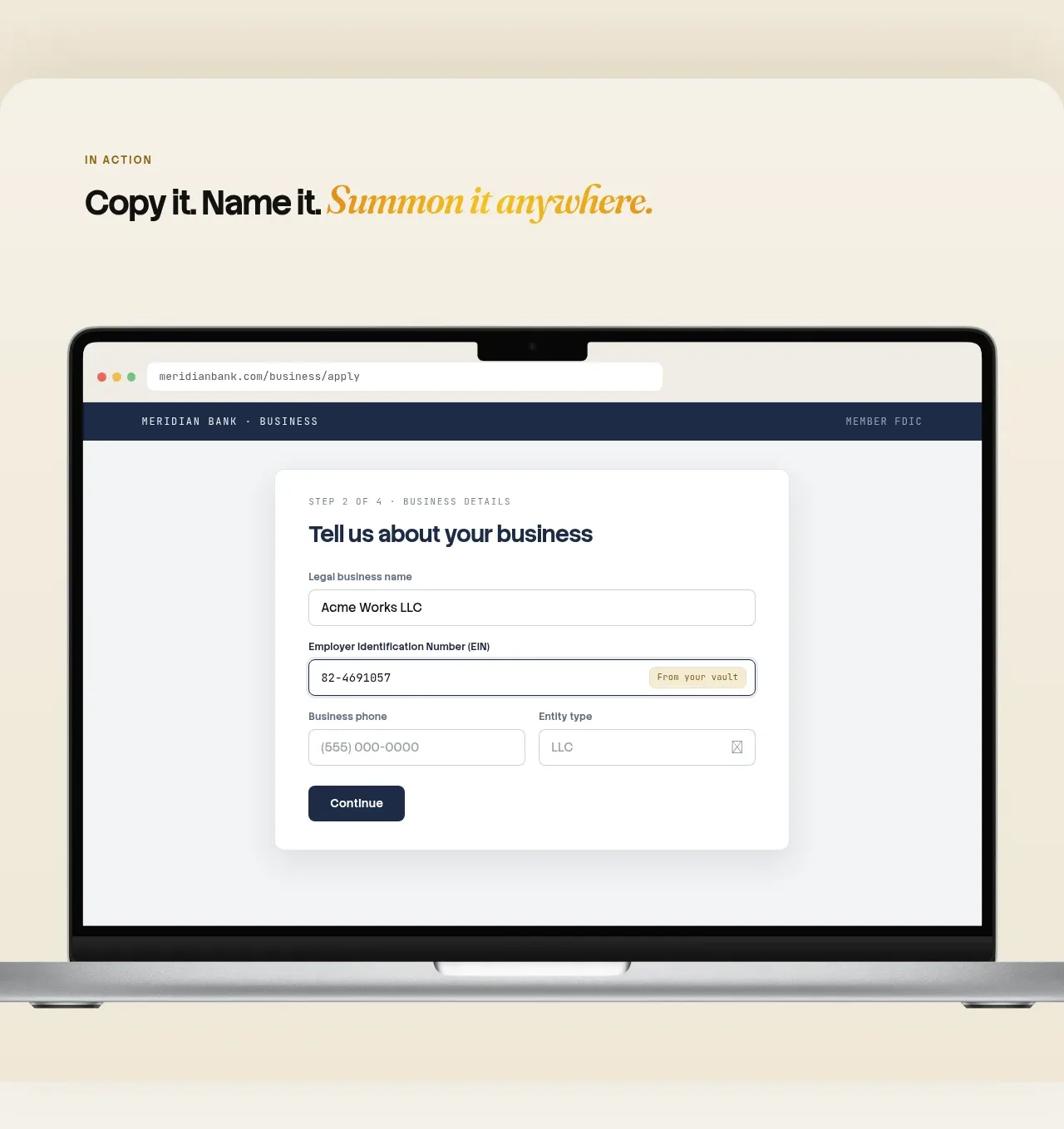 Automatic capture and search
Relic · Feature grid
Automatic capture and search
Relic · Feature grid