 kage
cloudknife.com
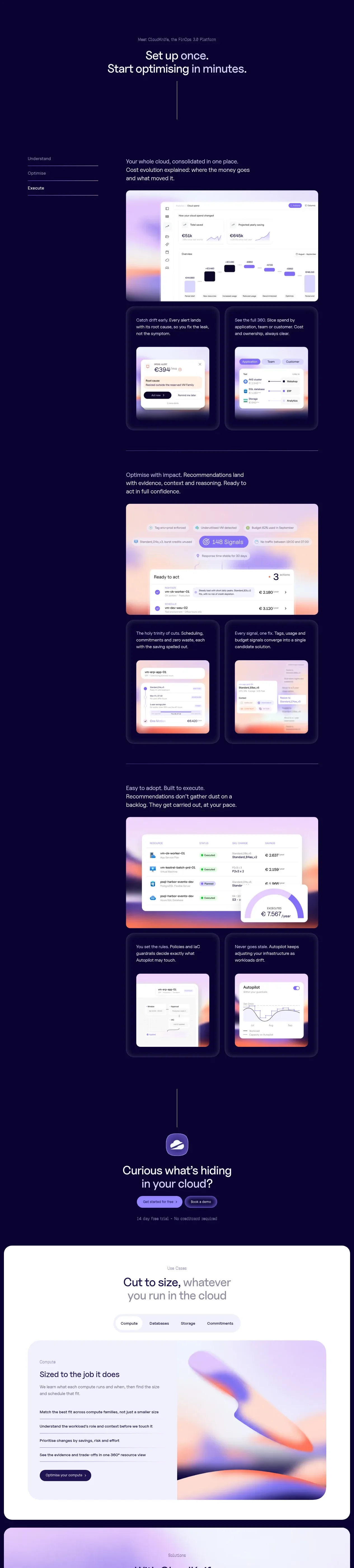
Design analysis
A long dark product-story section explains three sequential stages through alternating text, large interface panels, and paired supporting cards.
Prompt preview
## Reference images

Study these alongside the description below: hierarchy, rhythm, spacing, colour. Build for the product you are asked about, using this design language.

- Component: https://kage-design-assets.t3.tigrisfiles.io/components/cloudknife/9dafaa08-16c6-4721-8c78-296bafbb7abc-1793081089-3.webp
- Full page it was cut from: https://kage-design-assets.t3.tigrisfiles.io/screenshots/cloudknife/9dafaa08-16c6-4721-8c78-296bafbb7abc-1793080968695-full.webp
- Component on Kage: https://kage.design/component/cloudknife-feature-grid

## Before you start
Ask what the user's product is, who it serves, and what their brand personality and visual identity are. Apply the following principles to that product rather than copying the reference.

Design a vertically paced, three-stage feature narrative on a deep navy canvas around #0b0630. Start with a centered section eyebrow and two-line heading, then present each stage as a generous horizontal composition. Use a slim left-side step index or tab list, a compact explanatory block, one large rounded interface screenshot or product mockup, and two smaller supporting cards beneath or beside it. Repeat the structure with different content while varying the alignment enough to create rhythm, but keep a clear reading order.

Use a max-width around 920px, large vertical gaps of 120–180px, 14–16px body text, 28–40px stage headings, and thin divider lines in rgba(255,255,255,.18). Product panels should have 18–24px radius, a near-black translucent shell, subtle inner border, soft violet shadow, and pale lavender/peach gradient highlights. Use accent purple #8c79ff and warm coral #ff9e8c sparingly for status and emphasis. Add scroll or tab interaction only when it improves navigation; preserve all content accessibly on mobile by stacking text above visuals.

Never: use logos, product names, copy, illustrations, or imagery from the reference.
More components
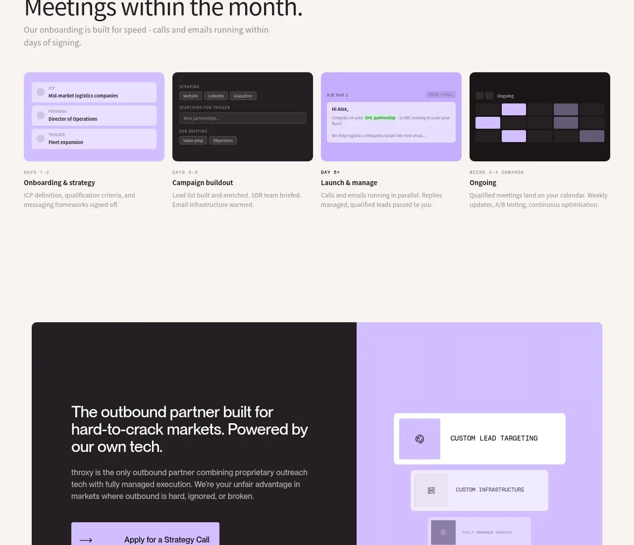
 Rapid onboarding timeline
throxy · Feature grid
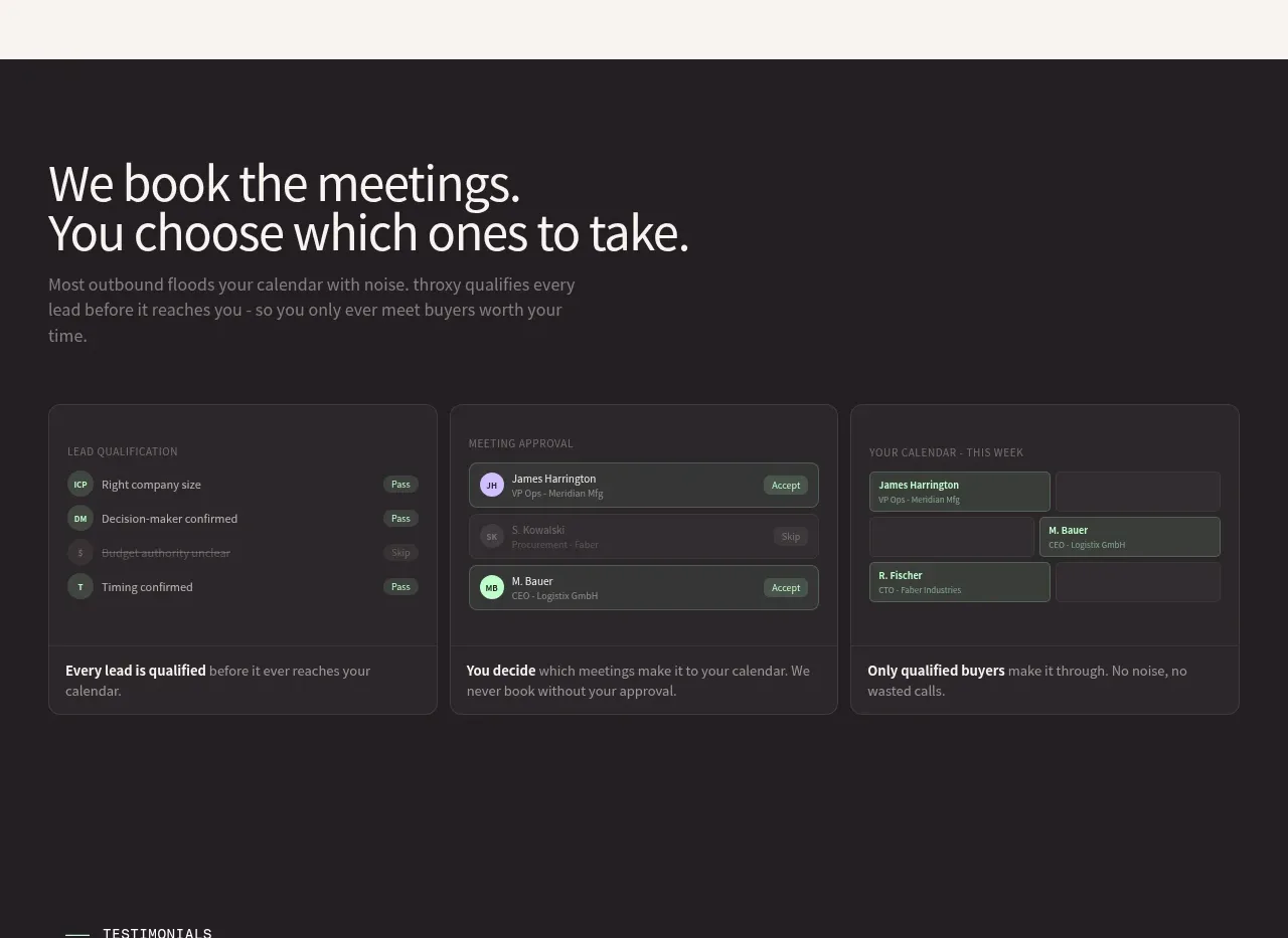 Qualification workflow cards
throxy · Feature grid
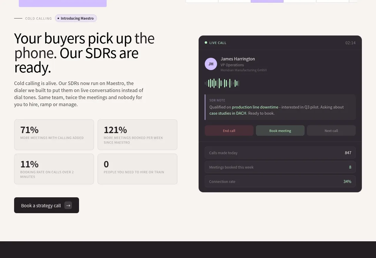 Cold-calling performance section
throxy · Feature grid
 Outbound partner benefits
throxy · Feature grid
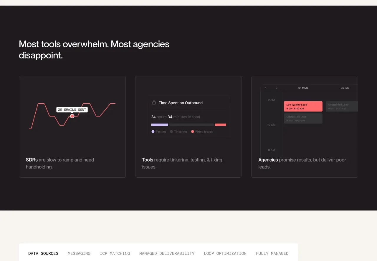 Why alternatives disappoint
throxy · Feature grid
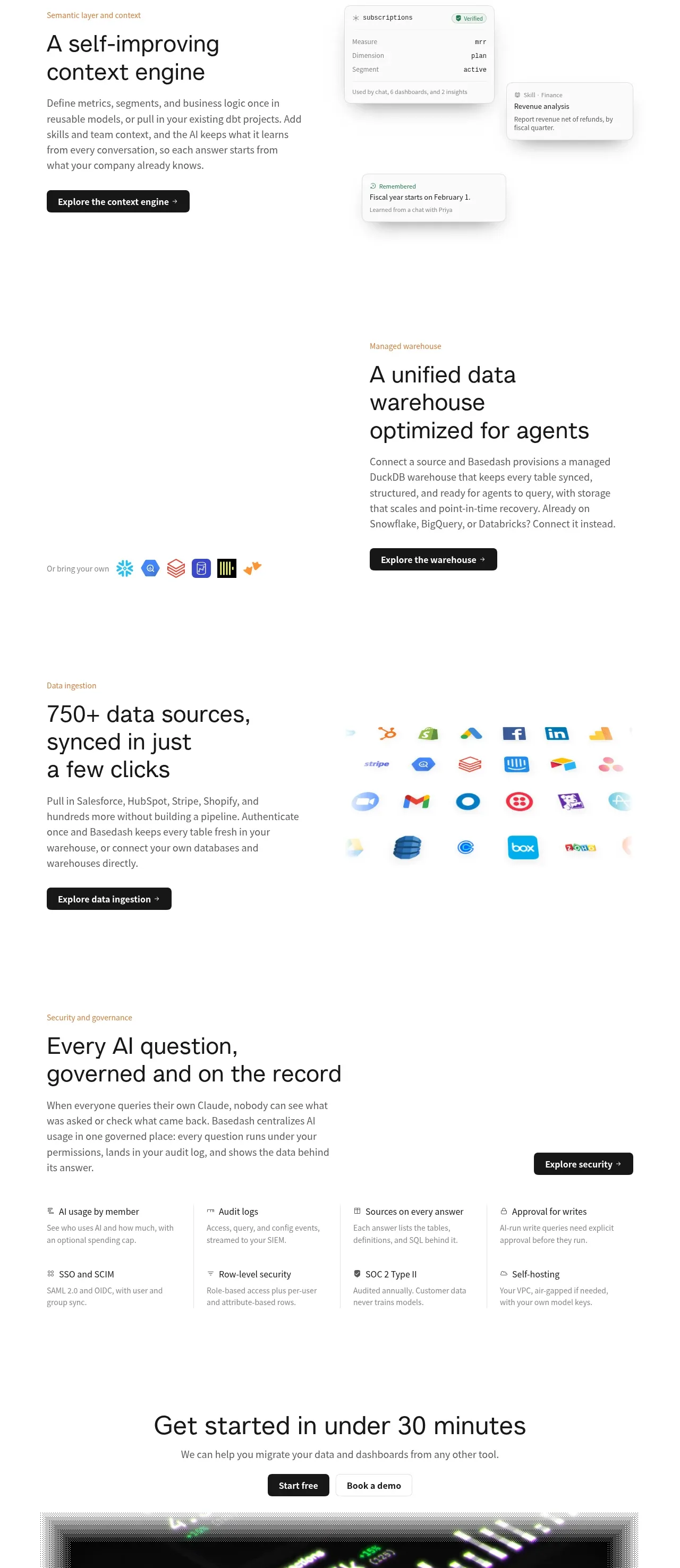
 Platform foundation features
Basedash View-only members · Feature grid