 kage
cloudknife.com

Design analysis
Three compact dark cards articulate product principles with small gradient icons, short headings, and concise supporting statements.
Prompt preview
## Reference images

Study these alongside the description below: hierarchy, rhythm, spacing, colour. Build for the product you are asked about, using this design language.

- Component: https://kage-design-assets.t3.tigrisfiles.io/components/cloudknife/9dafaa08-16c6-4721-8c78-296bafbb7abc-1793081093-9.webp
- Full page it was cut from: https://kage-design-assets.t3.tigrisfiles.io/screenshots/cloudknife/9dafaa08-16c6-4721-8c78-296bafbb7abc-1793080968695-full.webp
- Component on Kage: https://kage.design/component/cloudknife-feature-grid-2

## Before you start
Ask what the user's product is, who it serves, and what their brand personality and visual identity are. Apply the following principles to that product rather than copying the reference.

Build a three-column principles grid on a dark navy background. Each card should contain a small rounded-square gradient icon, a short heading, and two or three lines of explanatory text. Use equal-height cards, 16–20px gaps, 18px radius, translucent indigo surfaces around #171143, and a thin border in rgba(255,255,255,.1). Keep headings at 14–16px and body copy at 12–13px with generous internal padding. Add a restrained hover elevation or border-brightening state, and stack the cards on mobile.

Never: use logos, product names, copy, illustrations, or imagery from the reference.
More components
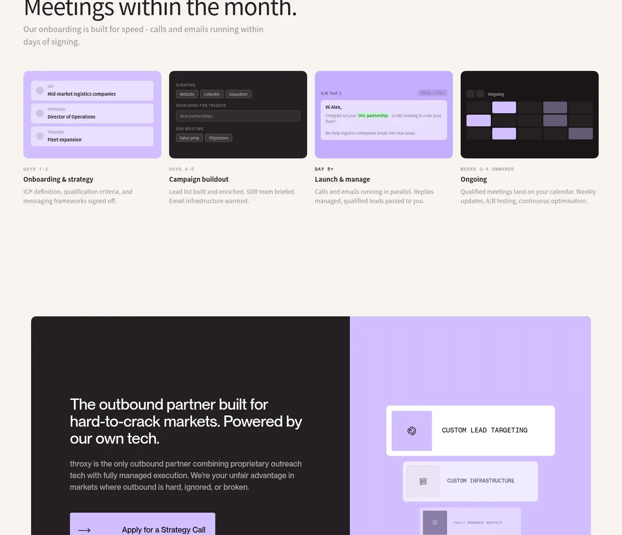
 Rapid onboarding timeline
throxy · Feature grid
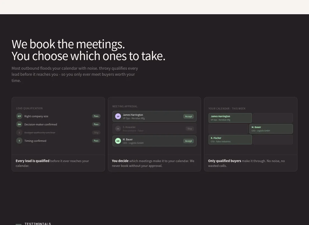 Qualification workflow cards
throxy · Feature grid
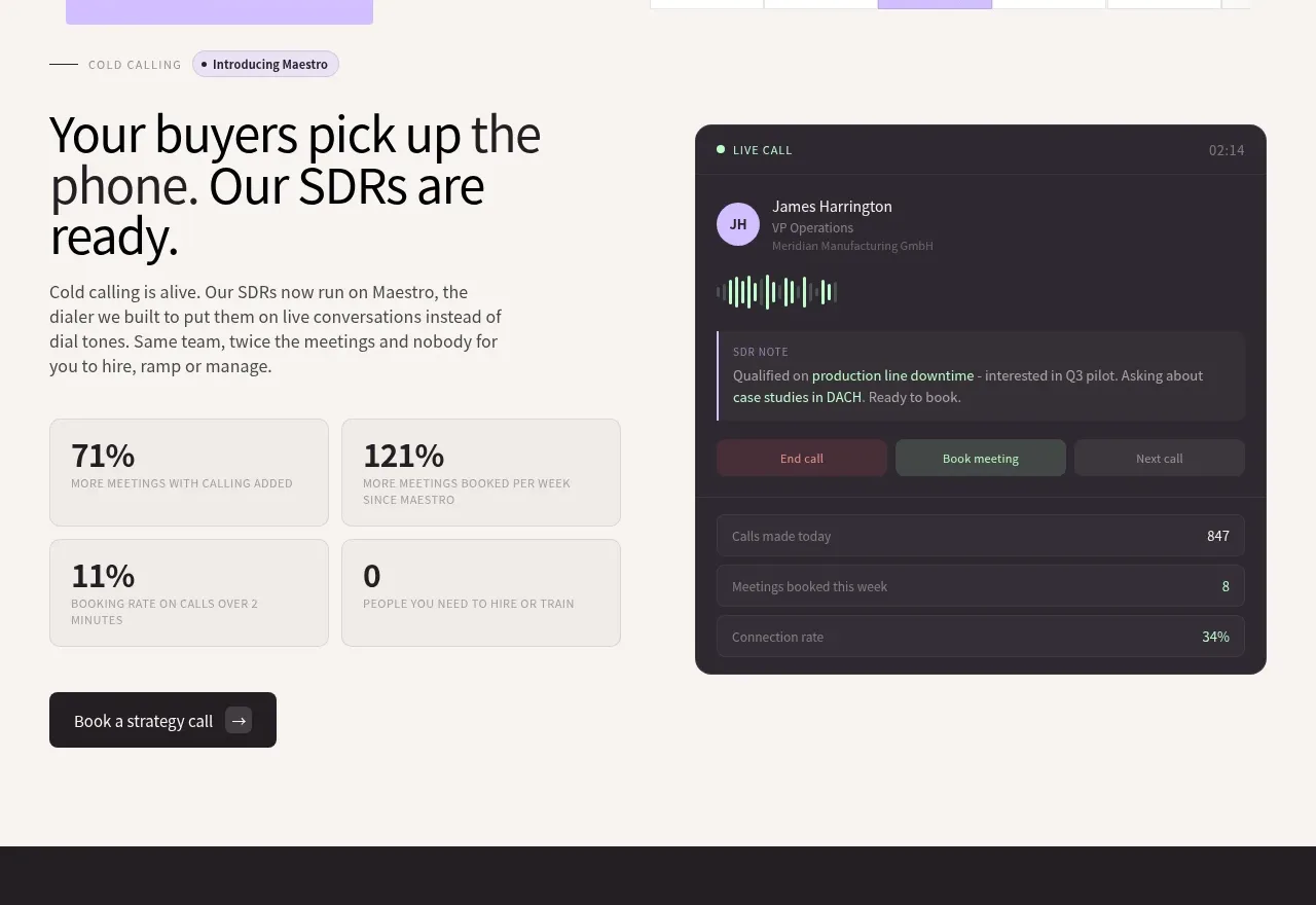 Cold-calling performance section
throxy · Feature grid
 Outbound partner benefits
throxy · Feature grid
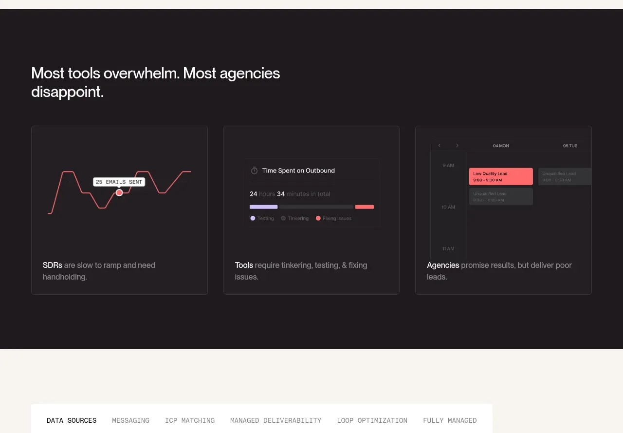 Why alternatives disappoint
throxy · Feature grid
 Platform foundation features
Basedash View-only members · Feature grid