 kage
cloudknife.com
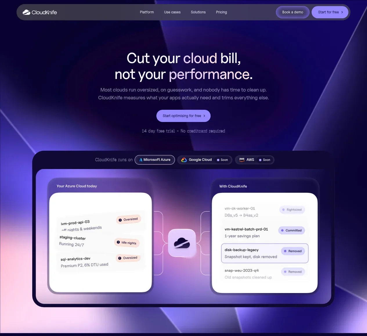
Design analysis
The opening hero uses a centered value proposition above a prominent product dashboard visual, with a luminous purple-blue background and a low-friction CTA pair.
Prompt preview
## Reference images

Study these alongside the description below: hierarchy, rhythm, spacing, colour. Build for the product you are asked about, using this design language.

- Component: https://kage-design-assets.t3.tigrisfiles.io/components/cloudknife/9dafaa08-16c6-4721-8c78-296bafbb7abc-1793081088-1.webp
- Full page it was cut from: https://kage-design-assets.t3.tigrisfiles.io/screenshots/cloudknife/9dafaa08-16c6-4721-8c78-296bafbb7abc-1793080968695-full.webp
- Component on Kage: https://kage.design/component/cloudknife-hero

## Before you start
Ask what the user's product is, who it serves, and what their brand personality and visual identity are. Apply the following principles to that product rather than copying the reference.

Create a full-width hero directly below the navigation. Center a short eyebrow or supporting line, a large two-line headline, concise explanatory copy, a primary rounded CTA, and a small reassurance line. Under the text, place a wide product visual inside a dark rounded frame; use the visual to demonstrate the product's outcome rather than decorate the page. Set a deep navy background near #0b0630 with layered indigo, violet, blue, and warm coral radial gradients. Use a 48–64px desktop headline with tight line-height, 14–16px body copy in muted lavender-white, and 12px labels. Give the dashboard frame a 2px translucent border, 22–28px radius, soft violet glow, and generous surrounding whitespace. Buttons should be pill-shaped, with a bright lavender primary around #927bff and a near-black secondary. Make the layout responsive by scaling the visual below the copy on mobile.

Never: use logos, product names, copy, illustrations, or imagery from the reference.
More components
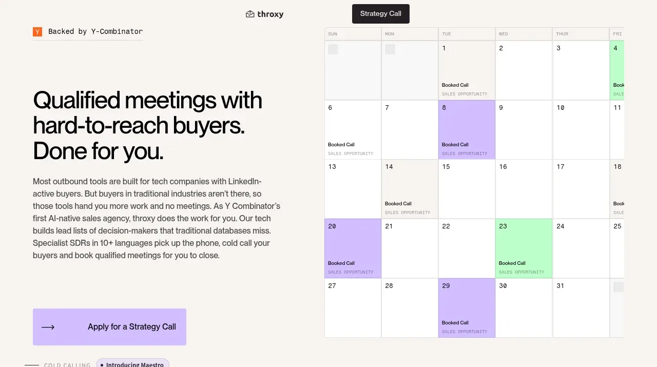
 Buyer-focused hero with calendar visual
throxy · Hero
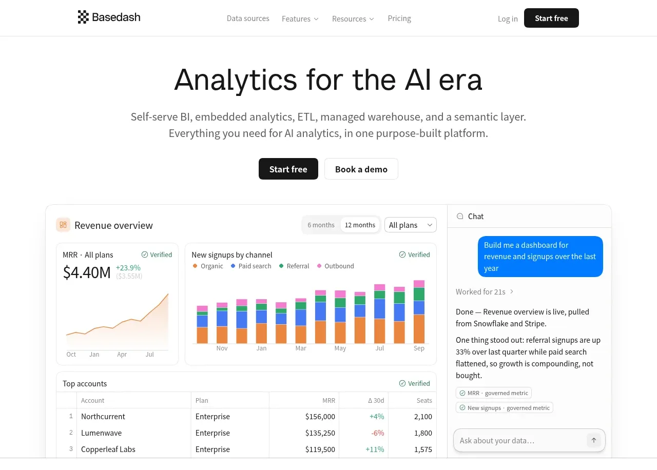
 Analytics product hero
Basedash View-only members · Hero

 AI customer experience hero
Open For sales · Hero
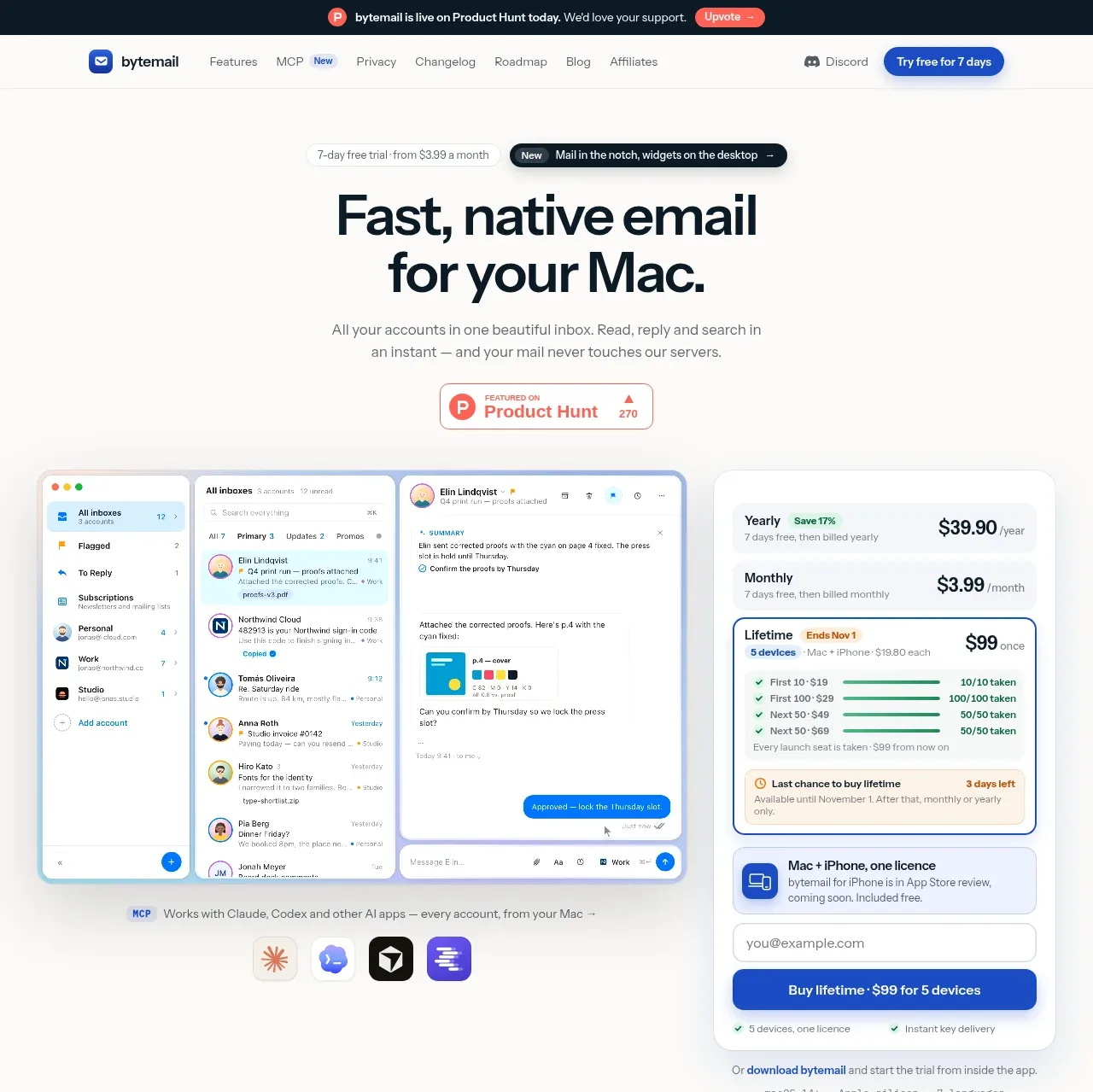
 Mac email product hero
bytemail · Hero
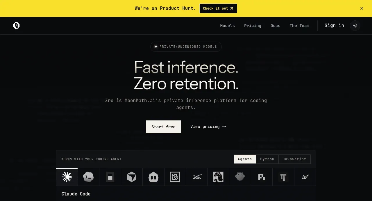
 Private inference hero
Zro: Uncensored Security Models · Hero
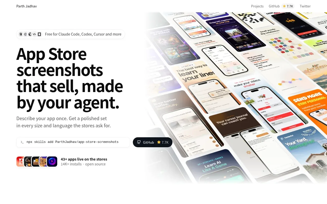
 Product hero with screenshot collage
App Store Screenshots · Hero