 kage
kage
agentfield.ai
Design analysis
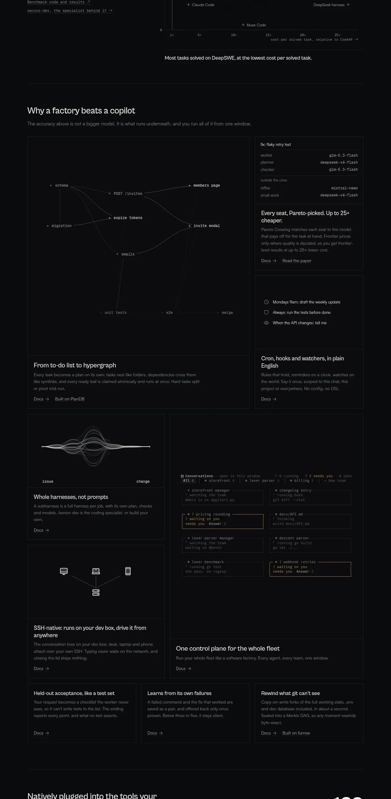
A long editorial feature grid uses a large systems diagram, stacked explanatory cards, and varied visual tiles to explain the product's underlying workflow and differentiation.
Prompt preview
## Reference images

Study these alongside the description below: hierarchy, rhythm, spacing, colour. Build for the product you are asked about, using this design language.

- Component: https://kage-design-assets.t3.tigrisfiles.io/components/codeaf/74fffb9e-aea6-4193-af2d-c8a5b19c270c-1791007528-4.webp
- Full page it was cut from: https://kage-design-assets.t3.tigrisfiles.io/screenshots/codeaf/74fffb9e-aea6-4193-af2d-c8a5b19c270c-1791007420738-full.webp
- Component on Kage: https://kage.design/component/codeaf-feature-grid

## Before you start
Ask what core principles differentiate the user's product from a simpler alternative, which concepts need diagrams, and what evidence supports each claim. Build an original feature system from those answers.

Create a dark editorial feature section with a left-aligned heading and a short thesis, followed by a responsive asymmetric grid. Use one dominant wide diagram tile showing nodes and connecting paths, a vertical stack of smaller explanatory cards, and several lower tiles mixing lightweight system diagrams, code-like UI fragments, and text. Each card should have a concise heading, two or three lines of explanation, and a small documentation/action link. Vary tile sizes while preserving a strict column grid and shared edges.

Design language: #08090a background, panels #0b0d0e, borders #252827, primary text #d6d9d6, secondary text #777b79, and restrained amber #b99543 for selected nodes or rules. Use 18–20px section headings, 13–15px card headings, 11–12px body text, and 10–11px mono labels. Cards are square or use a subtle 2px radius; keep 24px internal padding and 12–16px grid gaps. Diagrams should use hairline strokes, dots, and low-contrast labels. Add hover elevation only through border brightness and slight content reveal; do not use loud shadows.

Never: use logos, product names, copy, illustrations, or imagery from the reference.
More components

 Three-step process cards
godaylight.com · Feature grid
Three-step process cards
godaylight.com · Feature grid

 Use-case selector with vertical video preview
Spira Maxima · Feature grid
Use-case selector with vertical video preview
Spira Maxima · Feature grid

 Insights and enterprise model access
FastRouter.ai · Feature grid
Insights and enterprise model access
FastRouter.ai · Feature grid
 Solutions by organizational role
FastRouter.ai · Feature grid
Solutions by organizational role
FastRouter.ai · Feature grid
 Routing reliability and model collaboration
FastRouter.ai · Feature grid
Routing reliability and model collaboration
FastRouter.ai · Feature grid
 Goal-oriented product capabilities
FastRouter.ai · Feature grid
Goal-oriented product capabilities
FastRouter.ai · Feature grid