kage
kage
agentfield.ai

Design analysis
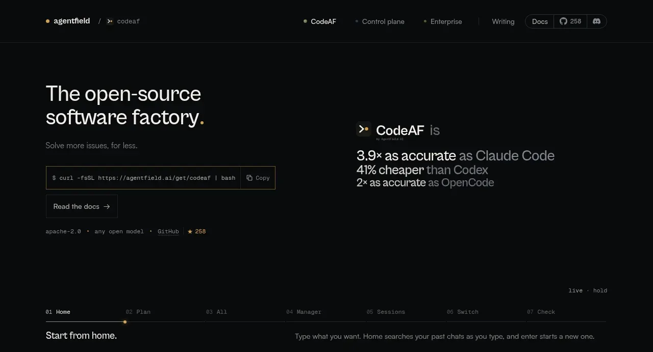
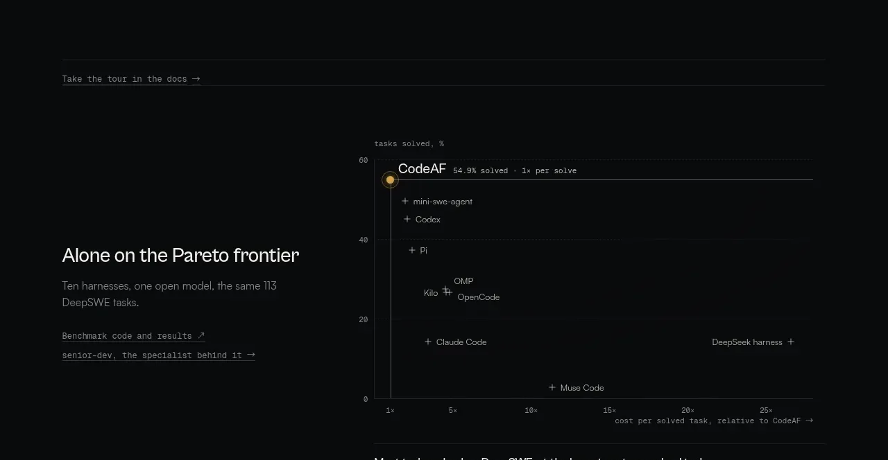
A near-black developer landing page that reads like an instrument panel: hairline borders on pure dark, generous whitespace, one yellow accent dot, and monospace used as a texture throughout. The hero pairs a huge light-weight sans headline with a copyable curl command and a typographic proof block ("3.9x as accurate…") instead of screenshots. Rhythm shifts down the page: a tabbed live demo strip, a scattered-node Pareto benchmark chart, an asymmetric bento feature grid mixing line-drawn diagrams and UI mockups, a 129-connection icon grid, an open-model logo row, a numbered two-column FAQ, and a footer that repeats the install command and closes with a giant cropped wordmark. Density grows toward the middle then relaxes again.
Prompt preview
## Reference images

Study these alongside the description below: hierarchy, rhythm, spacing, colour. Build for the product you are asked about, using this design language.

- Full page: https://kage-design-assets.t3.tigrisfiles.io/screenshots/codeaf/74fffb9e-aea6-4193-af2d-c8a5b19c270c-1791007420738-full.webp
- Above the fold: https://kage-design-assets.t3.tigrisfiles.io/screenshots/codeaf/74fffb9e-aea6-4193-af2d-c8a5b19c270c-1791007416335.webp
- Design on Kage: https://kage.design/designs/codeaf-landing-page

## Before you start
Ask the user what they are building, who it is for, and what brand assets they already have (name, colours, type). Wait for the answers, then apply this design language to their product — do not clone the reference content.

## Page structure
1. **Nav**: slim dark bar; breadcrumb-style brand ("org / product"), centre nav links, right-aligned docs button + GitHub star pill.
2. **Hero**: two columns. Left: oversized light-weight headline with a single accent-coloured word, one-line subcopy, a bordered terminal/curl command row with a Copy button, and a "Read the docs →" link. Right: a typographic proof block ("X is 3.9x as accurate as A, 41% cheaper than B, 2x as accurate as C") with metric words in white and comparison words in muted grey. Small license/model/GitHub meta row beneath.
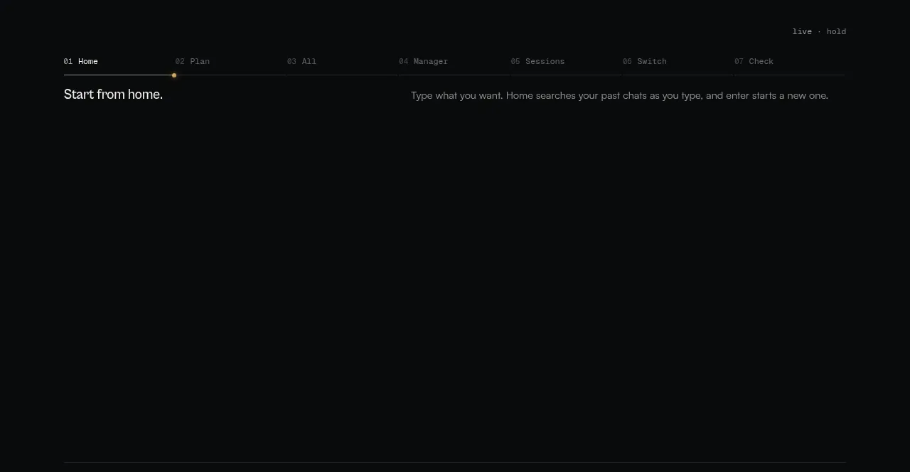
3. **Interactive demo strip**: a horizontal tab bar of numbered steps (01 Home … 07 Check) with a caption ("Start from home.") and explanatory text, above a large demo viewport. "Take the tour in the docs →" link below.
4. **Benchmark section**: left column headline + short copy + links; right a sparse scatter/step chart (tasks solved vs cost per task) with the product highlighted in the accent colour, one-line takeaway underneath.
5. **"Why a factory beats a copilot" bento grid**: asymmetric cells — a large line-drawn node/hypergraph diagram, a model-routing card with a mono table of seats and model names, a cron/hooks card with icon rows, each with headline, short paragraph, and "Docs →" links.
6. **Second bento row**: three cells — diagram cell (issue→change), a control-plane UI mockup with grid of conversation tiles and status badges, an SSH/device diagram cell. Headlines like "Whole harnesses, not prompts".
7. **Three small feature cards**: equal-width row of text-only cards (acceptance, self-learning, rewind) with "Docs →" links.
8. **Integrations**: headline + a big numeric stat (129) on the right, then a single-row icon grid of partner logos, "See all connections →".
9. **Open models section**: headline + copy, a boxed diagram of the open-model logo, a horizontal row of model logos, and a "Star on GitHub" prompt.
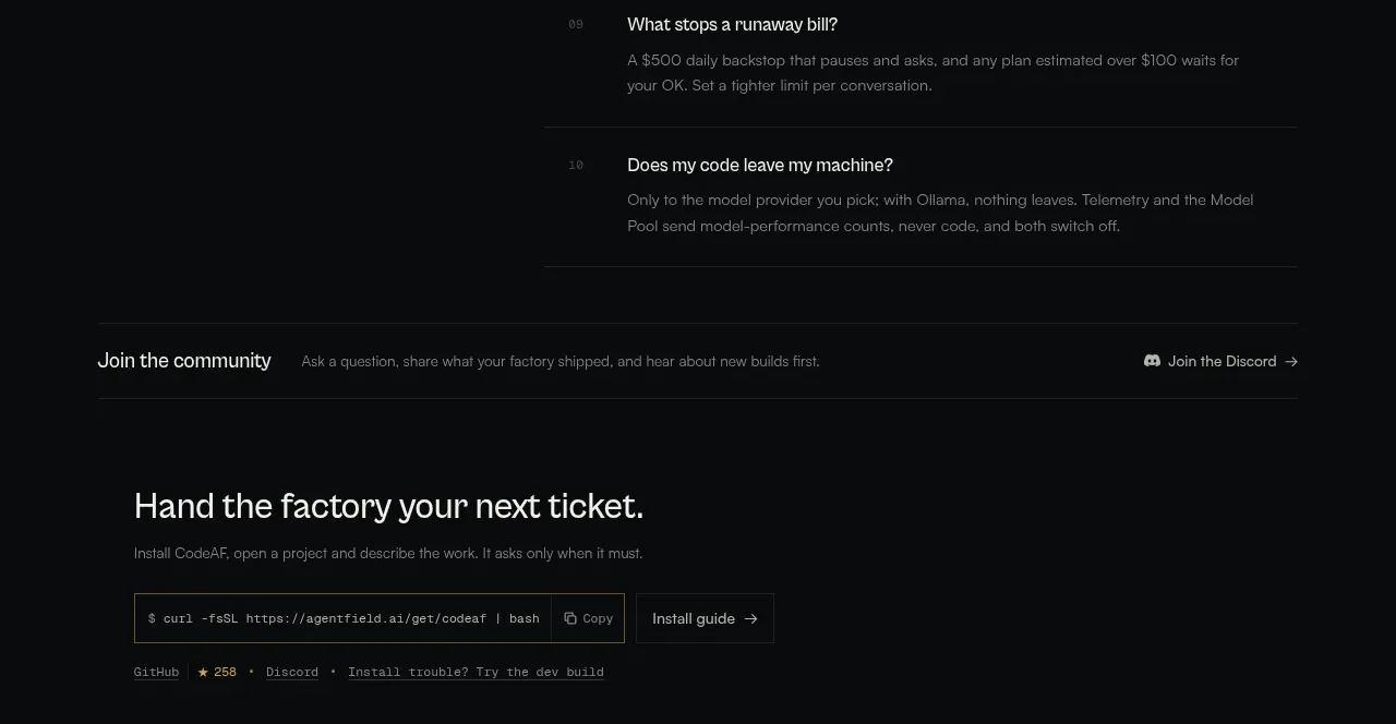
10. **FAQ**: "Before you install." left column with Discord link; right a numbered accordion (01–10) of bold questions with grey answers, separated by hairlines.
11. **Community strip**: "Join the community" one-liner with a Discord button on the right.
12. **Closing CTA**: centred headline "Hand the factory your next ticket.", subcopy, repeated terminal install row with Copy, install guide link, GitHub/Discord meta links.
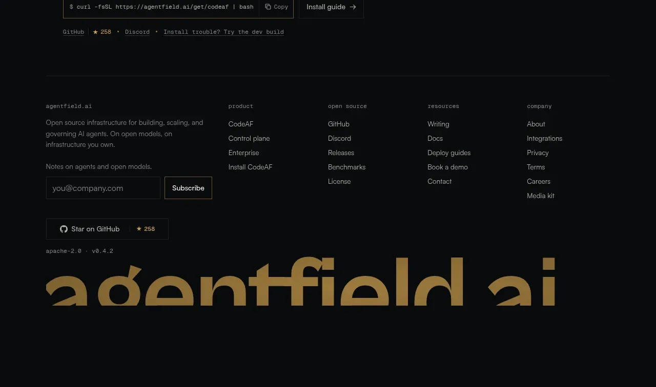
13. **Footer**: four-column link lists, newsletter email input + Subscribe, GitHub star button, license meta, and a giant cropped accent-coloured wordmark bleeding off the bottom edge.

## Design language
- Base palette: near-black background (#0a0a0a–#111), text in off-white (#e8e6e1), secondary text in warm grey (#8a8578), a single warm yellow accent (#c9a84c / #d4b45a) used sparingly — one accent word in the headline, active tab, chart highlight, giant footer wordmark.
- Hierarchy is built from type scale and weight contrast, not colour: very large light-weight display sans (300–400) for headlines, normal sans for body, monospace for anything technical (commands, tab labels, numbered steps, meta rows, chart axis labels).
- Everything sits on hairline 1px borders (#2a2a2a) in flat rectangles with little or no border-radius and no shadows; depth comes from structure, not elevation.
- Sections are separated by full-width hairlines and generous vertical padding (~120px); density peaks in the bento grid (2:1 asymmetric column splits) and relaxes in the FAQ and closing CTA.
- Numbering as ornament: "01 … 07" prefixes on tabs, "01–10" on FAQ rows give a mechanical, factory rhythm.
- Diagrams are line-drawn (thin grey strokes, small mono labels), never filled illustrations; UI mockups are simplified dark panels with tiny mono text.
- Interaction is quiet: copy buttons, underline-on-hover links with "→" arrows, active tab marked by a short accent underline.
- Footer closes with an oversized cropped wordmark in the accent colour as a signature moment.

## Never
- Never reuse the reference product name, wordmark, copy, comparison claims, diagram content, or its logo/icon set.
- Never present the output as the reference product; apply the visual language to the user's own brand.
Components from this page
All components
 Global product navigation
CodeAF · Navigation
Global product navigation
CodeAF · Navigation
 Open-source software factory hero
CodeAF · Hero
Open-source software factory hero
CodeAF · Hero
 Workflow stages explainer
CodeAF · Tabs & steps
Workflow stages explainer
CodeAF · Tabs & steps
 Benchmark and Pareto proof
CodeAF · Chart
Benchmark and Pareto proof
CodeAF · Chart
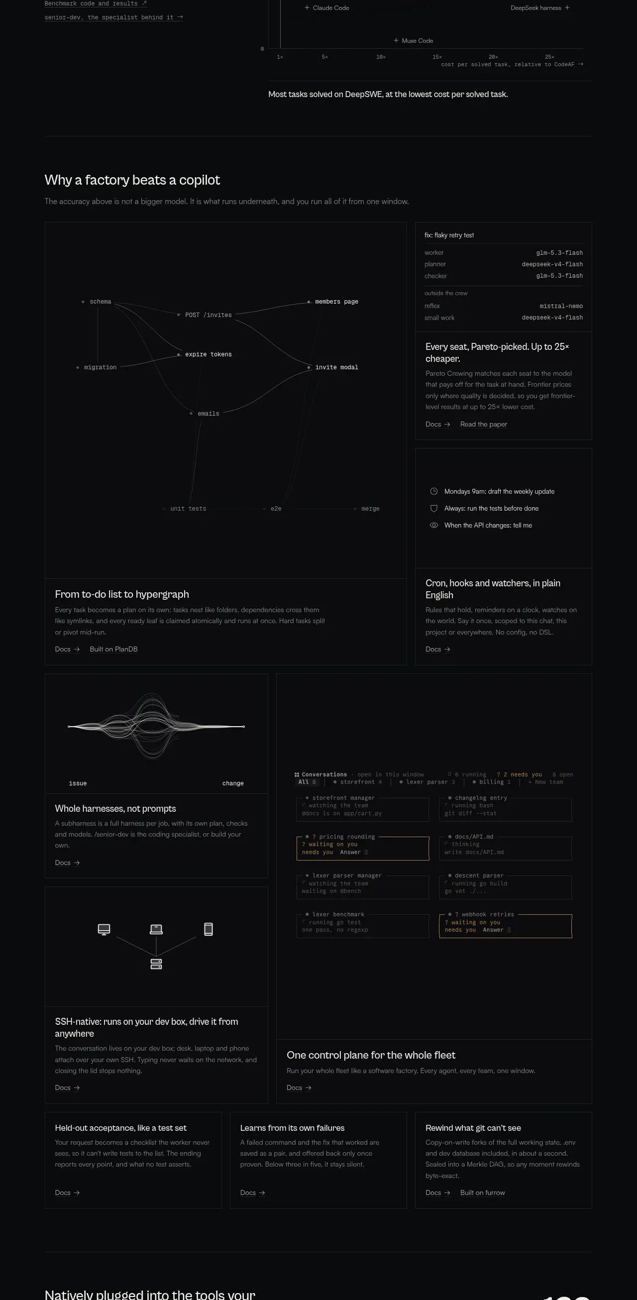 Why the factory beats a copilot
CodeAF · Feature grid
Why the factory beats a copilot
CodeAF · Feature grid
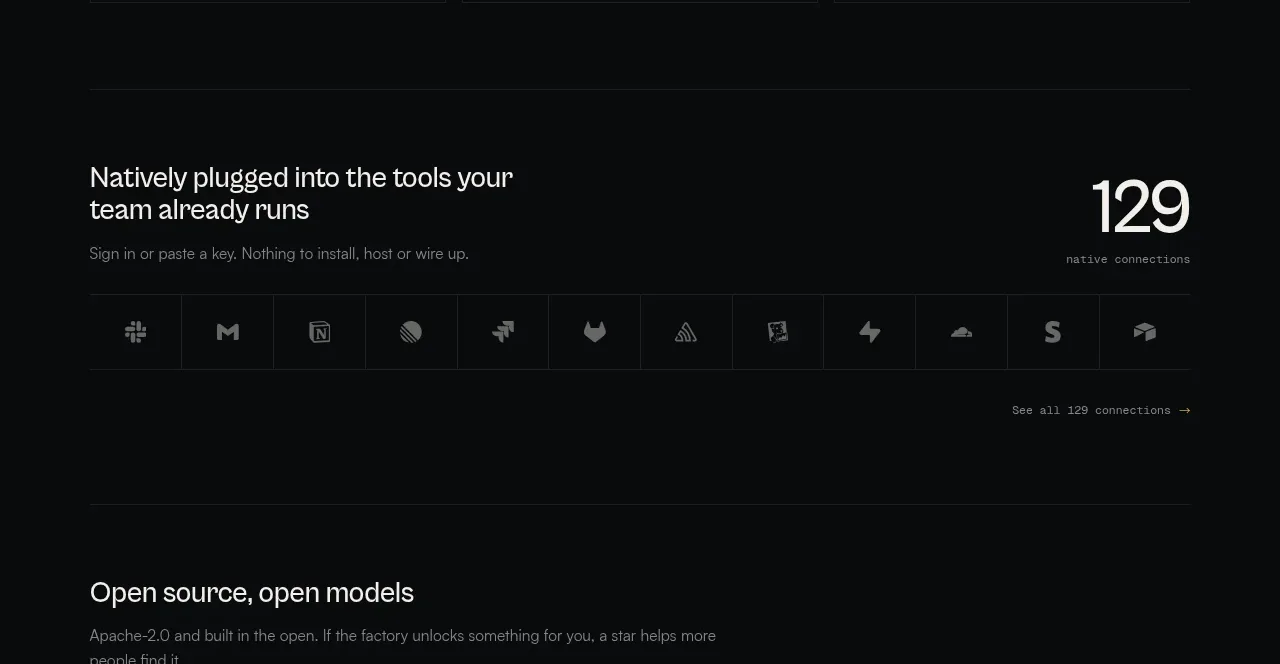 Native tool connections
CodeAF · Logo cloud
Native tool connections
CodeAF · Logo cloud
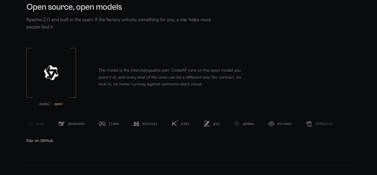 Open ecosystem and models
CodeAF · Logo cloud
Open ecosystem and models
CodeAF · Logo cloud
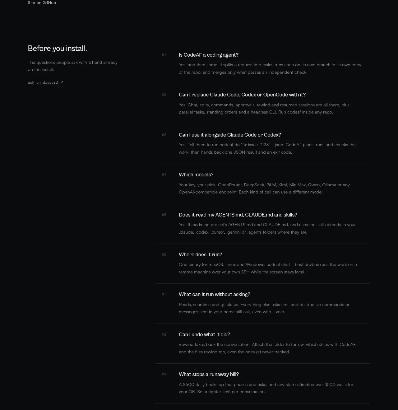 Installation and product FAQ
CodeAF · FAQ
Installation and product FAQ
CodeAF · FAQ
 Install and start a project
CodeAF · Call to action
Install and start a project
CodeAF · Call to action
 Site footer and brand lockup
CodeAF · Footer
Site footer and brand lockup
CodeAF · Footer