 kage
kage
cognition.com
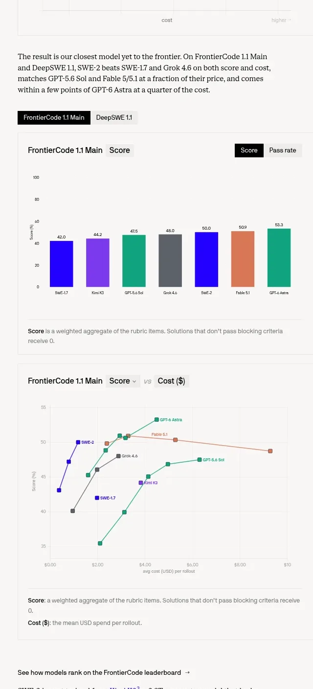
Design analysis
A results section combines explanatory copy, segmented controls, a benchmark bar chart, and a cost-versus-score plot so readers can compare models and trade-offs.
Prompt preview
## Reference images

Study these alongside the description below: hierarchy, rhythm, spacing, colour. Build for the product you are asked about, using this design language.

- Component: https://kage-design-assets.t3.tigrisfiles.io/components/cognitions-swe-2/e9966f12-655e-494e-9580-e5330b0ddc92-1789365705-2.webp
- Full page it was cut from: https://kage-design-assets.t3.tigrisfiles.io/screenshots/cognitions-swe-2/e9966f12-655e-494e-9580-e5330b0ddc92-1789365639098-full.webp
- Component on Kage: https://kage.design/component/cognitions-swe-2-chart

## Before you start
Ask what the user's product, audience, and brand are, then apply the principles below to create an original benchmark comparison section.

Build a technical benchmark section with a concise explanatory paragraph, compact tabs or segmented controls, a grouped bar chart for scores, and a line/scatter chart showing cost versus quality. Make comparisons easy to scan.

### Design language
- Layout: stack the intro, controls, score chart, chart explanation, and cost chart in one reading column; align chart widths and titles.
- Typography: body 14–16px, chart headings 14px semibold, labels 10–12px; use tabular numerals for scores.
- Spacing: 28–40px between subsections, 12px around controls, and 16–24px chart padding.
- Colour: surface `#fafaf8`, ink `#181818`, muted labels `#777777`, vivid primary `#3013e8`, with distinct but low-saturation comparison colours such as `#e56f55`, `#e1a14e`, `#159b79`, and `#777777`.
- Borders and radius: thin `#e6e6e1` chart rules, 2–4px control radius, no ornamental container shadows.
- Interaction: tabs switch benchmark views; chart points reveal exact values on hover/focus; controls have selected and keyboard-focus states.

### Never
- Never reuse logos, product names, copy, illustrations, or imagery from the reference.
- Never use colour alone without labels or legends to identify series.
- Never present a chart without units, timeframe, or a short interpretive caption.
More components
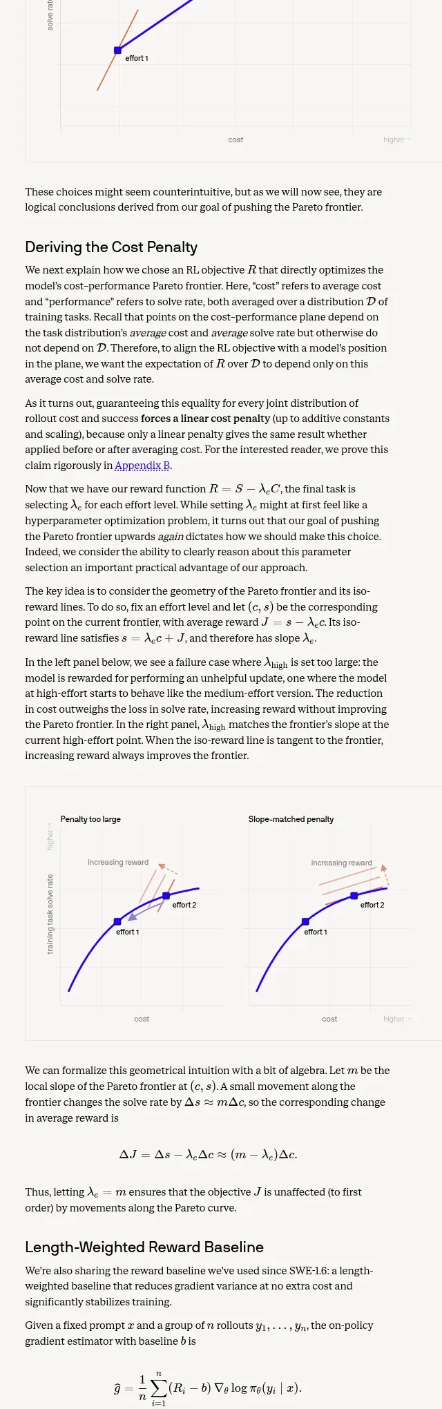
 Length-weighted reward and RL stability
Cognition's SWE-2 · Chart
Length-weighted reward and RL stability
Cognition's SWE-2 · Chart
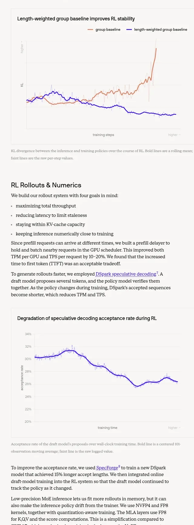 Trustworthiness evaluation charts
Cognition's SWE-2 · Chart
Trustworthiness evaluation charts
Cognition's SWE-2 · Chart

 Financial dashboard charts
tryobra.com · Chart
Financial dashboard charts
tryobra.com · Chart

 Old way vs live-product workflow comparison chart
Modeinspect · Chart
Old way vs live-product workflow comparison chart
Modeinspect · Chart

 Performance comparison bar chart
astro.build · Chart
Performance comparison bar chart
astro.build · Chart

 Code Example with Capability Index
bun.sh · Chart
Code Example with Capability Index
bun.sh · Chart