kage
kage
coldiq.com
Design analysis
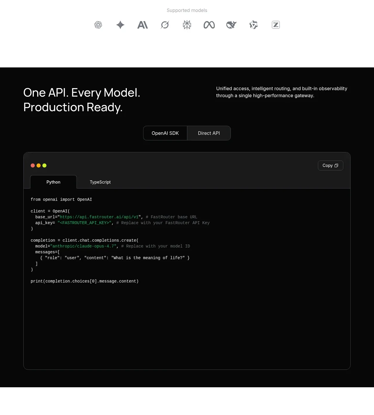
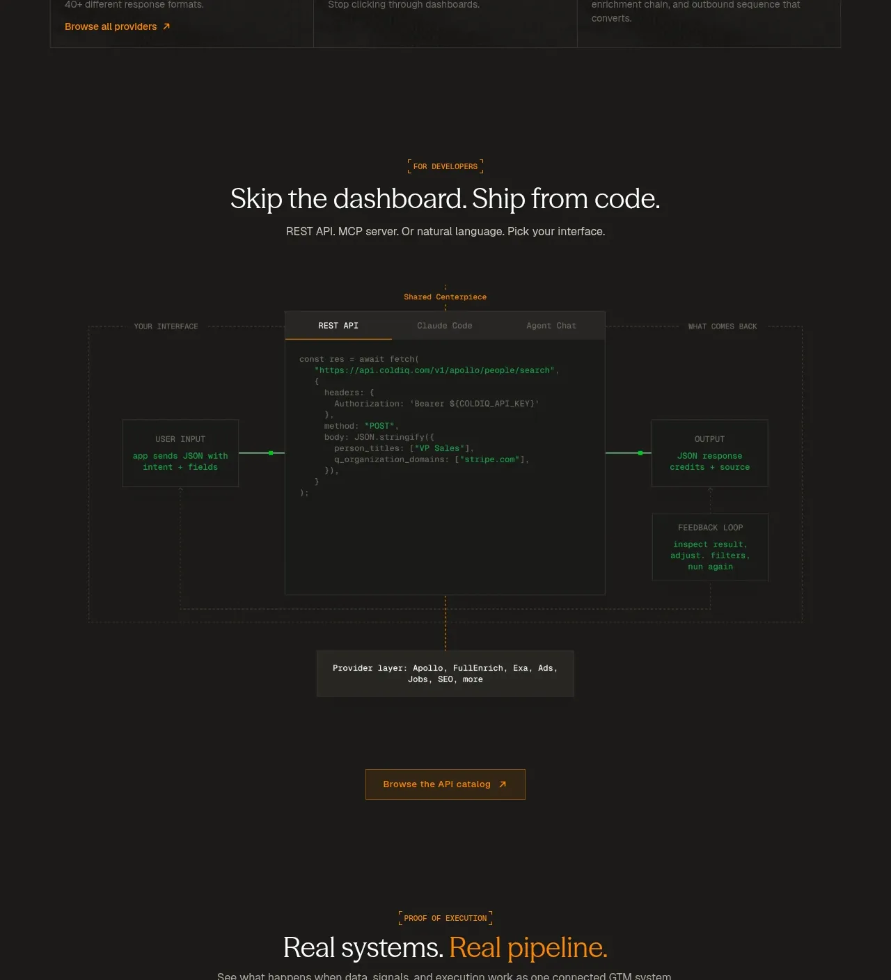
A developer-focused section frames a central code panel between input and output nodes, then ends with a provider-layer explanation and a catalog CTA.
Prompt preview
## Reference images

Study these alongside the description below: hierarchy, rhythm, spacing, colour. Build for the product you are asked about, using this design language.

- Component: https://kage-design-assets.t3.tigrisfiles.io/components/coldiq-x-slack/e029c4ff-104d-4249-8c7e-44961fb1d1f9-1790748087-4.webp
- Full page it was cut from: https://kage-design-assets.t3.tigrisfiles.io/screenshots/coldiq-x-slack/e029c4ff-104d-4249-8c7e-44961fb1d1f9-1790748039437-full.webp
- Component on Kage: https://kage.design/component/coldiq-x-slack-code-block

## Before you start
Ask what developers integrate, what the simplest request looks like, and what inputs and outputs should be shown. Apply the principles to the user's API or technical workflow.

Build a dark developer section with a centered eyebrow, editorial headline, and short supporting sentence. Below, create a wide systems diagram: a left input node, a large central code editor with tabs, and a right output node, connected by thin lines and small status markers. Add a secondary provider or infrastructure layer below the editor, then finish with one outlined or amber CTA.

Use #171816 and #1d1f1d for surfaces, #343530 for panel borders, #efeee8 for headings, #8f918b for annotations, and #ff8a00 for active states. Code must use a readable 11–13px monospace typeface with syntax accents in green, teal, and amber. Use a 12-column or flex layout with a central panel taking about half the width; use dotted rules and faint grid lines sparingly. Tabs should visibly switch the shown code state, and the diagram should collapse into a vertical flow on mobile.

Never: use logos, product names, copy, illustrations, or imagery from the reference.