 kage
kage
coldiq.com
Design analysis
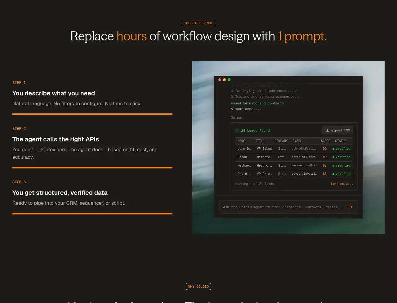
A short section heading introduces three vertically stacked workflow steps on the left and a framed product visual on the right, making the product promise easy to scan.
Prompt preview
## Reference images

Study these alongside the description below: hierarchy, rhythm, spacing, colour. Build for the product you are asked about, using this design language.

- Component: https://kage-design-assets.t3.tigrisfiles.io/components/coldiq-x-slack/e029c4ff-104d-4249-8c7e-44961fb1d1f9-1790748086-2.webp
- Full page it was cut from: https://kage-design-assets.t3.tigrisfiles.io/screenshots/coldiq-x-slack/e029c4ff-104d-4249-8c7e-44961fb1d1f9-1790748039437-full.webp
- Component on Kage: https://kage.design/component/coldiq-x-slack-feature-grid

## Before you start
Ask what workflow the user's product simplifies and what three meaningful stages a user passes through. Apply the structure to that workflow.

Build a two-column explanatory feature section on the same dark canvas. Center a small eyebrow and editorial heading above the columns. In the left column, stack exactly three numbered steps with a small uppercase label, strong one-line title, muted explanation, and a thin orange progress rule beneath each item. In the right column, show one large framed product screenshot or UI mockup with a restrained atmospheric treatment behind it.

Use a 48–56px serif heading, 13–16px body text, and 11px uppercase step labels. Keep the content container near 748px wide, use a 40–56px column gap, and 36–48px between steps. Use #171816, #f2eee8, #9b9a94, and #f28a00; borders should be 1px #343530 with square or 2px corners. On mobile, stack the visual below the steps. The visual should support the explanation, not compete with it.

Never: use logos, product names, copy, illustrations, or imagery from the reference.
More components

 Three-step process cards
godaylight.com · Feature grid
Three-step process cards
godaylight.com · Feature grid

 Use-case selector with vertical video preview
Spira Maxima · Feature grid
Use-case selector with vertical video preview
Spira Maxima · Feature grid

 Insights and enterprise model access
FastRouter.ai · Feature grid
Insights and enterprise model access
FastRouter.ai · Feature grid
 Solutions by organizational role
FastRouter.ai · Feature grid
Solutions by organizational role
FastRouter.ai · Feature grid
 Routing reliability and model collaboration
FastRouter.ai · Feature grid
Routing reliability and model collaboration
FastRouter.ai · Feature grid
 Goal-oriented product capabilities
FastRouter.ai · Feature grid
Goal-oriented product capabilities
FastRouter.ai · Feature grid