 kage
kage
coldiq.com
Design analysis
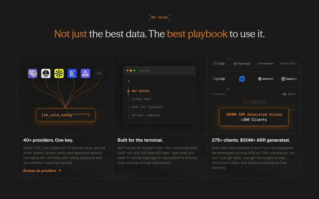
Three equal cards translate the product into distinct capabilities: broad coverage, terminal-native use, and measurable customer outcomes.
Prompt preview
## Reference images

Study these alongside the description below: hierarchy, rhythm, spacing, colour. Build for the product you are asked about, using this design language.

- Component: https://kage-design-assets.t3.tigrisfiles.io/components/coldiq-x-slack/e029c4ff-104d-4249-8c7e-44961fb1d1f9-1790748086-3.webp
- Full page it was cut from: https://kage-design-assets.t3.tigrisfiles.io/screenshots/coldiq-x-slack/e029c4ff-104d-4249-8c7e-44961fb1d1f9-1790748039437-full.webp
- Component on Kage: https://kage.design/component/coldiq-x-slack-feature-grid-2

## Before you start
Ask which three capabilities most differentiate the user's product and what evidence makes each believable. Apply the same information architecture to the user's brand.

Create a three-column capability grid with a centered eyebrow and section headline above it. Each card should include a dark visual or abstract interface panel in its upper half, a strong capability title, a short evidence-led paragraph, and a small text link where useful. Use consistent card heights and align all lower content so the grid feels engineered.

Use a near-black background (#171816), cards with barely lighter fills (#1c1e1b), 1px borders (#343530), and 0–2px radius. Titles use 16–18px semibold text; descriptions use 12–14px muted gray; links use orange (#ff8a00). The upper visual area can use line diagrams, terminal fragments, provider nodes, or metrics generated for the user's product, but should remain functional-looking. Maintain 24px internal padding and 0px gaps or hairline dividers between adjacent cards. Make the layout responsive by switching to one column on narrow screens.

Never: use logos, product names, copy, illustrations, or imagery from the reference.
More components

 Three-step process cards
godaylight.com · Feature grid
Three-step process cards
godaylight.com · Feature grid

 Use-case selector with vertical video preview
Spira Maxima · Feature grid
Use-case selector with vertical video preview
Spira Maxima · Feature grid

 Insights and enterprise model access
FastRouter.ai · Feature grid
Insights and enterprise model access
FastRouter.ai · Feature grid
 Solutions by organizational role
FastRouter.ai · Feature grid
Solutions by organizational role
FastRouter.ai · Feature grid
 Routing reliability and model collaboration
FastRouter.ai · Feature grid
Routing reliability and model collaboration
FastRouter.ai · Feature grid
 Goal-oriented product capabilities
FastRouter.ai · Feature grid
Goal-oriented product capabilities
FastRouter.ai · Feature grid