 kage
kage
coldiq.com
Design analysis
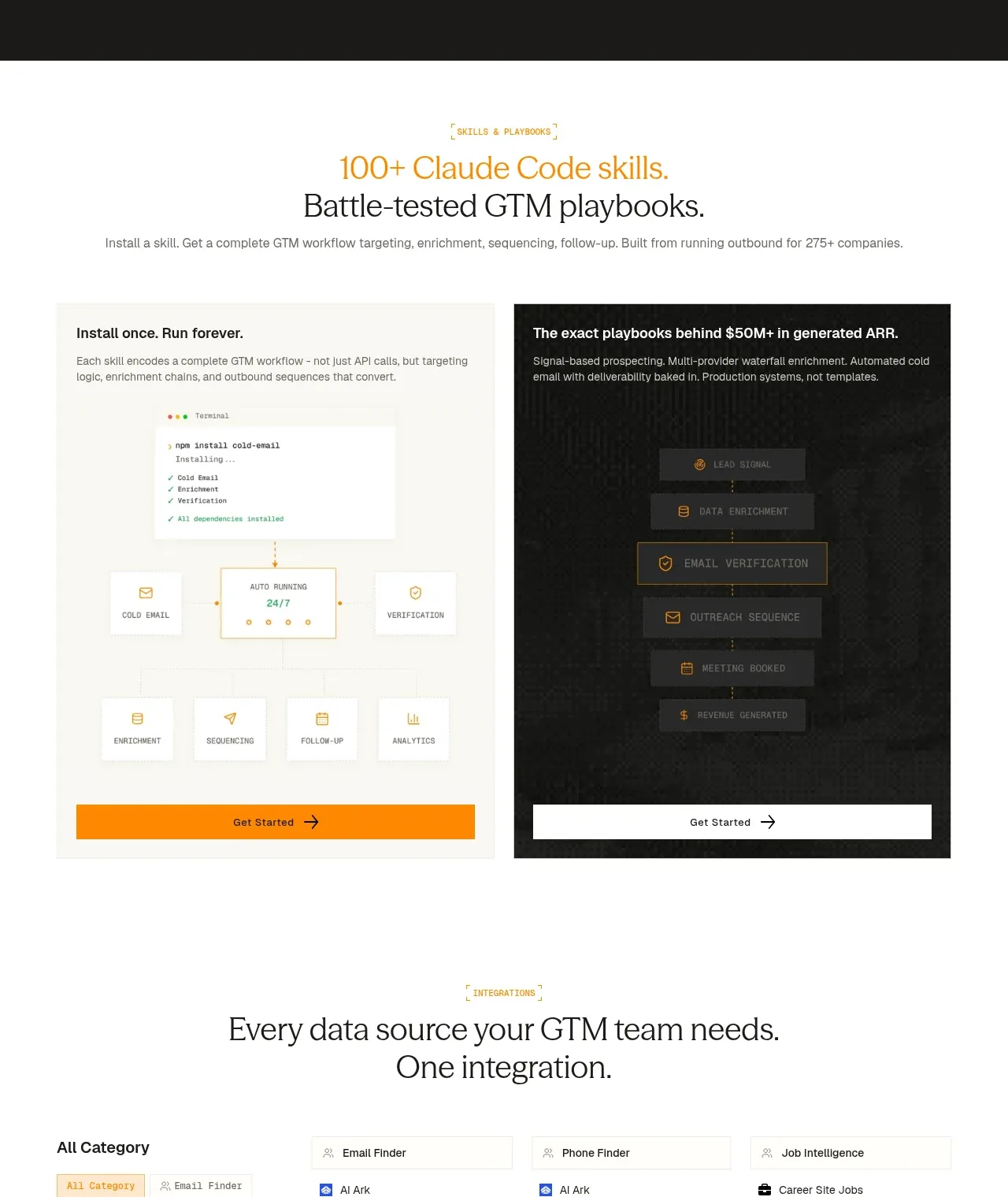
A light-background section introduces reusable skills with two contrasting panels: a practical install-and-run workflow and a more dramatic automated pipeline.
Prompt preview
## Reference images

Study these alongside the description below: hierarchy, rhythm, spacing, colour. Build for the product you are asked about, using this design language.

- Component: https://kage-design-assets.t3.tigrisfiles.io/components/coldiq-x-slack/e029c4ff-104d-4249-8c7e-44961fb1d1f9-1790748088-7.webp
- Full page it was cut from: https://kage-design-assets.t3.tigrisfiles.io/screenshots/coldiq-x-slack/e029c4ff-104d-4249-8c7e-44961fb1d1f9-1790748039437-full.webp
- Component on Kage: https://kage.design/component/coldiq-x-slack-feature-grid-3

## Before you start
Ask what reusable templates, workflows, or automations the user's product provides and which two use cases best communicate their value. Apply the structure to those use cases.

Switch to a light editorial section with a centered eyebrow and a two-line serif headline, using a warm accent for the first line or key phrase. Add a short explanatory line, then show two equal side-by-side panels. Each panel needs a clear title, small supporting paragraph, a distinctive workflow visual, and a full-width CTA button anchored to the bottom. Make the panels intentionally contrasting: one light and practical, one dark and cinematic, while preserving shared spacing and hierarchy.

Use a warm off-white background #f7f6f1, dark text #20211e, muted text #73746e, orange #ff8a00, and dark panel #171816. Use 1px #e6e4dc borders, minimal radius, 24–32px padding, and 16px panel gaps. Headings can use a 42–52px serif; labels and UI annotations should be 10–12px uppercase or monospace. Buttons should be at least 44px tall with strong contrast. Ensure the panels become a vertical stack on small screens.

Never: use logos, product names, copy, illustrations, or imagery from the reference.
More components

 Three-step process cards
godaylight.com · Feature grid
Three-step process cards
godaylight.com · Feature grid

 Use-case selector with vertical video preview
Spira Maxima · Feature grid
Use-case selector with vertical video preview
Spira Maxima · Feature grid

 Insights and enterprise model access
FastRouter.ai · Feature grid
Insights and enterprise model access
FastRouter.ai · Feature grid
 Solutions by organizational role
FastRouter.ai · Feature grid
Solutions by organizational role
FastRouter.ai · Feature grid
 Routing reliability and model collaboration
FastRouter.ai · Feature grid
Routing reliability and model collaboration
FastRouter.ai · Feature grid
 Goal-oriented product capabilities
FastRouter.ai · Feature grid
Goal-oriented product capabilities
FastRouter.ai · Feature grid