 kage
kage
coldiq.com
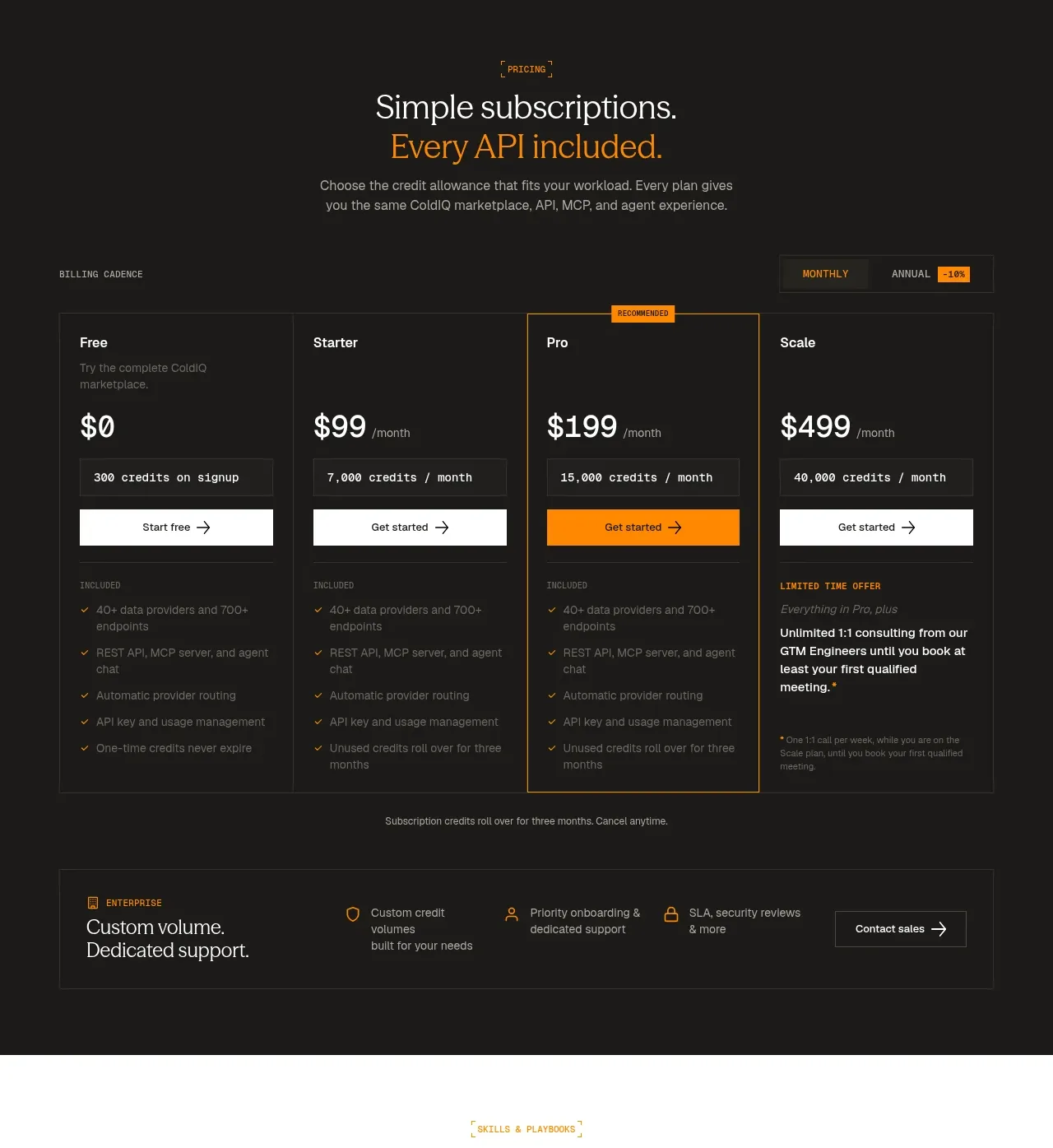
Design analysis
A dark pricing section uses four aligned plans, a highlighted recommended tier, billing controls, feature lists, and an enterprise support strip.
Prompt preview
## Reference images

Study these alongside the description below: hierarchy, rhythm, spacing, colour. Build for the product you are asked about, using this design language.

- Component: https://kage-design-assets.t3.tigrisfiles.io/components/coldiq-x-slack/e029c4ff-104d-4249-8c7e-44961fb1d1f9-1790748087-6.webp
- Full page it was cut from: https://kage-design-assets.t3.tigrisfiles.io/screenshots/coldiq-x-slack/e029c4ff-104d-4249-8c7e-44961fb1d1f9-1790748039437-full.webp
- Component on Kage: https://kage.design/component/coldiq-x-slack-pricing-table

## Before you start
Ask about the user's pricing model, plan names, billing cadence, included usage, and the plan that should be recommended. Apply these rules to the user's actual offer.

Build a pricing section with a centered eyebrow, two-line headline, and short explanatory paragraph. Add a billing cadence toggle above a four-column pricing table. Each plan should contain a name, brief description, large price, usage allowance, primary button, and a clearly separated included-features list. Highlight one recommended plan with an orange border and a small label, while keeping the other plans quieter. Finish with a full-width enterprise support band beneath the table containing a concise value statement, three benefits, and a contact-sales action.

Use #171816, #1f211e, #353630, #f1eee8, #a4a39b, and #ff8a00. Use 1px borders, 0–2px radii, 24px card padding, and consistent row alignment. Price values should be 28–32px; plan labels 15–16px; feature text 12–13px. The monthly/annual switch should have an obvious selected state and update prices accessibly. On mobile, allow horizontal scroll or stack cards while preserving the recommended state.

Never: use logos, product names, copy, illustrations, or imagery from the reference.
More components
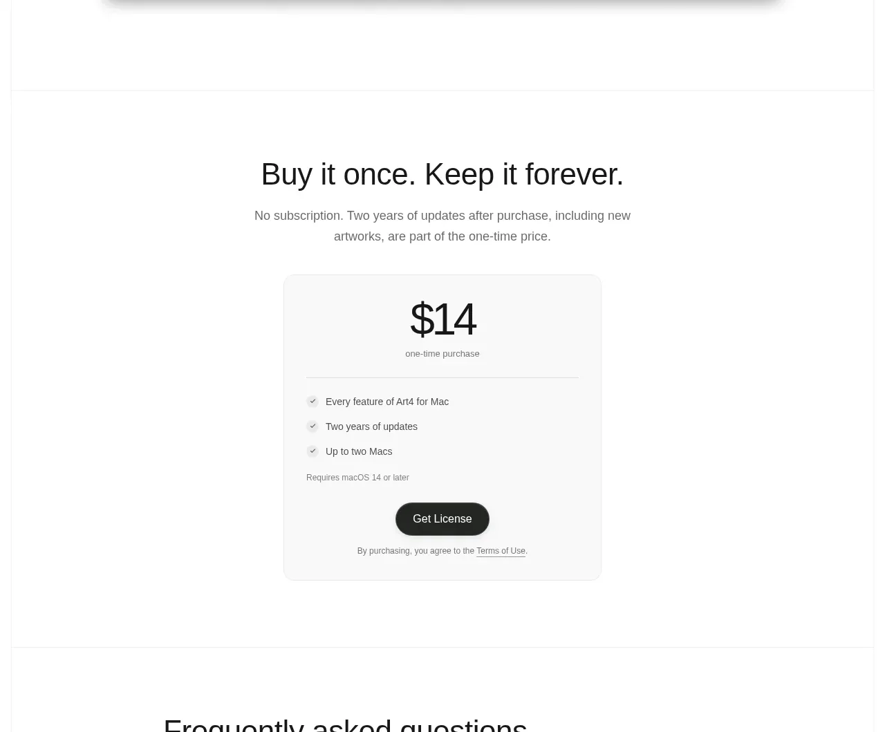
 Single purchase pricing card
Art4 · Pricing table
Single purchase pricing card
Art4 · Pricing table
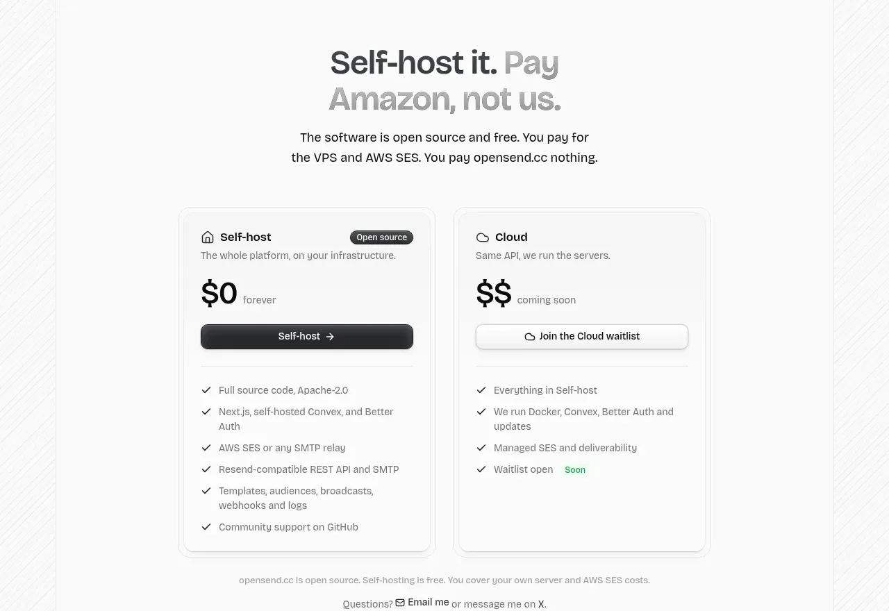
 Self-host versus cloud pricing
opensend.cc · Pricing table
Self-host versus cloud pricing
opensend.cc · Pricing table
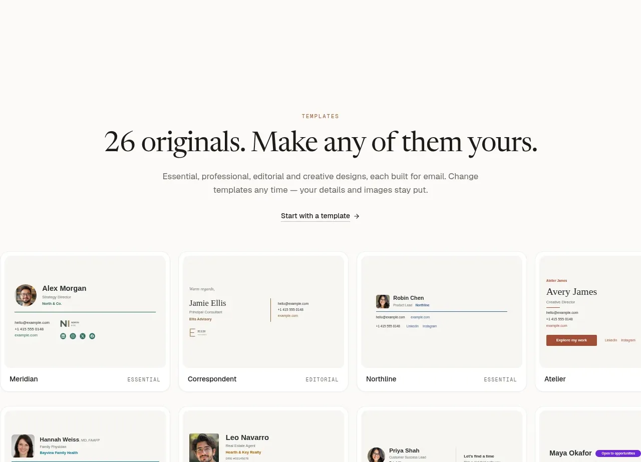
 Two-tier pricing table
esigna · Pricing table
Two-tier pricing table
esigna · Pricing table
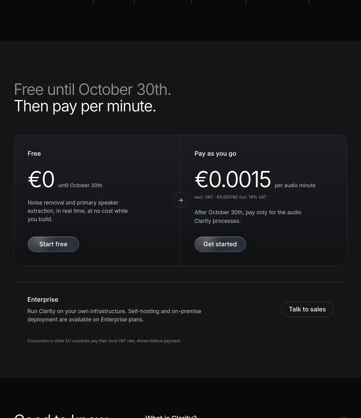
 Usage-based pricing
Clarity · Pricing table
Usage-based pricing
Clarity · Pricing table
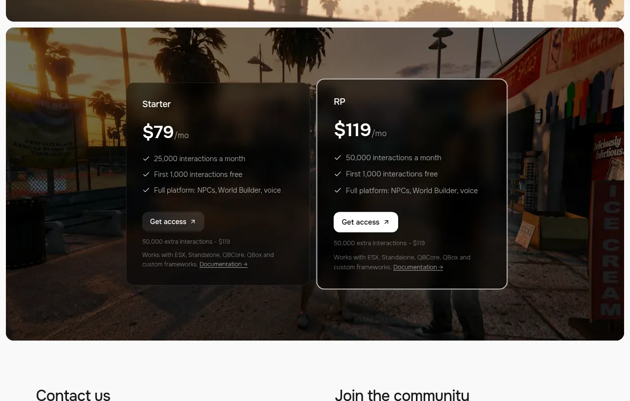
 Two-plan access pricing
Humalike x GTA RP · Pricing table
Two-plan access pricing
Humalike x GTA RP · Pricing table
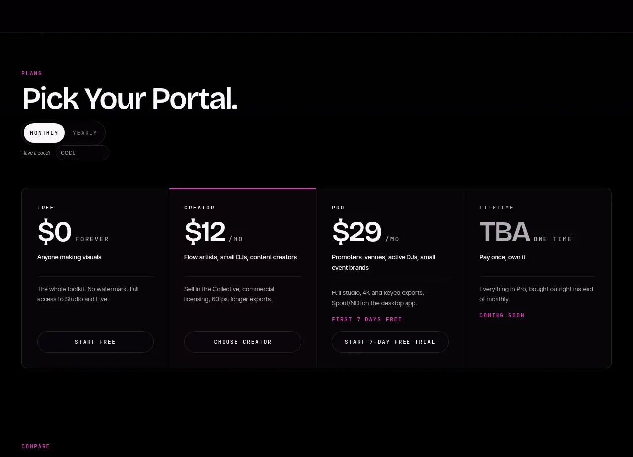
 Four-tier pricing selector
FRCTL · Pricing table
Four-tier pricing selector
FRCTL · Pricing table