 kage
contextengine.com
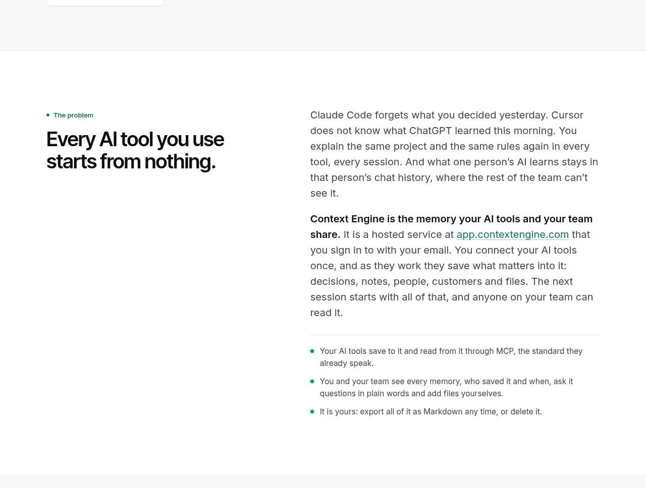
Design analysis
A two-column editorial section contrasts a bold problem statement with explanatory paragraphs, then closes with a short benefit list.
Prompt preview
## Reference images

Study these alongside the description below: hierarchy, rhythm, spacing, colour. Build for the product you are asked about, using this design language.

- Component: https://kage-design-assets.t3.tigrisfiles.io/components/context-engine/37fe6fcb-aa91-474a-8a89-1c1cadc0a655-1792821970-2.webp
- Full page it was cut from: https://kage-design-assets.t3.tigrisfiles.io/screenshots/context-engine/37fe6fcb-aa91-474a-8a89-1c1cadc0a655-1792821825382-full.webp
- Component on Kage: https://kage.design/component/context-engine-feature-grid

## Before you start
Ask what recurring problem the user's product solves and what proof or explanation customers need before trusting it. Adapt this editorial structure to those answers.

Build a spacious two-column explanation band. Keep a small green eyebrow and strong section headline in the left column; use the right column for two or three short paragraphs with one emphasized lead sentence and a compact bullet list underneath. Align both columns to the same top grid and keep the left column narrower so the headline has visual authority. Use a white background, black type, gray body copy, mint bullets, 16–18px body text with 1.5 line height, and a 36–44px section heading. Use generous vertical padding, no heavy cards, and only a subtle divider if needed. On mobile, stack the columns while preserving the heading before the explanation.

Never: use logos, product names, copy, illustrations, or imagery from the reference.
More components

 Data-room education and security overview
Papermark Data Rooms · Feature grid
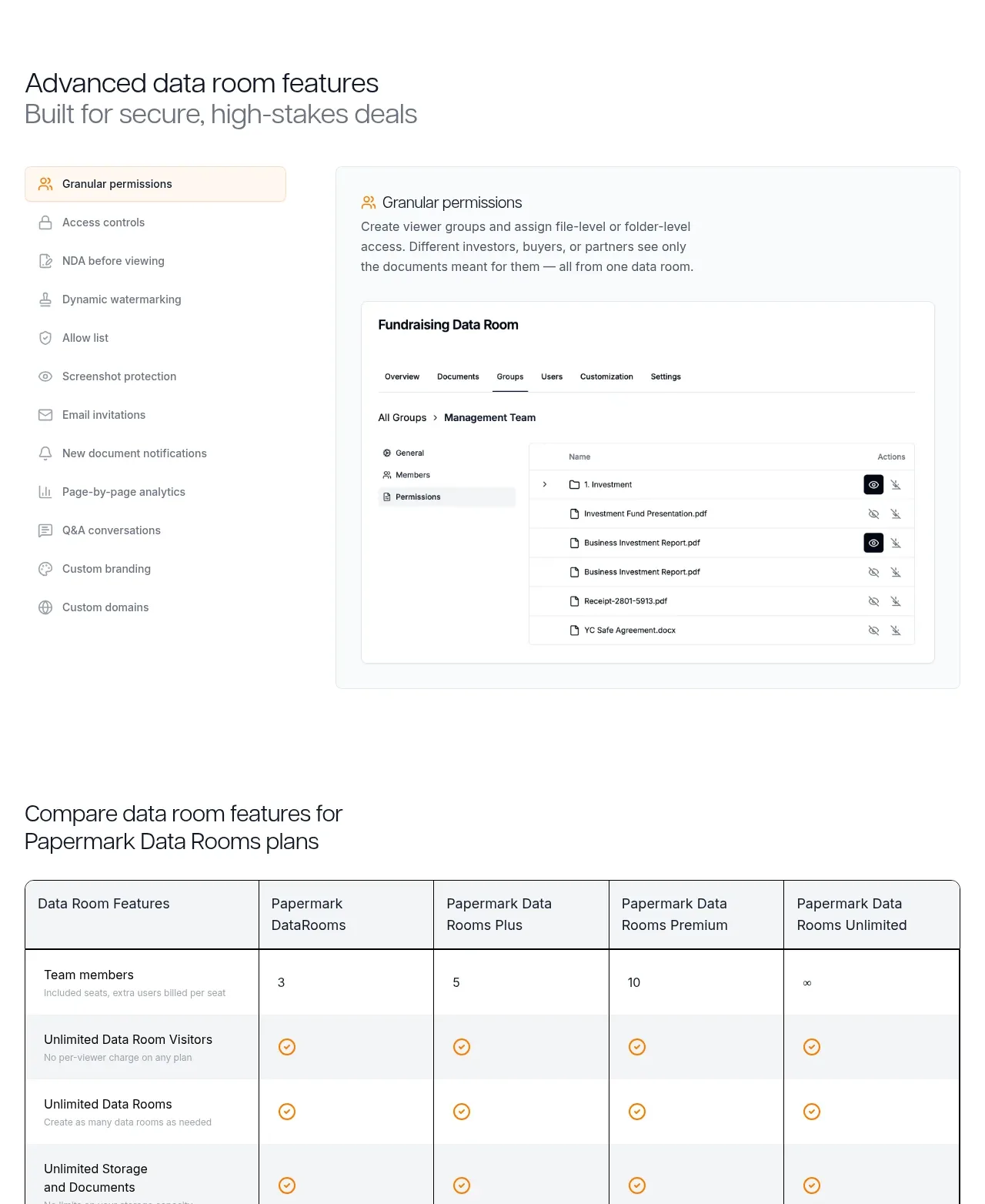 Advanced data-room features
Papermark Data Rooms · Feature grid
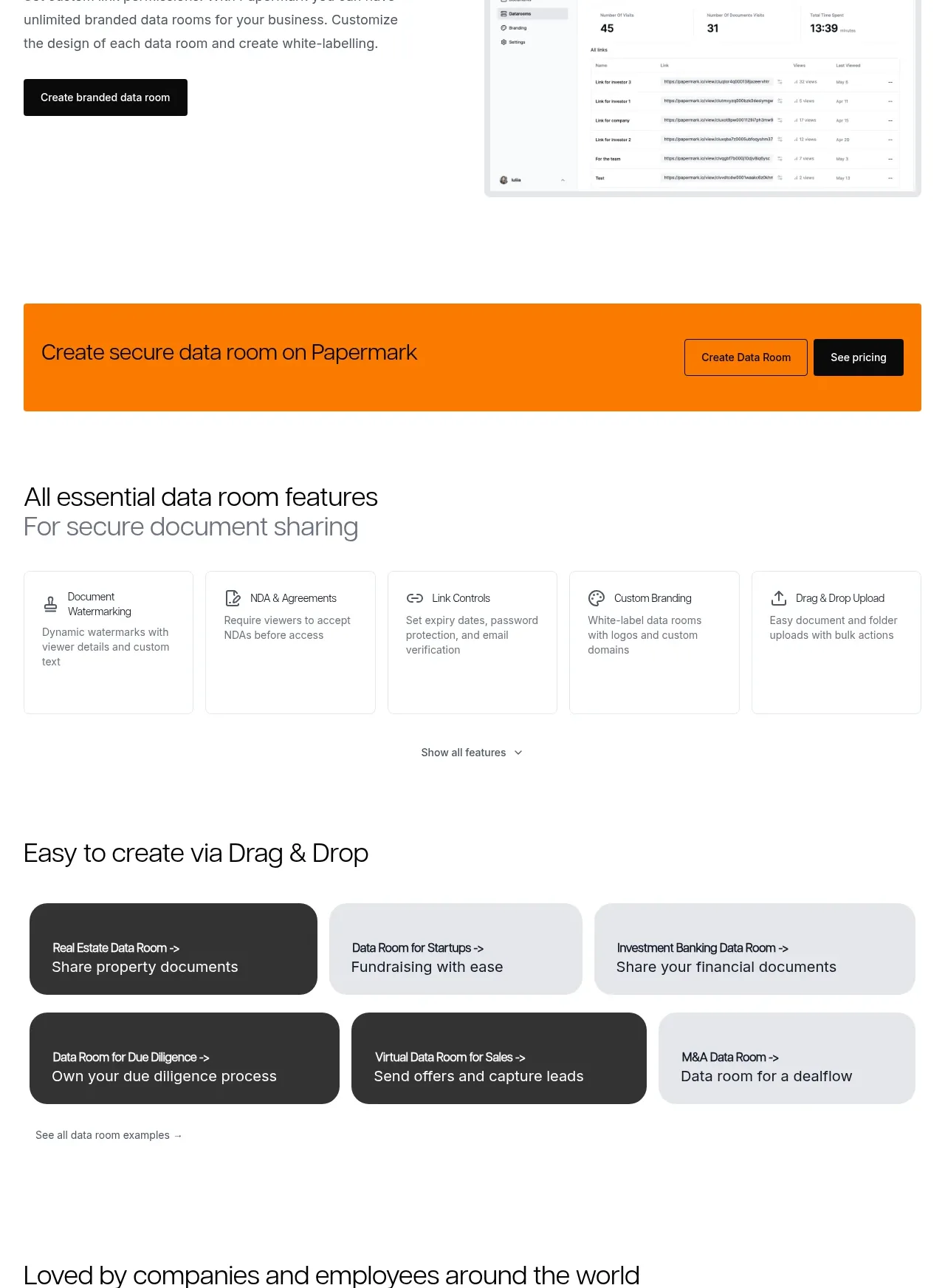 Workflow demonstrations
Papermark Data Rooms · Feature grid
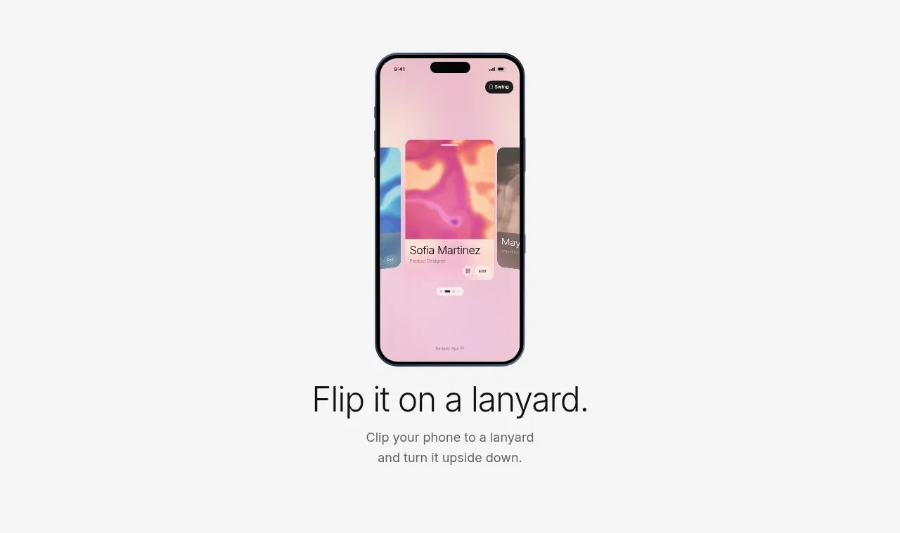
 Lanyard use-case feature
Badgey · Feature grid

 Problem statement
Clips by Plastic · Feature grid
 Effects and customization panel
Clips by Plastic · Feature grid