kage
kage
cortexdocs.dev
Design analysis
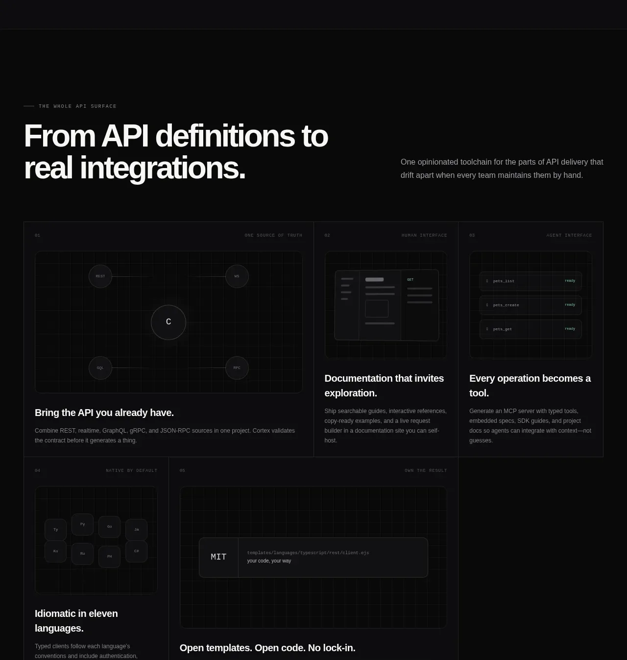
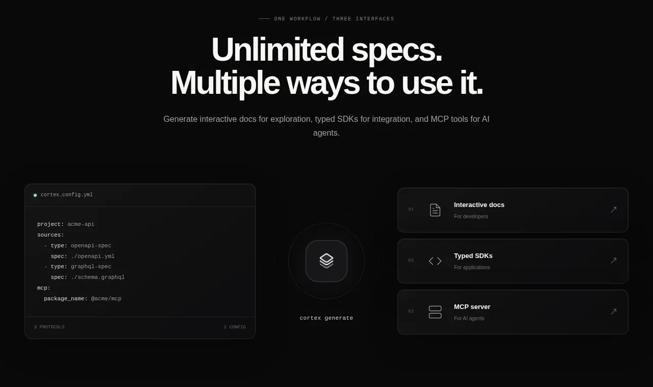
A centered section headline introduces a three-part workflow, illustrated by a configuration panel, a central mark, and stacked interface cards.
Prompt preview
## Reference images

Study these alongside the description below: hierarchy, rhythm, spacing, colour. Build for the product you are asked about, using this design language.

- Component: https://kage-design-assets.t3.tigrisfiles.io/components/cortex/48e48c32-4544-4e71-94d3-849a84be1bb9-1789279409-4.webp
- Full page it was cut from: https://kage-design-assets.t3.tigrisfiles.io/screenshots/cortex/48e48c32-4544-4e71-94d3-849a84be1bb9-1789279340596-full.webp
- Component on Kage: https://kage.design/component/cortex-feature-grid

## Before you start
Ask what core workflows the user's product enables and which three interfaces or outcomes matter most. Build an original section around those answers.

Create a dark feature section with a centered eyebrow, a large two-line headline, and a muted supporting sentence. Beneath it, use a wide visual composition: a code/configuration card on the left, a small central product symbol or transformation node, and three vertically stacked outcome cards on the right. Connect the visual relationships subtly with spacing and faint lines rather than heavy decoration.

Use #090a0a as the background, #171819 cards, #303234 borders, white headings, and gray body copy. Cards should have 10–12px radii, compact monospace metadata, small icons, and clear hover elevation. Keep the section around 440–500px tall, with a responsive stacked layout on mobile.

Never: use the reference's logos, product names, copy, illustrations, imagery, or exact card labels.