 kage
kage
cortexdocs.dev
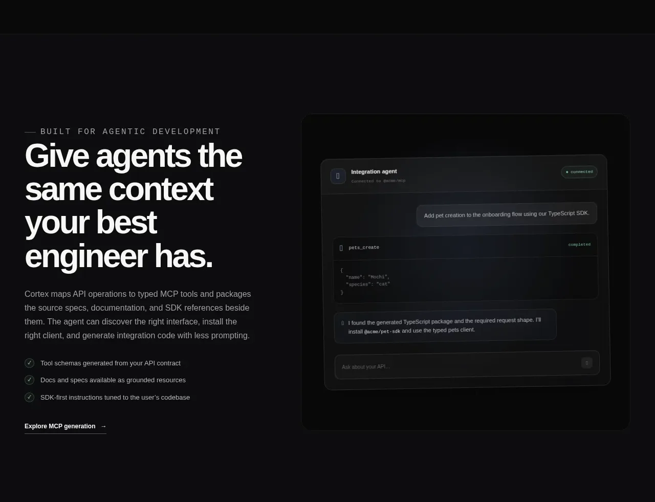
Design analysis
A two-column feature band pairs a large editorial headline and checklist on the left with a dark simulated agent conversation on the right.
Prompt preview
## Reference images

Study these alongside the description below: hierarchy, rhythm, spacing, colour. Build for the product you are asked about, using this design language.

- Component: https://kage-design-assets.t3.tigrisfiles.io/components/cortex/48e48c32-4544-4e71-94d3-849a84be1bb9-1789279410-5.webp
- Full page it was cut from: https://kage-design-assets.t3.tigrisfiles.io/screenshots/cortex/48e48c32-4544-4e71-94d3-849a84be1bb9-1789279340596-full.webp
- Component on Kage: https://kage.design/component/cortex-feature-grid-2

## Before you start
Ask what difficult problem the user's product solves and what proof points build trust. Apply the following pattern to that product.

Build a two-column feature section on a dark charcoal background (#0d0e0f). The left column should contain a small uppercase eyebrow, a very large 3–4 line headline, a concise explanatory paragraph, two or three checkmarked benefits, and a low-key text link. The right column should contain a framed simulated workflow, such as an agent chat, command output, dashboard, or generated result.

Use a 48/52 or 45/55 grid with a generous gap. Give the visual a dark panel (#151617), 1px border, 12px radius, subtle inner gradients, and layered message/code rows to communicate activity. Use 52–64px editorial heading typography, muted 15px body text, and mint or brand-colored status accents. Stack the columns below 760px.

Never: use the reference's logos, product names, copy, illustrations, imagery, or exact checklist/link labels.
More components

 Announcement and what’s-new feature list
DockFix 5.0 · Feature grid
Announcement and what’s-new feature list
DockFix 5.0 · Feature grid
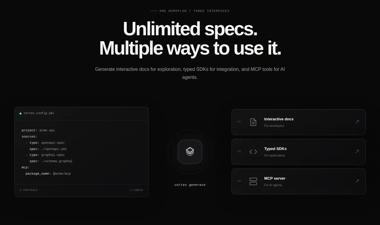
 Three interfaces workflow section
Cortex · Feature grid
Three interfaces workflow section
Cortex · Feature grid
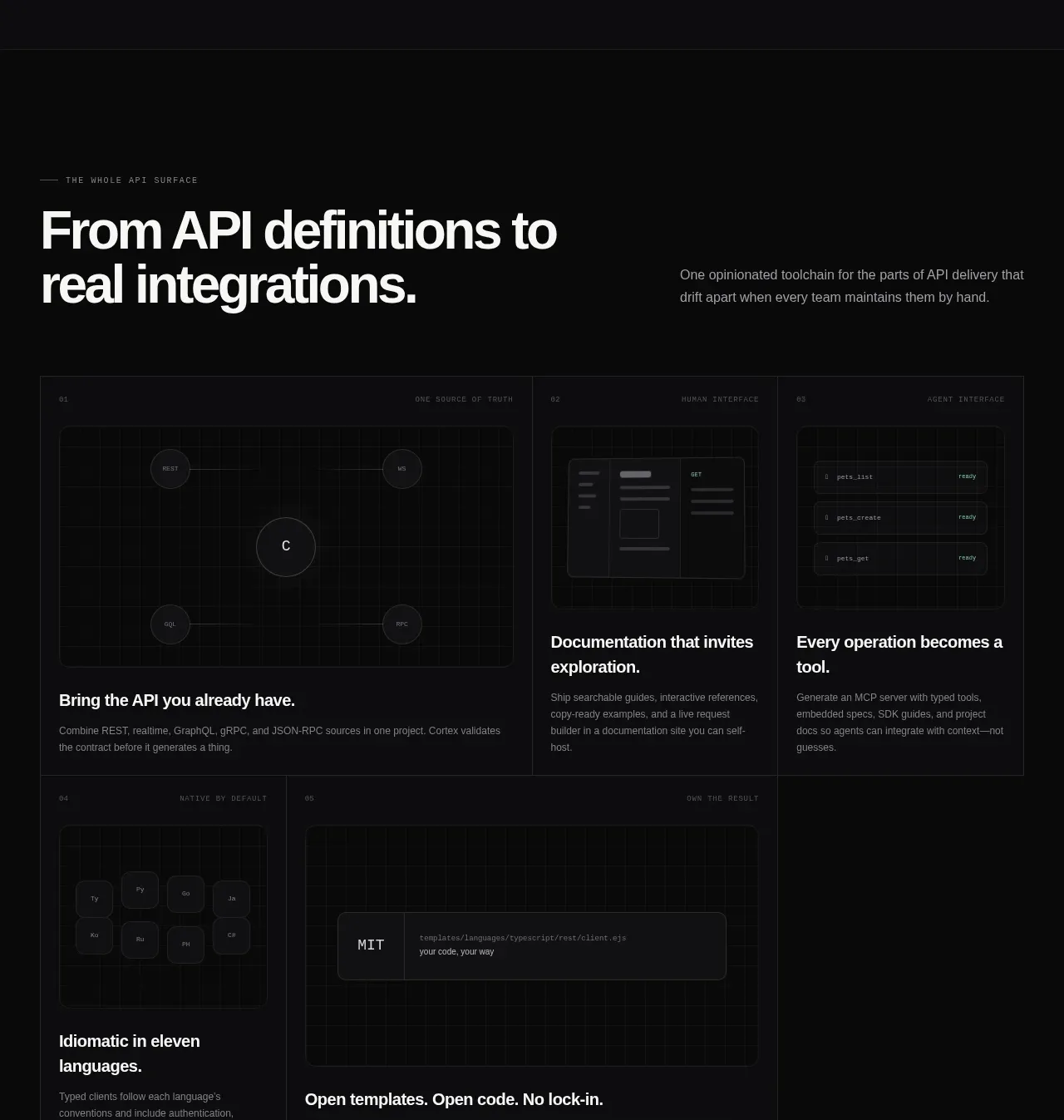 API surface capability cards
Cortex · Feature grid
API surface capability cards
Cortex · Feature grid
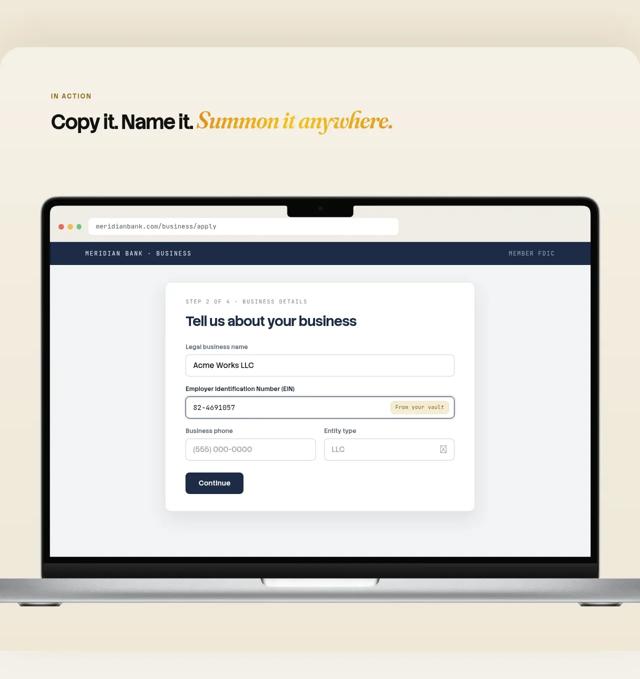
 Automatic capture and search
Relic · Feature grid
Automatic capture and search
Relic · Feature grid
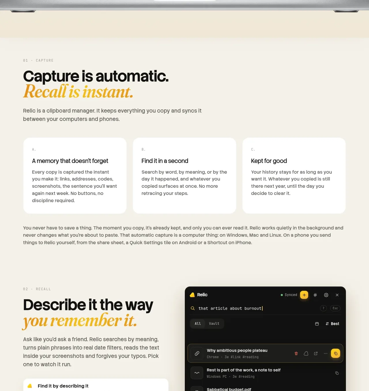 Descriptive memory workflow
Relic · Feature grid
Descriptive memory workflow
Relic · Feature grid
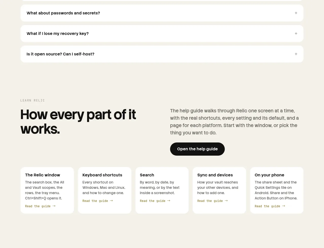 Help guide
Relic · Feature grid
Help guide
Relic · Feature grid