 kage
kage
cortexdocs.dev
Design analysis
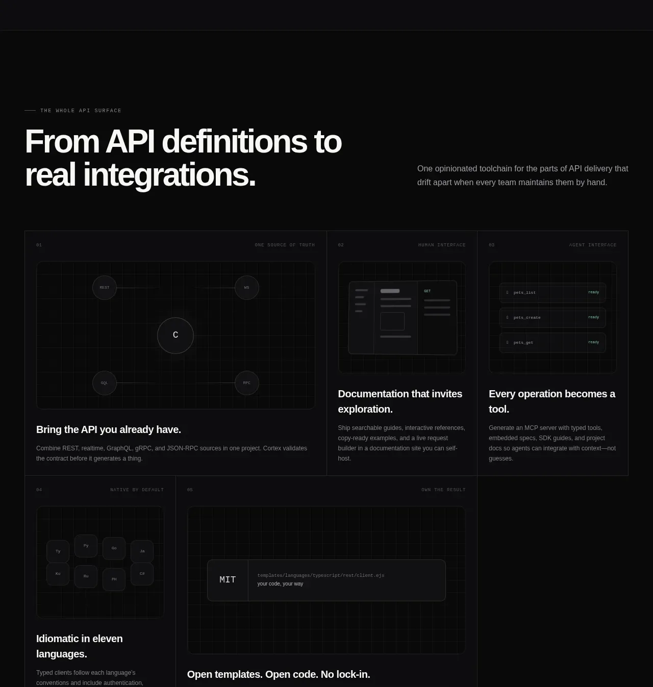
An editorial heading and short explanation lead into a dense asymmetric grid of five capability cards with individual visual treatments.
Prompt preview
## Reference images

Study these alongside the description below: hierarchy, rhythm, spacing, colour. Build for the product you are asked about, using this design language.

- Component: https://kage-design-assets.t3.tigrisfiles.io/components/cortex/48e48c32-4544-4e71-94d3-849a84be1bb9-1789279410-6.webp
- Full page it was cut from: https://kage-design-assets.t3.tigrisfiles.io/screenshots/cortex/48e48c32-4544-4e71-94d3-849a84be1bb9-1789279340596-full.webp
- Component on Kage: https://kage.design/component/cortex-feature-grid-3

## Before you start
Ask which capabilities distinguish the user's product and what visual metaphors fit its brand. Create original cards using this system.

Build an asymmetric feature-card grid after a large left-aligned section heading. Put a small uppercase eyebrow above a bold two-line headline, with a short explanatory paragraph aligned to the right. Below, create a bordered grid of five cards: one large spanning card, two compact cards on the top row, and two cards on the lower row with one wider card. Each card should include a tiny index/category label, a restrained visual demonstration, a bold benefit heading, and muted supporting copy.

Use near-black surfaces (#0b0c0d), borders #252729, 8–10px radii, and 24–32px internal padding. Maintain consistent card heights and align headings along a grid. Visuals may be abstract UI blocks, nodes, code fields, or language tiles, but they should be simple and product-relevant. Add subtle hover border brightening and mobile stacking.

Never: use the reference's logos, product names, copy, illustrations, imagery, or exact card content.
More components

 Announcement and what’s-new feature list
DockFix 5.0 · Feature grid
Announcement and what’s-new feature list
DockFix 5.0 · Feature grid

 Three interfaces workflow section
Cortex · Feature grid
Three interfaces workflow section
Cortex · Feature grid
 Agent context split feature
Cortex · Feature grid
Agent context split feature
Cortex · Feature grid

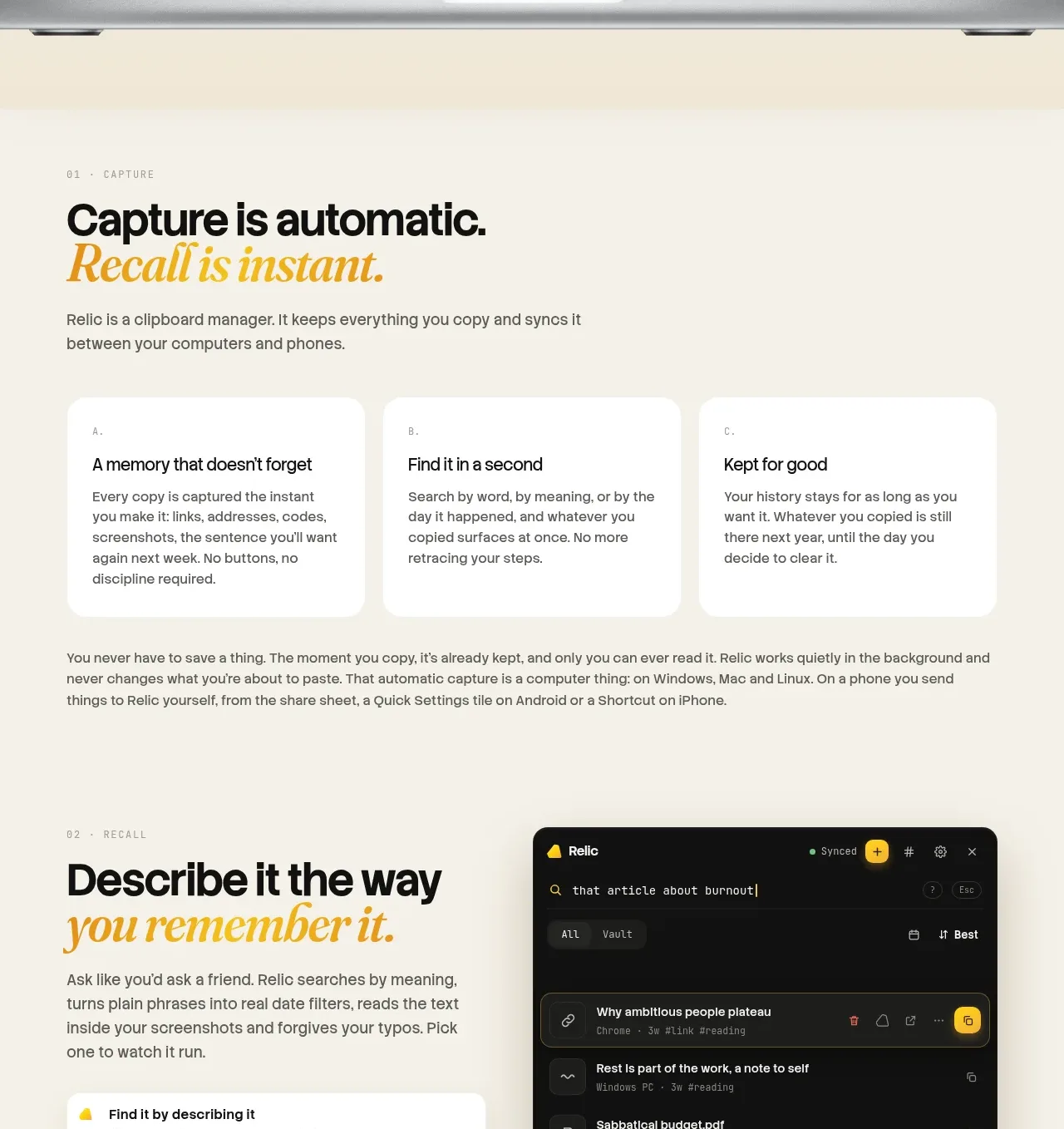
 Automatic capture and search
Relic · Feature grid
Automatic capture and search
Relic · Feature grid
 Descriptive memory workflow
Relic · Feature grid
Descriptive memory workflow
Relic · Feature grid
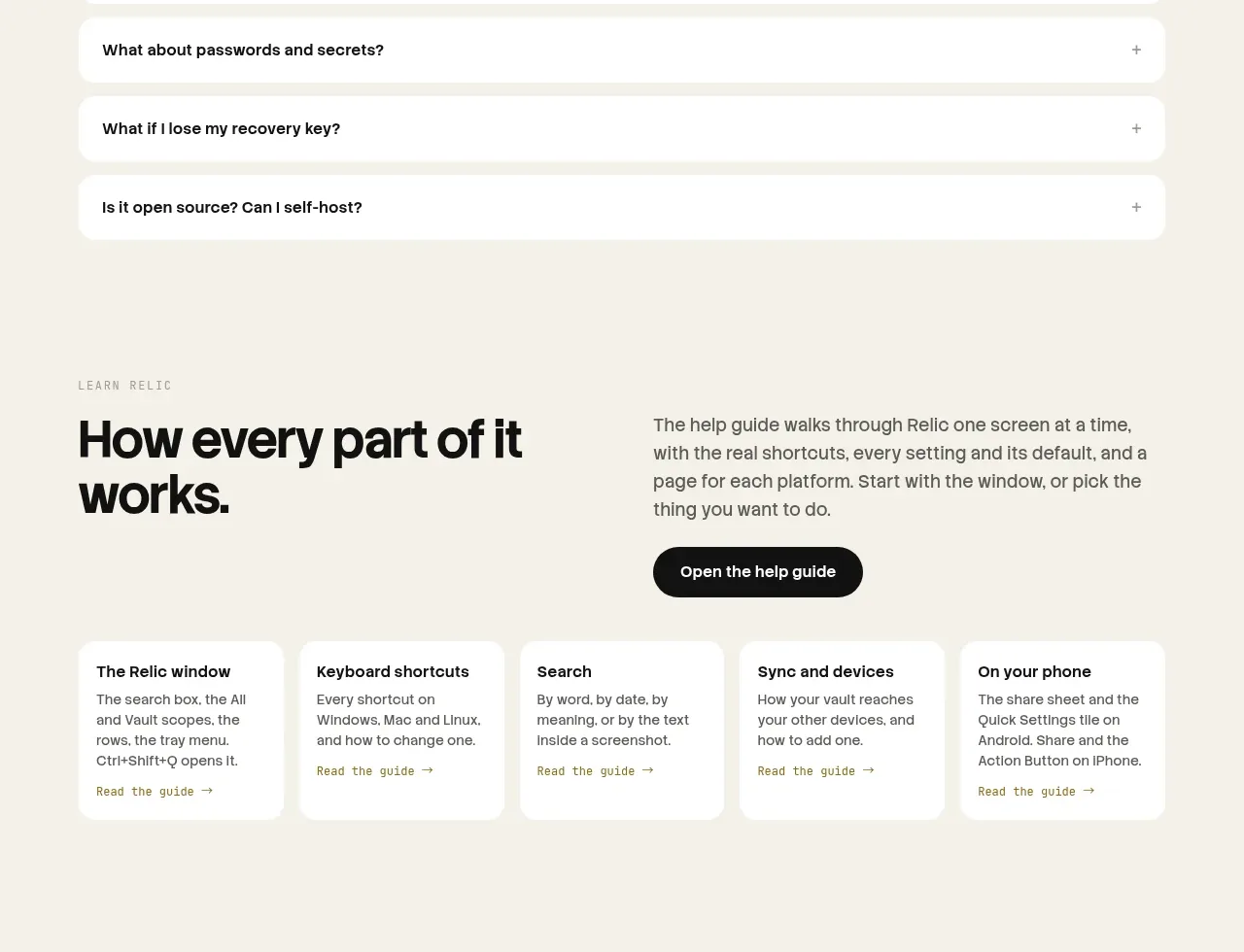 Help guide
Relic · Feature grid
Help guide
Relic · Feature grid