 kage
kage
creem.io
Design analysis
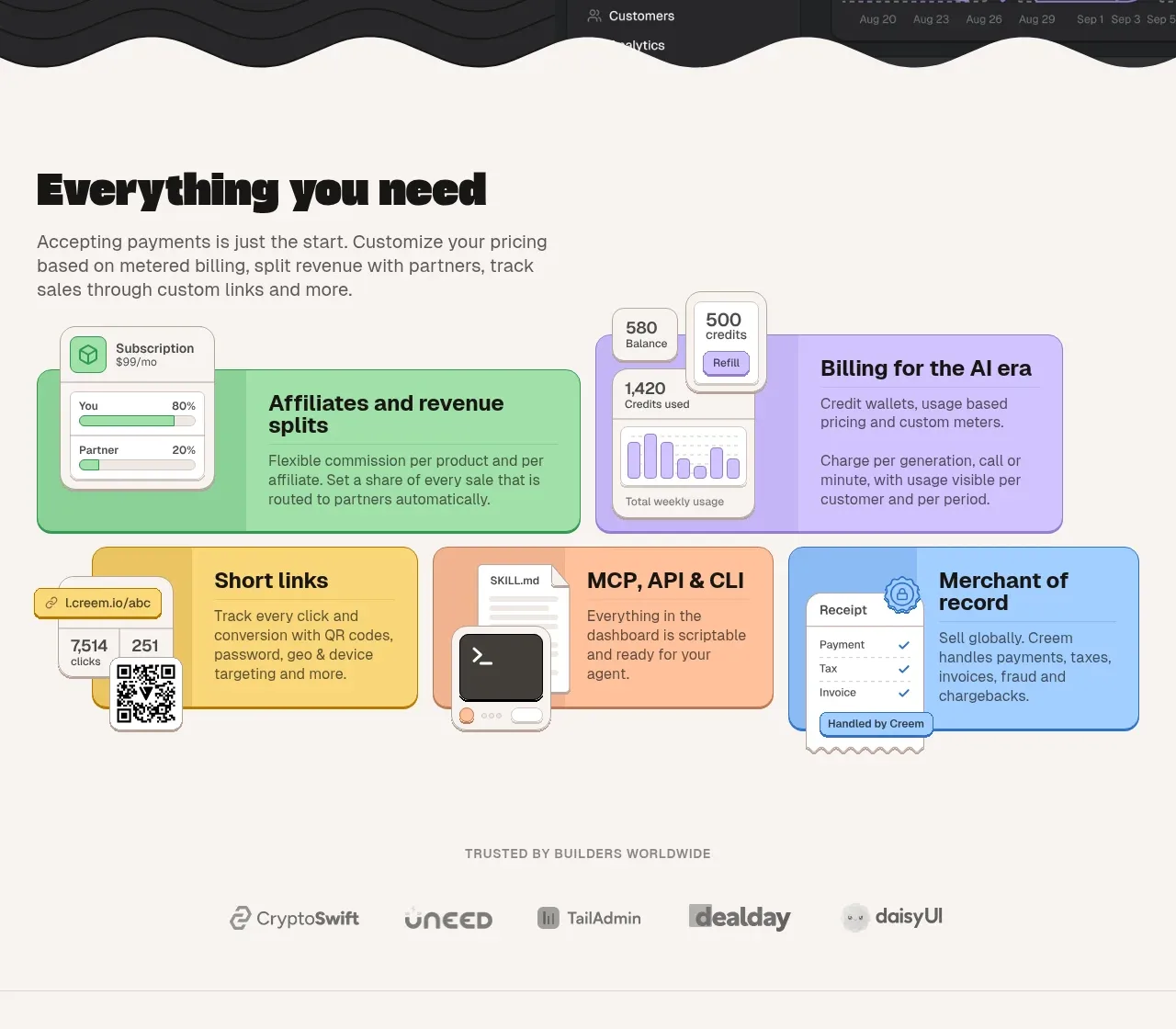
A warm off-white section introduces a broad capability set through a colorful mosaic of tactile cards, followed by a trust-oriented logo row.
Prompt preview
## Reference images

Study these alongside the description below: hierarchy, rhythm, spacing, colour. Build for the product you are asked about, using this design language.

- Component: https://kage-design-assets.t3.tigrisfiles.io/components/creem-2-0/d32a2098-e6df-45cb-a937-19c647abd2d5-1789711290-4.webp
- Full page it was cut from: https://kage-design-assets.t3.tigrisfiles.io/screenshots/creem-2-0/d32a2098-e6df-45cb-a937-19c647abd2d5-1789711237993-full.webp
- Component on Kage: https://kage.design/component/creem-2-0-feature-grid-2

## Before you start
Ask what the user's product offers and which capabilities deserve emphasis. Ask for the brand palette, then adapt this visual system to it.

Create an off-white capabilities section with a left-aligned heading and explanatory paragraph, followed by a responsive mosaic of six feature cards. Use varied but coordinated pastel fills—mint, lavender, butter yellow, peach, and sky blue—with dark text, thin charcoal borders, and 12–16px corner radii. Cards should have clear short headings, one-sentence descriptions, and small original UI fragments or abstract interface details that explain the function. Vary card widths in a deliberate grid while preserving alignment. Add a small centered trust label and a restrained monochrome customer-logo row beneath the mosaic, separated by generous whitespace. Use a 12-column desktop grid and stack cards on mobile.

Never use the reference logo, product name, copy, illustrations, imagery, or exact customer logos.
More components

 AI-powered helpdesk feature section
intercom.com · Feature grid
AI-powered helpdesk feature section
intercom.com · Feature grid
 Integrations and ecosystem section
intercom.com · Feature grid
Integrations and ecosystem section
intercom.com · Feature grid
 AI agent capabilities section
intercom.com · Feature grid
AI agent capabilities section
intercom.com · Feature grid
 Unified support experience overview
intercom.com · Feature grid
Unified support experience overview
intercom.com · Feature grid

 Core invoicing capabilities
sendinvo.com · Feature grid
Core invoicing capabilities
sendinvo.com · Feature grid
 Audience and trade types
sendinvo.com · Feature grid
Audience and trade types
sendinvo.com · Feature grid