kage
kage
creem.io

Design analysis
A long-form fintech landing page that alternates warm off-white content sections with lavender, mint, peach, yellow, and near-black bands. Oversized condensed display headlines create a strong editorial hierarchy, while rounded product UI mockups, hand-drawn wave separators, thin borders, and small utility labels make the page feel tactile and builder-oriented. The rhythm moves from a dense hero and proof strip into modular feature cards, then into dark agent-focused sections, pricing and partner panels, testimonials, FAQ, and a compact conversion footer.
Prompt preview
## Reference images

Study these alongside the description below: hierarchy, rhythm, spacing, colour. Build for the product you are asked about, using this design language.

- Full page: https://kage-design-assets.t3.tigrisfiles.io/screenshots/creem-2-0/d32a2098-e6df-45cb-a937-19c647abd2d5-1789711237993-full.webp
- Above the fold: https://kage-design-assets.t3.tigrisfiles.io/screenshots/creem-2-0/d32a2098-e6df-45cb-a937-19c647abd2d5-1789711233548.webp
- Design on Kage: https://kage.design/designs/creem-2-0-landing-page

## Before you start
Ask the user what they are building, who it is for, and which brand assets they already have (name, colours, typography, logo, illustrations, and product screenshots). Wait for their answers before designing. Apply the reference's structure and visual principles to their product, not to Creem, and use their own content and assets.

## Page structure
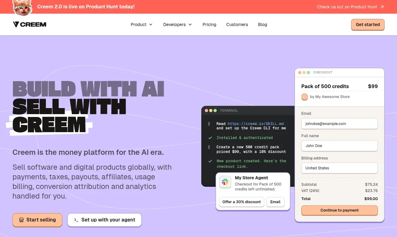
1. **Announcement bar** — Add a thin coral/red strip above the navigation with a small celebratory visual on the left, concise announcement copy, and a right-aligned outbound link.
2. **Navigation** — Use a white, compact header with the product mark at left, a centered row of a few dropdown and plain links, and a rounded peach primary CTA at right.
3. **Hero** — Build a large lavender hero with subtle hand-drawn contour lines. Place a very large stacked display headline and short explanatory paragraph on the left, two pill-shaped CTAs below, and layered checkout, terminal, and assistant product mockups on the right.
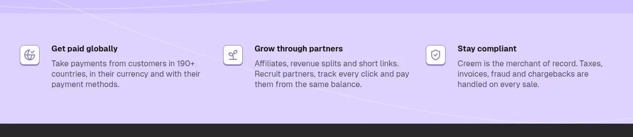
4. **Three-value proof strip** — Follow with a lighter lavender band containing three evenly spaced value propositions, each with a small outlined icon tile, bold label, and short supporting text.
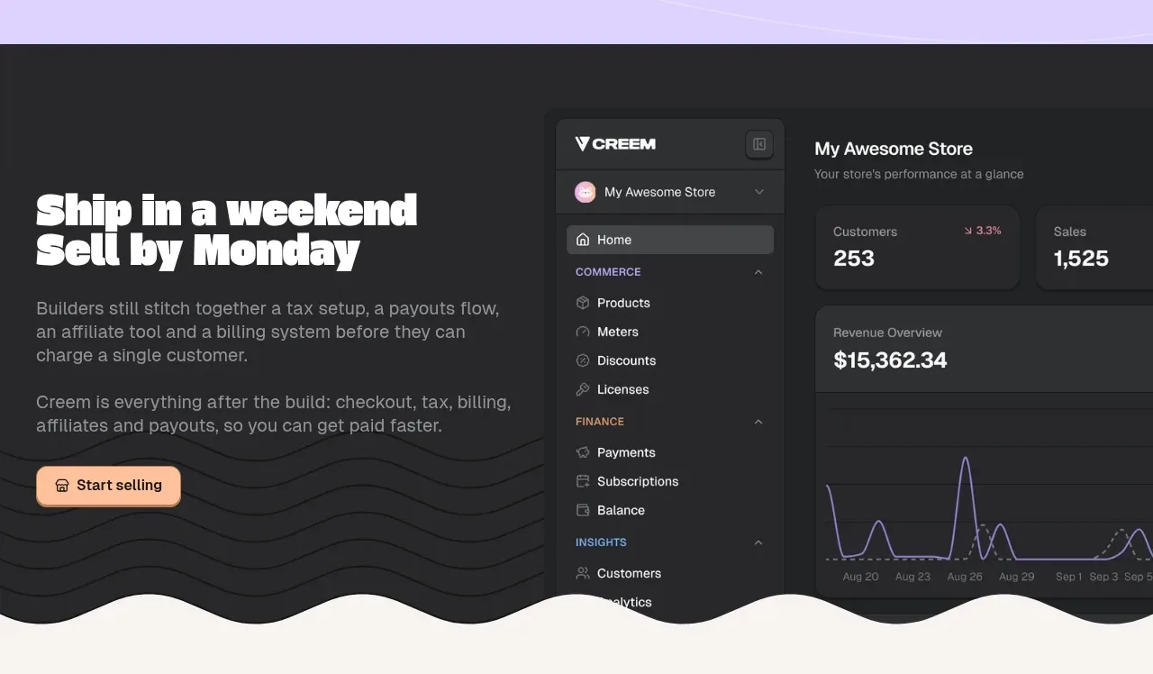
5. **Dark “ship quickly” feature** — Switch to a near-black section with a wavy lower edge. Use a two-column layout: oversized white headline, paragraphs, and CTA on the left; a large dark dashboard mockup on the right. Add subtle horizontal wave lines as background texture.
6. **Core feature overview** — Return to warm off-white. Introduce an oversized headline and short intro, then arrange colourful overlapping feature cards in a loose two-row collage: green, purple, yellow, peach, and blue panels with small UI illustrations and concise descriptions.
7. **Trust logo row** — Center a small uppercase eyebrow above a quiet row of muted customer logos, separated from the next section by a fine horizontal rule.
8. **Usage-based billing section** — Use a spacious off-white section with headline and intro at top, followed by three equal columns. Each column has a bordered mini-interface mockup, a bold title, and explanatory text.
9. **Global selling section** — Divide the page into two columns with a vertical rule: copy-heavy left side with a large stacked headline; right side with four vertically stacked benefits, each using a lavender icon tile, bold heading, and short description.
10. **Partner growth section** — Keep the warm background and introduce another three-column feature grid with affiliate, revenue split, and short-link mockups above their descriptions. Transition into a dark wavy band at the bottom.
11. **AI agent setup section** — In the dark band, pair a large white headline and explanatory copy on the left with a terminal mockup on the right. Below, add three horizontally arranged implementation benefits with icon tiles and compact text.
12. **Post-launch agent section** — Continue the dark treatment with a second two-column block about ongoing agent activity. Show a dark activity dashboard with floating notification cards, then add another three-item benefit row beneath it.
13. **Mobile selling section** — Change back to warm off-white. Place copy and two outlined app buttons on the left, with overlapping phone/device mockups cropped into the right side.
14. **Performance-based pricing panel** — Use a bright mint/green band. Put a large headline, explanatory copy, and pricing CTA on the left; place a bordered “pay as you earn” pricing card on the right. Add a lower three-column checklist row separated by a rule.
15. **Partner plan section** — Use a lavender panel with a wavy lower edge. Put headline, intro, and three service bullets on the left with a CTA; place an angled dark payment-card illustration and support notification on the right.
16. **Testimonials** — Return to off-white with a headline, short intro, and a three-column by two-row grid of bordered testimonial cards. Keep cards white, softly rounded, lightly shadowed, and include small avatars and metadata.
17. **FAQ** — Add a headline and intro followed by a two-column grid of wide accordion rows. Each row is white with a fine border, modest radius, bold question text, and a small chevron aligned right.
18. **Final CTA** — Use a lavender closing panel with a wavy top edge. Place a very large two-line headline, short supporting copy, and the same paired primary/secondary CTAs as the hero.
19. **Footer** — Finish with a near-black footer. Put the product mark and short description on the left, then several compact link columns for product, developers, comparison, company, and legal. Include social icons and a small copyright line.

## Design language
- Build hierarchy through a heavy, condensed, slightly playful display face for major headlines and a neutral sans-serif for body copy, navigation, labels, and UI. Use very large two- or three-line headlines, generally around 56–76px desktop, with tight line height; keep body copy around 15–18px with relaxed line height.
- Make the page feel editorial but tactile: generous section padding, strong left alignment, and frequent shifts between dense UI compositions and open text-led areas. Let feature sections become more modular and card-based as the page progresses, then use dark bands to reset the rhythm before returning to pale conversion sections.
- Use a restrained palette with warm off-white around #F7F4EE, near-black around #202123, lavender around #C7B8FF, mint around #9BE0A7, peach around #F8B38B, yellow around #F5D477, blue around #8EC6F2, and coral around #FF665C. Use colour in broad section backgrounds and feature cards, while keeping text mostly black or white.
- Treat product screenshots as designed editorial objects: use layered windows, small browser/terminal chrome, floating notifications, charts, forms, QR blocks, and dashboard fragments. Overlap them slightly and crop them at section edges rather than placing every mockup in a rigid frame.
- Use thin gray borders, low-contrast inset rules, and small soft shadows. Cards should have roughly 10–16px radii; buttons should be compact pills or rounded rectangles with dark text, pale fills, and clear borders. Avoid glassmorphism and heavy gradients.
- Use hand-drawn wave separators between major colour changes. Add subtle contour or horizontal wave lines to selected lavender and dark sections so the background has texture without competing with content.
- Keep icons simple, small, and mostly monochrome inside rounded square tiles. Use checkmarks and short utility labels to make dense benefit rows scannable.
- Keep primary CTAs consistent throughout, usually warm peach with a dark border, paired with a white or transparent secondary CTA. Repeat the CTA pair in the hero and final conversion section.
- Where interactions are visible, use compact dropdown navigation, accordion FAQ rows, and buttons with small arrow or terminal cues. Motion should be restrained: gentle card float/slide on scroll, subtle hover lift, and smooth accordion expansion rather than flashy effects.
- On responsive layouts, collapse two-column compositions into readable stacks, preserve the oversized headline scale with a smaller mobile step, and turn three-column feature grids into horizontally scrollable or stacked cards without losing the coloured section rhythm.

## Never
- Do not copy Creem's logos, wordmarks, product name, tagline, exact copy, customer names, testimonials, UI text, payment-card artwork, or screenshots.
- Do not reuse the reference's illustrations, icon set, dashboard composition, terminal content, QR codes, avatars, or brand-specific assets.
- Do not present the result as Creem or imply an affiliation. Replace every reference-specific visual and text asset with original material for the user's product.
Components from this page
All components
 Announcement bar and primary navigation
CREEM 2.0 · Navigation
Announcement bar and primary navigation
CREEM 2.0 · Navigation
 AI commerce platform hero
CREEM 2.0 · Hero
AI commerce platform hero
CREEM 2.0 · Hero
 Three platform benefits
CREEM 2.0 · Feature grid
Three platform benefits
CREEM 2.0 · Feature grid
 Ship quickly product dashboard section
CREEM 2.0 · Hero
Ship quickly product dashboard section
CREEM 2.0 · Hero
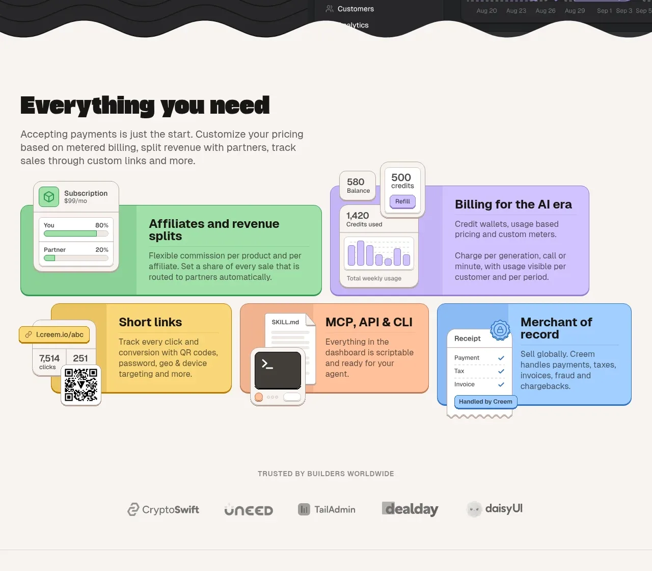 Product capabilities mosaic
CREEM 2.0 · Feature grid
Product capabilities mosaic
CREEM 2.0 · Feature grid
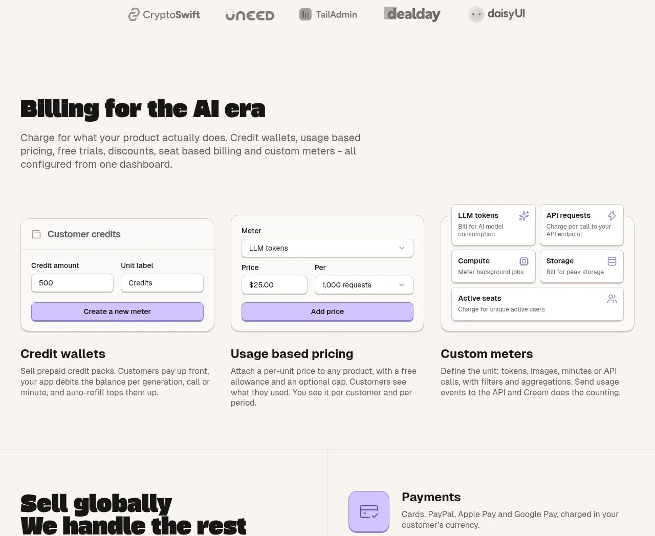 Billing and usage-based pricing
CREEM 2.0 · Feature grid
Billing and usage-based pricing
CREEM 2.0 · Feature grid
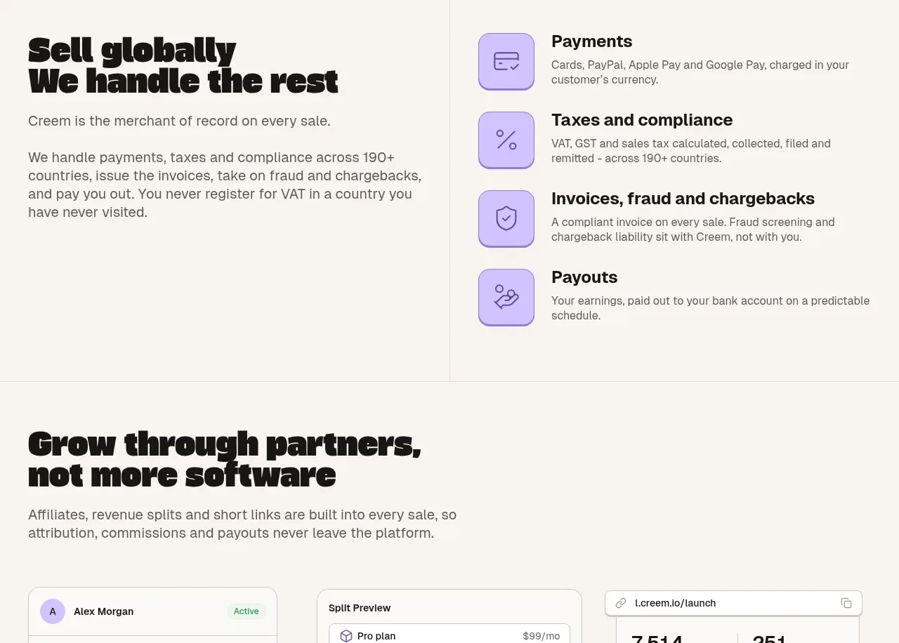 Global merchant operations
CREEM 2.0 · Feature grid
Global merchant operations
CREEM 2.0 · Feature grid
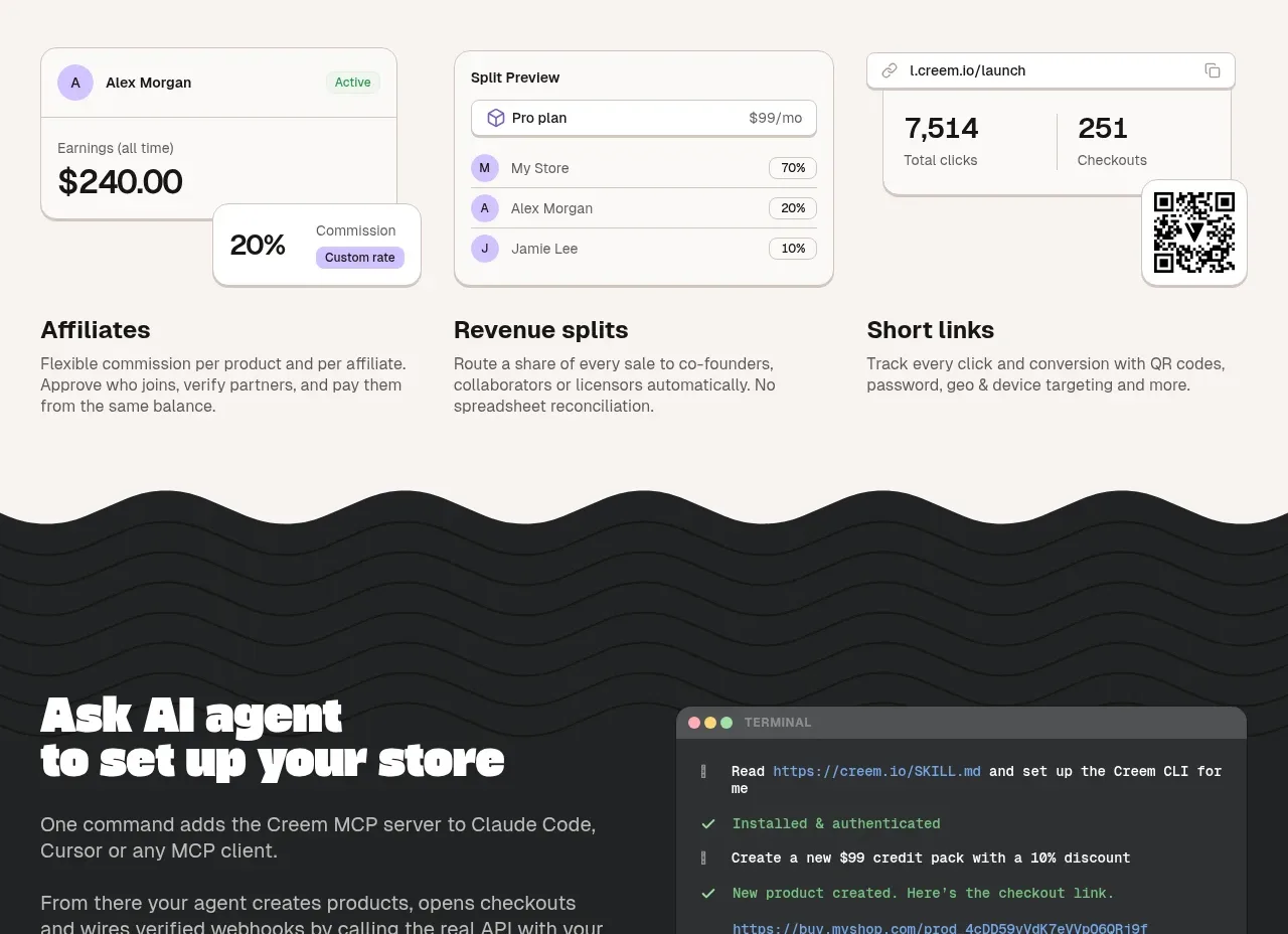 Partner growth tools
CREEM 2.0 · Feature grid
Partner growth tools
CREEM 2.0 · Feature grid
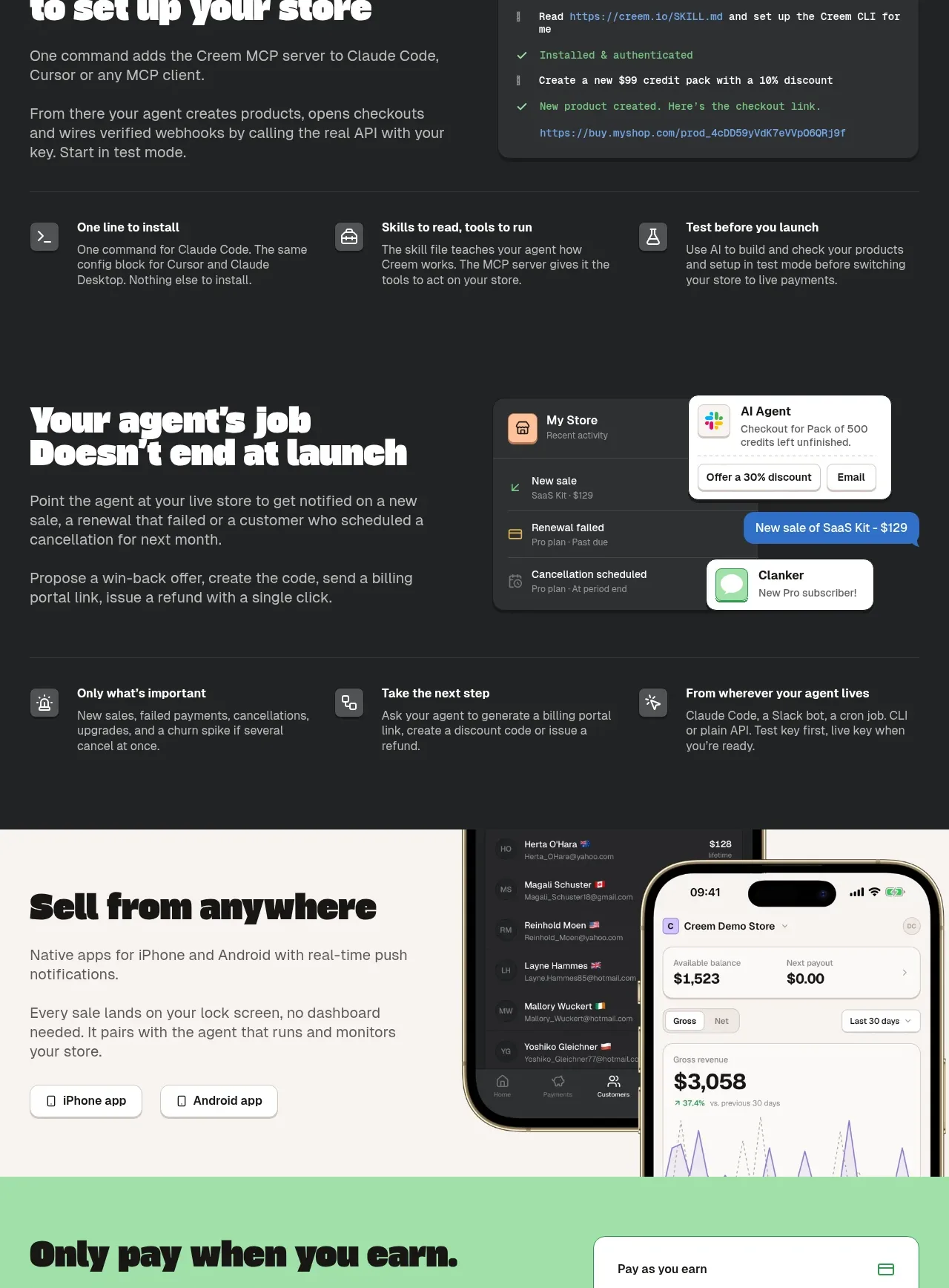 AI agent workflow showcase
CREEM 2.0 · Feature grid
AI agent workflow showcase
CREEM 2.0 · Feature grid
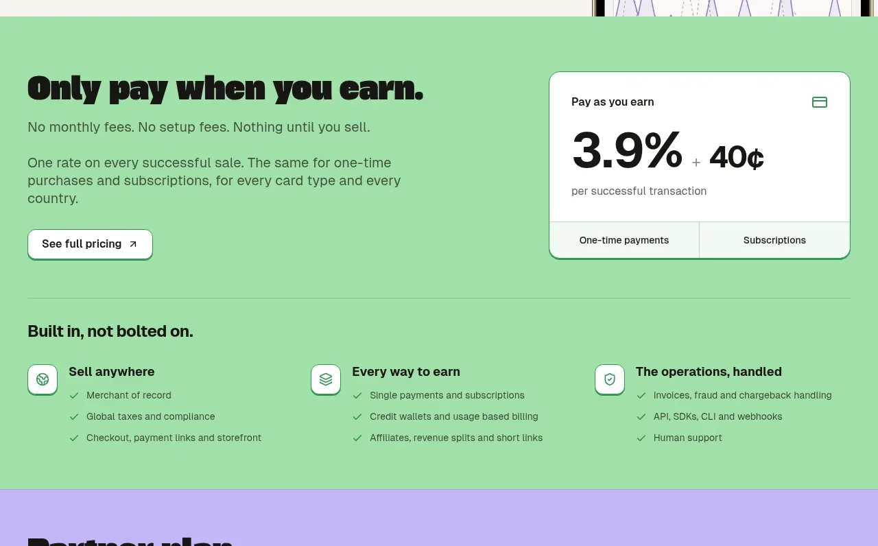 Mobile selling experience
CREEM 2.0 · Hero
Mobile selling experience
CREEM 2.0 · Hero
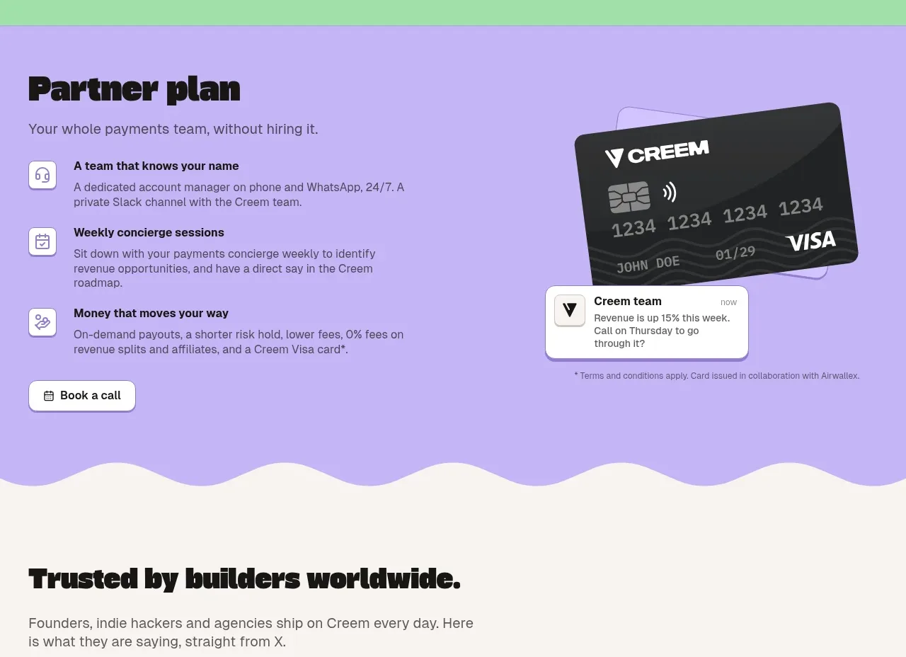 Performance-based pricing
CREEM 2.0 · Call to action
Performance-based pricing
CREEM 2.0 · Call to action
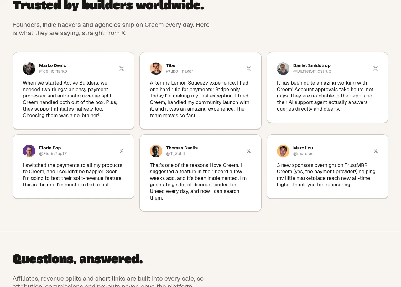 Partner plan concierge
CREEM 2.0 · Feature grid
Partner plan concierge
CREEM 2.0 · Feature grid