 kage
kage
creem.io
Design analysis
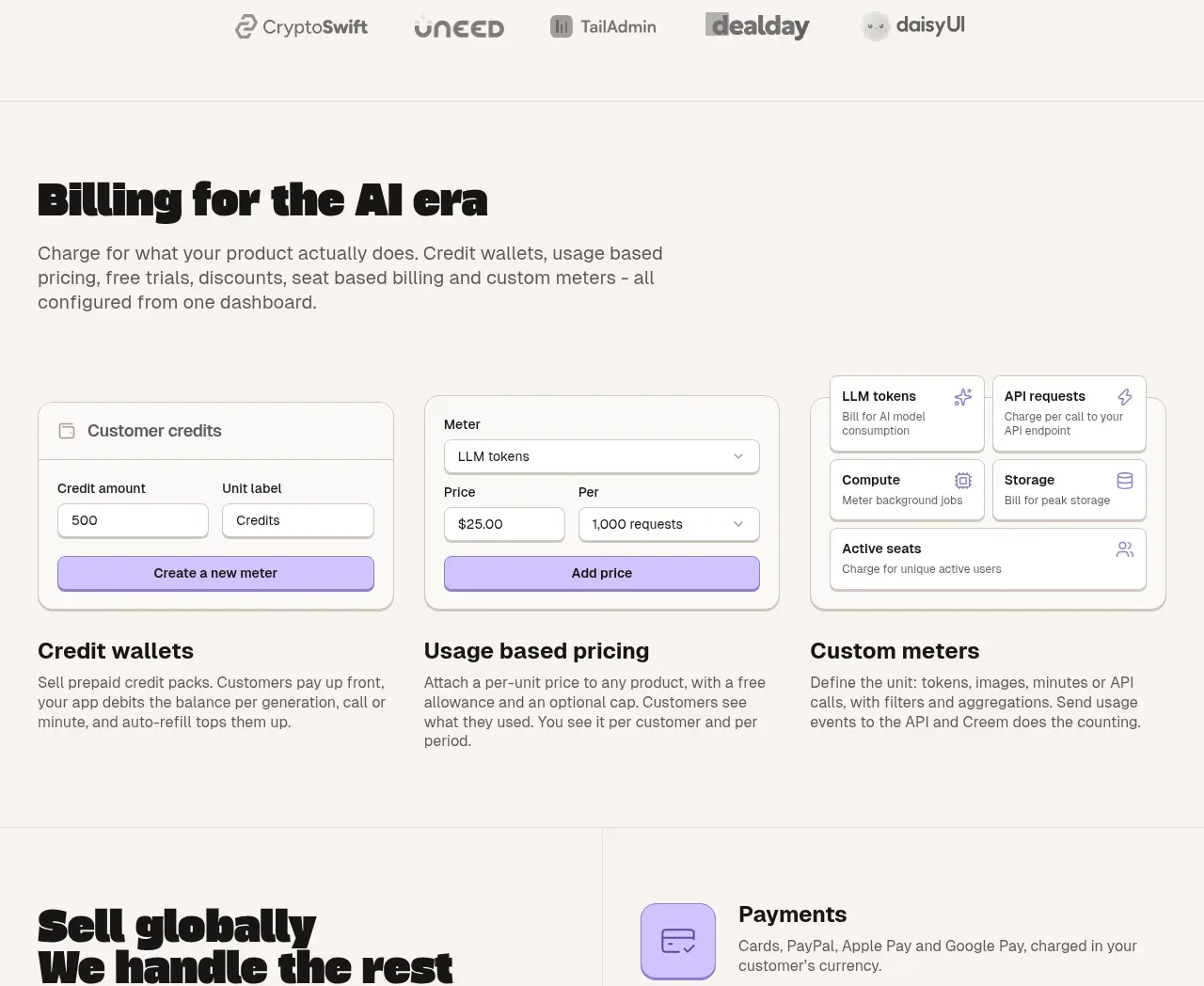
This section explains flexible billing through a heading, a row of configuration cards, and three concise explanatory columns for credits, usage pricing, and custom meters.
Prompt preview
## Reference images

Study these alongside the description below: hierarchy, rhythm, spacing, colour. Build for the product you are asked about, using this design language.

- Component: https://kage-design-assets.t3.tigrisfiles.io/components/creem-2-0/d32a2098-e6df-45cb-a937-19c647abd2d5-1789711290-5.webp
- Full page it was cut from: https://kage-design-assets.t3.tigrisfiles.io/screenshots/creem-2-0/d32a2098-e6df-45cb-a937-19c647abd2d5-1789711237993-full.webp
- Component on Kage: https://kage.design/component/creem-2-0-feature-grid-3

## Before you start
Ask what the user's product sells, how it charges customers, and which pricing model should be easiest to understand. Apply that information to an original billing explainer.

Use an off-white background and a strong left-aligned heading with a short paragraph constrained to about 520px. Below it, show three compact white configuration cards with subtle gray borders, 10px radius, form-like labels, inputs, dropdowns, and a colored action bar or button. Follow with three equal text columns explaining the major pricing concepts. Use near-black headings, gray body copy, lavender as the main interactive accent (#bca8ff), and very light gray divider lines. Keep vertical rhythm spacious and make all mock controls visibly nonfunctional but believable. On mobile, stack the cards and explanatory columns.

Never use the reference logo, product name, copy, illustrations, imagery, or exact form content.
More components

 AI-powered helpdesk feature section
intercom.com · Feature grid
AI-powered helpdesk feature section
intercom.com · Feature grid
 Integrations and ecosystem section
intercom.com · Feature grid
Integrations and ecosystem section
intercom.com · Feature grid
 AI agent capabilities section
intercom.com · Feature grid
AI agent capabilities section
intercom.com · Feature grid
 Unified support experience overview
intercom.com · Feature grid
Unified support experience overview
intercom.com · Feature grid

 Core invoicing capabilities
sendinvo.com · Feature grid
Core invoicing capabilities
sendinvo.com · Feature grid
 Audience and trade types
sendinvo.com · Feature grid
Audience and trade types
sendinvo.com · Feature grid