 kage
kage
creem.io
Design analysis
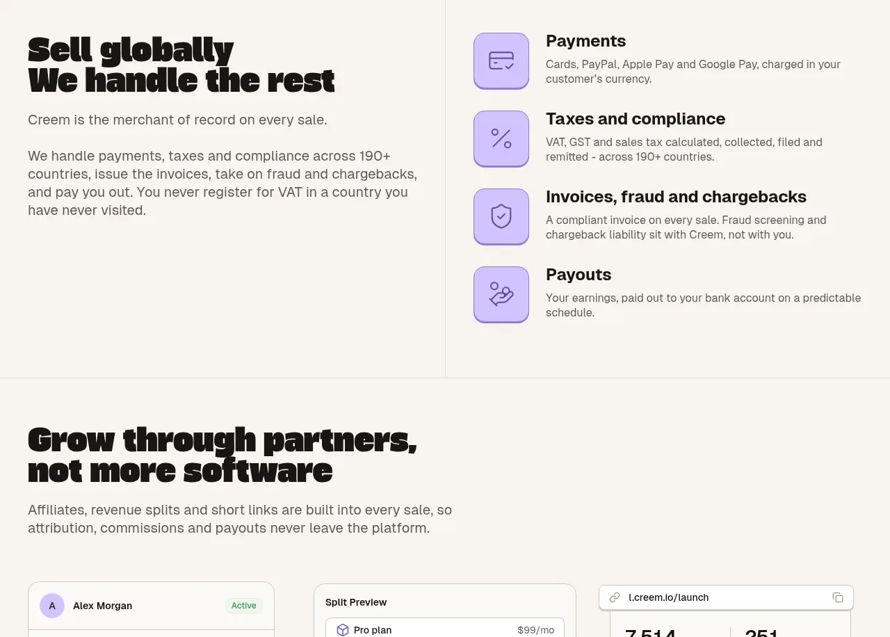
A split layout explains global selling on the left and lists four operational capabilities on the right, using lavender icon tiles and a strong vertical divider.
Prompt preview
## Reference images

Study these alongside the description below: hierarchy, rhythm, spacing, colour. Build for the product you are asked about, using this design language.

- Component: https://kage-design-assets.t3.tigrisfiles.io/components/creem-2-0/d32a2098-e6df-45cb-a937-19c647abd2d5-1789711291-6.webp
- Full page it was cut from: https://kage-design-assets.t3.tigrisfiles.io/screenshots/creem-2-0/d32a2098-e6df-45cb-a937-19c647abd2d5-1789711237993-full.webp
- Component on Kage: https://kage.design/component/creem-2-0-feature-grid-4

## Before you start
Ask what markets the user's product serves and which operational risks it removes. Use those answers to write original content within this structure.

Build a two-column section on a warm off-white surface. The left column contains a large two-line display heading, a concise introduction, and a supporting paragraph. The right column contains four vertically stacked feature rows, each with a rounded lavender icon tile, a bold heading, and a short explanation. Add a subtle vertical divider between columns on desktop; remove it on mobile. Use charcoal text, muted gray copy, lavender tiles (#c9b8ff), thin low-contrast borders, and about 28–36px spacing between rows. Keep the tone operational and trustworthy rather than salesy.

Never use the reference logo, product name, copy, illustrations, imagery, or exact icon designs.
More components

 AI-powered helpdesk feature section
intercom.com · Feature grid
AI-powered helpdesk feature section
intercom.com · Feature grid
 Integrations and ecosystem section
intercom.com · Feature grid
Integrations and ecosystem section
intercom.com · Feature grid
 AI agent capabilities section
intercom.com · Feature grid
AI agent capabilities section
intercom.com · Feature grid
 Unified support experience overview
intercom.com · Feature grid
Unified support experience overview
intercom.com · Feature grid

 Core invoicing capabilities
sendinvo.com · Feature grid
Core invoicing capabilities
sendinvo.com · Feature grid
 Audience and trade types
sendinvo.com · Feature grid
Audience and trade types
sendinvo.com · Feature grid