 kage
kage
creem.io
Design analysis
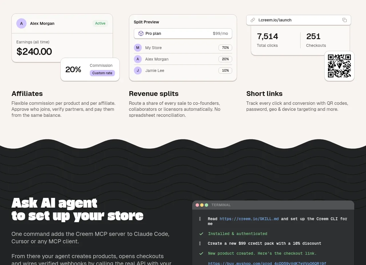
A partner-focused section combines a bold promise with three visual cards demonstrating affiliate earnings, revenue splits, and short-link tracking, then labels each use case below.
Prompt preview
## Reference images

Study these alongside the description below: hierarchy, rhythm, spacing, colour. Build for the product you are asked about, using this design language.

- Component: https://kage-design-assets.t3.tigrisfiles.io/components/creem-2-0/d32a2098-e6df-45cb-a937-19c647abd2d5-1789711291-7.webp
- Full page it was cut from: https://kage-design-assets.t3.tigrisfiles.io/screenshots/creem-2-0/d32a2098-e6df-45cb-a937-19c647abd2d5-1789711237993-full.webp
- Component on Kage: https://kage.design/component/creem-2-0-feature-grid-5

## Before you start
Ask what partner, referral, or revenue-sharing workflows the user's product supports and what brand colors should represent them. Build an original interpretation using those answers.

Create a bright, airy section with a large two-line heading and a short introduction at the top. Under it, place three equal-width white product cards with thin borders and 12px radius. Each card should show a simple invented UI preview—such as an earnings figure, a split table, or a link analytics panel—using restrained neutrals and one accent color. Add three aligned labels and short explanations beneath the previews. Keep the grid anchored to a centered max-width container, with a faint wavy divider or organic transition at the bottom only if it supports the brand. On mobile, stack cards and preserve the relationship between preview and description.

Never use the reference logo, product name, copy, illustrations, imagery, or exact QR code or UI content.
More components

 AI-powered helpdesk feature section
intercom.com · Feature grid
AI-powered helpdesk feature section
intercom.com · Feature grid
 Integrations and ecosystem section
intercom.com · Feature grid
Integrations and ecosystem section
intercom.com · Feature grid
 AI agent capabilities section
intercom.com · Feature grid
AI agent capabilities section
intercom.com · Feature grid
 Unified support experience overview
intercom.com · Feature grid
Unified support experience overview
intercom.com · Feature grid

 Core invoicing capabilities
sendinvo.com · Feature grid
Core invoicing capabilities
sendinvo.com · Feature grid
 Audience and trade types
sendinvo.com · Feature grid
Audience and trade types
sendinvo.com · Feature grid