 kage
kage
creem.io
Design analysis
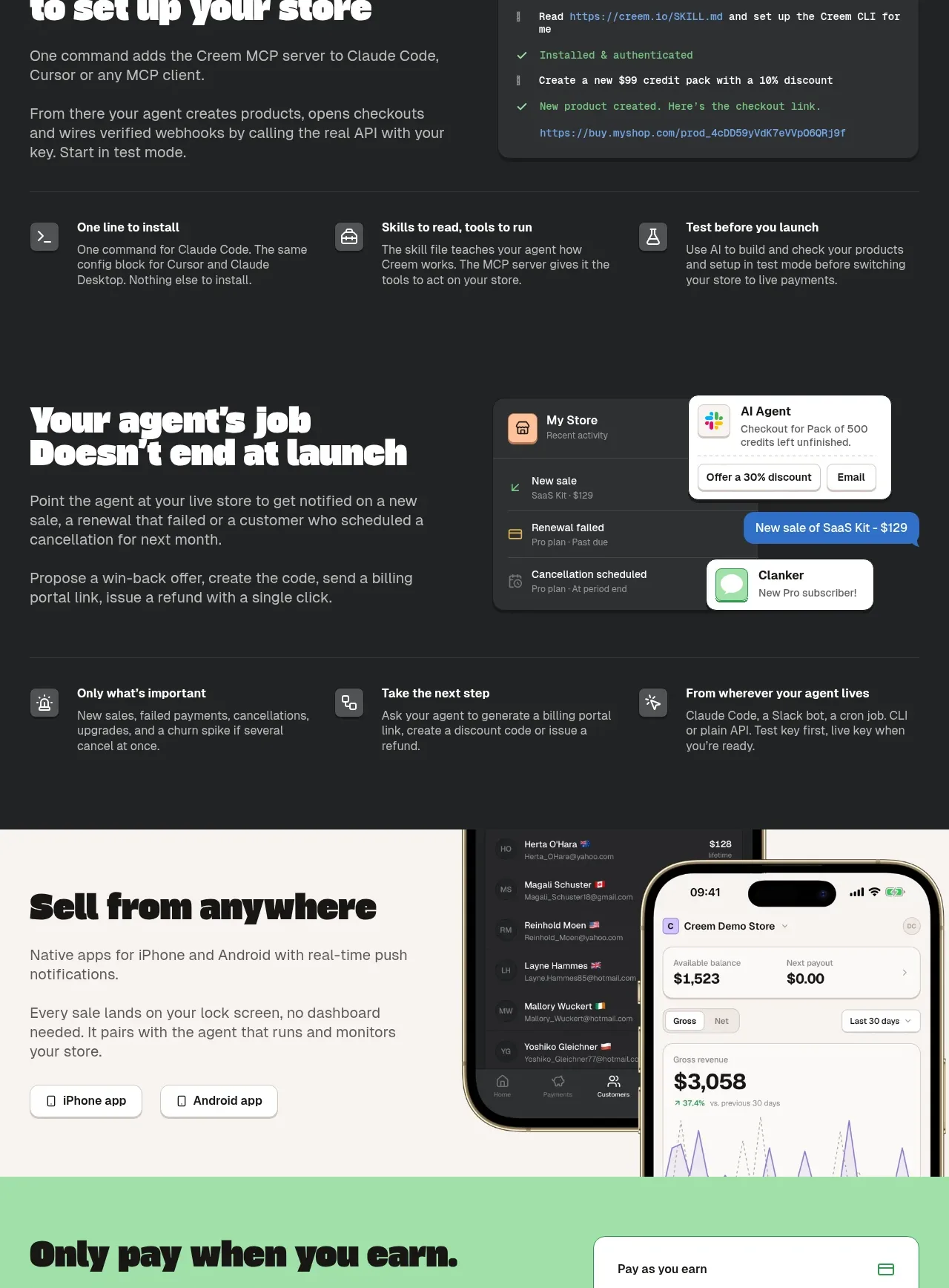
Two dark product-story panels show an agent setting up a store and continuing to monitor it after launch, each supported by UI mockups and a three-item takeaway row.
Prompt preview
## Reference images

Study these alongside the description below: hierarchy, rhythm, spacing, colour. Build for the product you are asked about, using this design language.

- Component: https://kage-design-assets.t3.tigrisfiles.io/components/creem-2-0/d32a2098-e6df-45cb-a937-19c647abd2d5-1789711292-8.webp
- Full page it was cut from: https://kage-design-assets.t3.tigrisfiles.io/screenshots/creem-2-0/d32a2098-e6df-45cb-a937-19c647abd2d5-1789711237993-full.webp
- Component on Kage: https://kage.design/component/creem-2-0-feature-grid-6

## Before you start
Ask what the user's agent can do before launch and after launch, and which moments should feel magical. Then map those answers into two original dark showcase panels.

Use a continuous near-black background with subtle contour lines. Create two stacked story blocks, each with a large white display heading on the left, two short paragraphs, and a primary or secondary action where useful. On the right, place an original terminal, notification, or activity-feed mockup with rounded corners and believable invented content. Separate each story from a three-column takeaway row containing a small icon, bold label, and one-sentence explanation. Use white headings, gray body copy, muted charcoal panels, mint or lavender status accents, thin dividers, and generous 64–96px vertical padding. Make the mockups responsive: on narrow screens place them below the copy and avoid horizontal overflow.

Never use the reference logo, product name, copy, illustrations, imagery, or exact terminal, notification, or dashboard content.
More components

 AI-powered helpdesk feature section
intercom.com · Feature grid
AI-powered helpdesk feature section
intercom.com · Feature grid
 Integrations and ecosystem section
intercom.com · Feature grid
Integrations and ecosystem section
intercom.com · Feature grid
 AI agent capabilities section
intercom.com · Feature grid
AI agent capabilities section
intercom.com · Feature grid
 Unified support experience overview
intercom.com · Feature grid
Unified support experience overview
intercom.com · Feature grid

 Core invoicing capabilities
sendinvo.com · Feature grid
Core invoicing capabilities
sendinvo.com · Feature grid
 Audience and trade types
sendinvo.com · Feature grid
Audience and trade types
sendinvo.com · Feature grid