kage
kage
creem.io
Design analysis
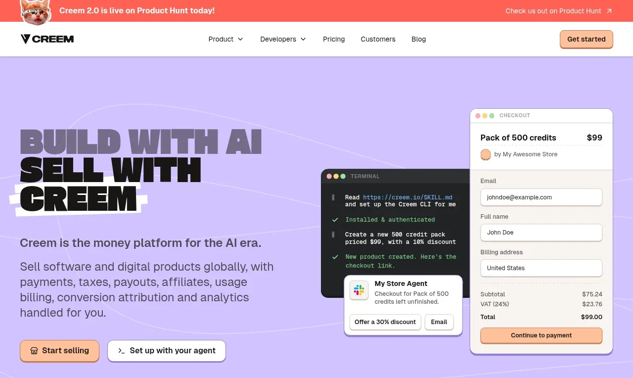
The lavender hero pairs an oversized, high-contrast headline and concise positioning copy with a layered checkout and terminal product visual, then offers two distinct calls to action.
Prompt preview
## Reference images

Study these alongside the description below: hierarchy, rhythm, spacing, colour. Build for the product you are asked about, using this design language.

- Component: https://kage-design-assets.t3.tigrisfiles.io/components/creem-2-0/d32a2098-e6df-45cb-a937-19c647abd2d5-1789711289-1.webp
- Full page it was cut from: https://kage-design-assets.t3.tigrisfiles.io/screenshots/creem-2-0/d32a2098-e6df-45cb-a937-19c647abd2d5-1789711237993-full.webp
- Component on Kage: https://kage.design/component/creem-2-0-hero

## Before you start
Ask what the user's product does, its audience, and its brand direction. Then create an original hero using the following structural principles.

Use a full-width pale lavender background (approximately #c8b9ff) with a very subtle line texture or abstract contour pattern. Place content in a two-column max-width layout: left text occupies roughly half the width and right side holds a layered product demonstration. Use a bold condensed or display sans-serif headline with 58–72px desktop size, tight line height, and a dark near-black color; let the headline break into an energetic multi-line statement. Follow with 18px supporting copy in a muted charcoal, constrained to about 430px. Put a peach filled primary button and white secondary button in one row with 12px radius, compact icons, and clear hover states. On the right, compose overlapping rounded UI cards such as a terminal panel behind a checkout panel; use white surfaces, thin lavender-gray borders, small field labels, and realistic but invented interface content. Keep the first visual and CTA fully inside the hero, with generous top and bottom whitespace. Stack the columns on mobile.

Never use the reference logo, product name, copy, illustrations, imagery, or exact UI content.