kage
kage
creem.io
Design analysis
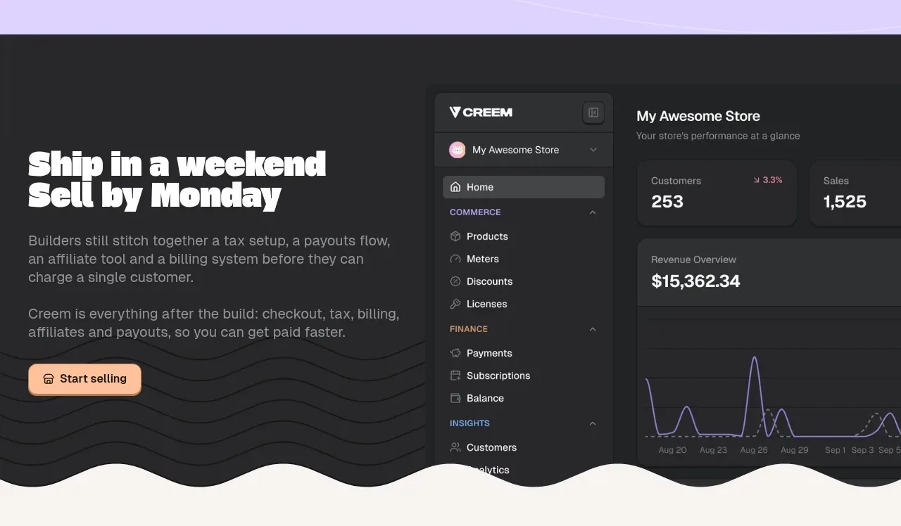
A dark, wave-textured product section uses a large promise on the left and a cropped dashboard visualization on the right, making the software feel tangible without becoming a dense feature list.
Prompt preview
## Reference images

Study these alongside the description below: hierarchy, rhythm, spacing, colour. Build for the product you are asked about, using this design language.

- Component: https://kage-design-assets.t3.tigrisfiles.io/components/creem-2-0/d32a2098-e6df-45cb-a937-19c647abd2d5-1789711290-3.webp
- Full page it was cut from: https://kage-design-assets.t3.tigrisfiles.io/screenshots/creem-2-0/d32a2098-e6df-45cb-a937-19c647abd2d5-1789711237993-full.webp
- Component on Kage: https://kage.design/component/creem-2-0-hero-2

## Before you start
Ask what the user's product is, what workflow it simplifies, and which product screen best proves that value. Apply those answers to this layout.

Build a dark full-width showcase section using near-black charcoal (#202123) and faint layered contour lines. Use a two-column layout with a left narrative block and a right oversized dashboard mockup that can crop beyond the container edge. The heading should be a large, chunky display face in white, around 48–64px with tight line height. Add two short paragraphs in cool gray, followed by one peach primary CTA. Render the dashboard as an original dark UI with a sidebar, cards, metrics, and a chart; use restrained gray panels and one lavender accent. End the section with an organic or wave-shaped lower edge if the page style benefits from it. Ensure contrast remains accessible and stack the layout on mobile.

Never use the reference logo, product name, copy, illustrations, imagery, or exact dashboard content.