kage
kage
creem.io
Design analysis
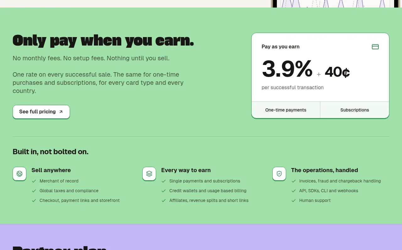
A light split section introduces mobile selling and real-time notifications, with app buttons on the left and a large phone mockup extending from the right edge.
Prompt preview
## Reference images

Study these alongside the description below: hierarchy, rhythm, spacing, colour. Build for the product you are asked about, using this design language.

- Component: https://kage-design-assets.t3.tigrisfiles.io/components/creem-2-0/d32a2098-e6df-45cb-a937-19c647abd2d5-1789711292-9.webp
- Full page it was cut from: https://kage-design-assets.t3.tigrisfiles.io/screenshots/creem-2-0/d32a2098-e6df-45cb-a937-19c647abd2d5-1789711237993-full.webp
- Component on Kage: https://kage.design/component/creem-2-0-hero-3

## Before you start
Ask whether the user's product has a mobile app, what users need to monitor on the go, and what visual style the brand uses. Apply that to an original mobile showcase.

Build a light cream split section with a left text column and a large smartphone mockup on the right, slightly cropped by the section edge. Use a bold dark heading around 48px, two short paragraphs, and two small outlined platform buttons. The phone should be an original device frame containing a simplified analytics or activity screen, with a second dark panel or list behind it to suggest live notifications. Use soft cream, charcoal, and a restrained lavender accent; keep shadows subtle and borders fine. On mobile, place the phone below the content and scale it to fit without clipping.

Never use the reference logo, product name, copy, illustrations, imagery, or exact app interface.