 kage
kage
ultracite.ai
Design analysis
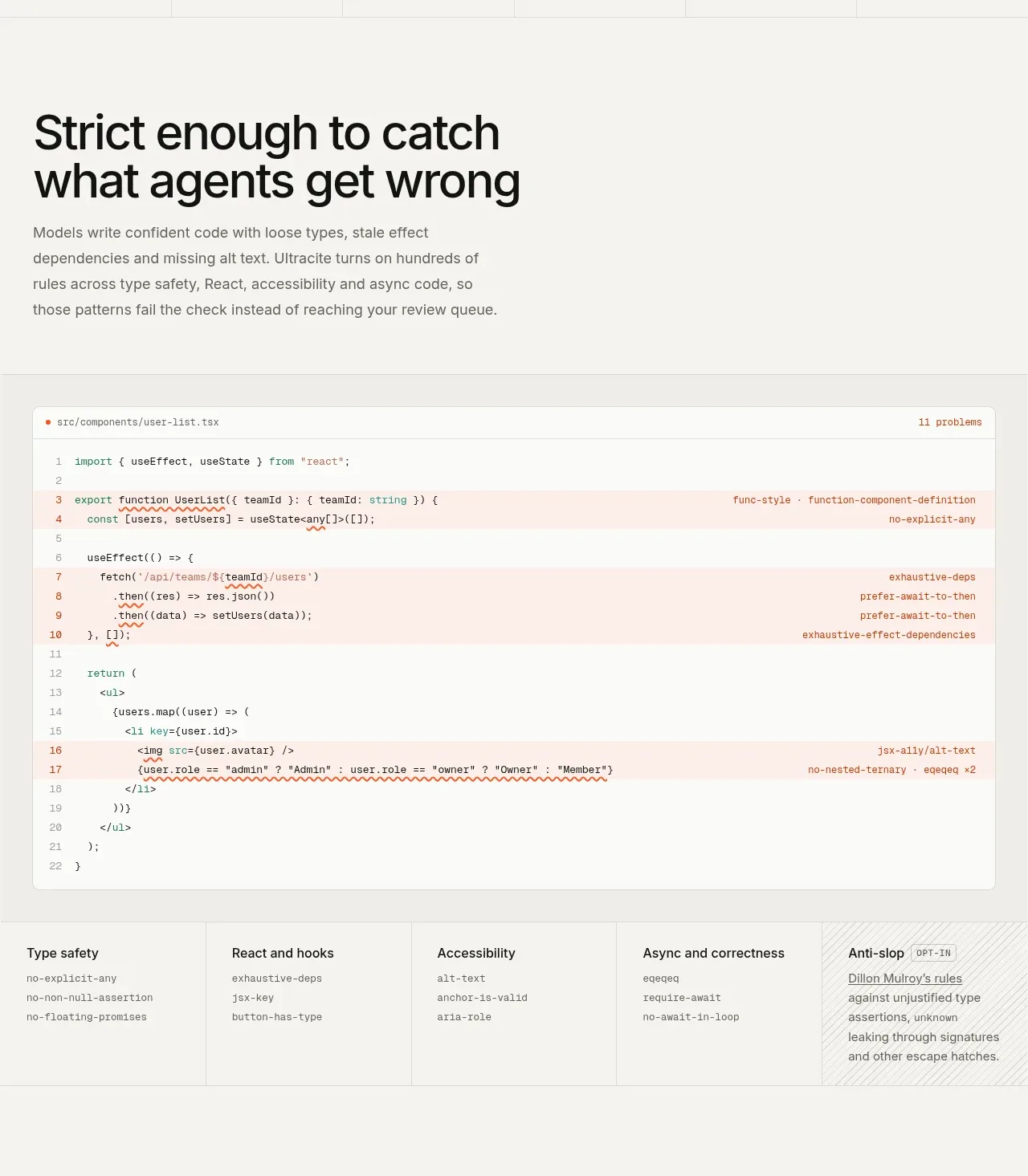
This feature section explains the quality promise with a strong heading, then makes it tangible through an annotated code panel and a row of focused rule categories. The technical evidence supports the claim better than abstract illustrations.
Prompt preview
## Reference images

Study these alongside the description below: hierarchy, rhythm, spacing, colour. Build for the product you are asked about, using this design language.

- Component: https://kage-design-assets.t3.tigrisfiles.io/components/ultracite-v8/2cfe6d77-9aac-44fd-bb06-05dad12091d2-1792303306-3.webp
- Full page it was cut from: https://kage-design-assets.t3.tigrisfiles.io/screenshots/ultracite-v8/2cfe6d77-9aac-44fd-bb06-05dad12091d2-1792303236925-full.webp
- Component on Kage: https://kage.design/component/ultracite-v8-feature-grid

## Before you start
Ask what quality, reliability, or workflow problems the user's product solves and which technical examples are safe to show. Build an original feature section around those answers.

Create an editorial feature section with a large left-aligned heading and a short explanatory paragraph, followed by a wide code review panel. The panel should show a realistic file header, line numbers, highlighted problem rows, and concise diagnostics aligned to the right so the benefit is immediately understandable. Under it, add a five-column category strip describing the major capabilities; each cell should have a short title and a few compact examples. Let the final category use a subtly different treatment to signal an optional or advanced feature.

Use warm off-white #f7f7f4 for the section, white #fcfcfa for the code panel, charcoal #161615 text, and muted gray #6d6d67. Use pale red or orange washes for problematic code rows without making the UI alarmist, plus thin #dededda dividers. Headings should be 44–56px desktop with tight line height; body copy 15px; code 11–13px in a readable monospace. Keep all content on shared left and right gutters, with generous space around the heading and a 1px grid structure. Make code diagnostics responsive: stack or move below the code on small screens.

### Never
- Never use the reference's logos, product names, copy, illustrations, or imagery.
- Never show proprietary code or claim unsupported checks.
- Never sacrifice code legibility for visual density.
More components

 Data-to-action engine
Salience · Feature grid
Data-to-action engine
Salience · Feature grid
 Actionable alert workflow
Salience · Feature grid
Actionable alert workflow
Salience · Feature grid
 Three-step implementation flow
Salience · Feature grid
Three-step implementation flow
Salience · Feature grid
 Trust proof and core outcomes
Salience · Feature grid
Trust proof and core outcomes
Salience · Feature grid
 What analytics misses
Salience · Feature grid
What analytics misses
Salience · Feature grid

 Workflow features and capabilities
CrewTower Mod for Claude Code · Feature grid
Workflow features and capabilities
CrewTower Mod for Claude Code · Feature grid