 kage
kage
alkera.ai
Design analysis
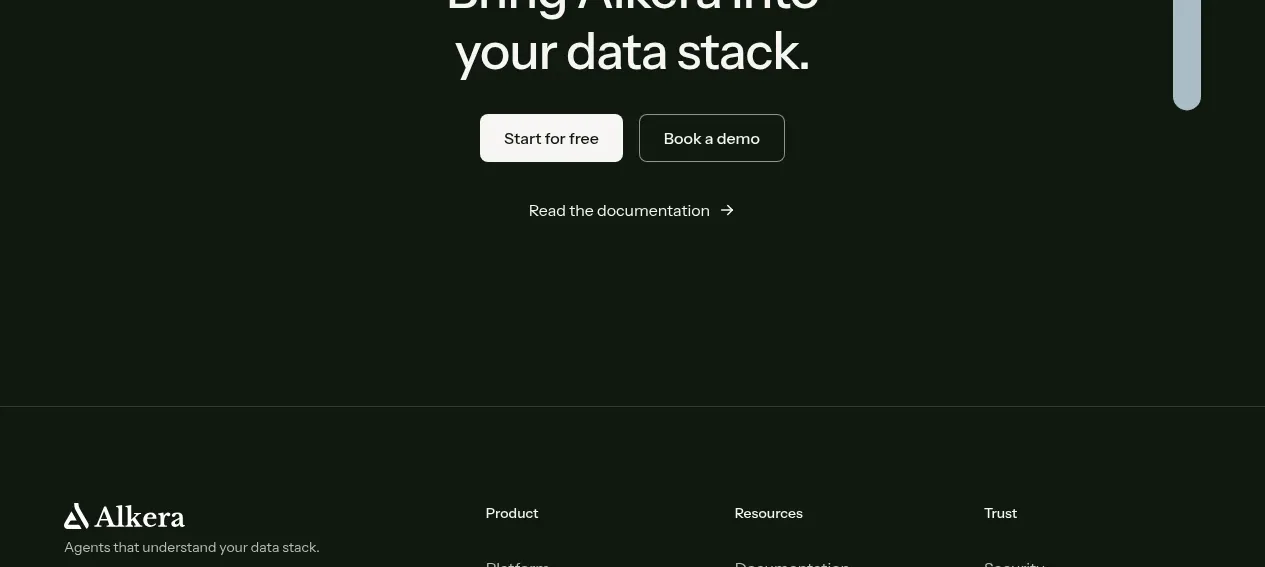
A full-width dark green panel creates a strong visual ending with a centered headline, paired primary and secondary actions, and a quieter documentation link beneath.
Prompt preview
## Reference images

Study these alongside the description below: hierarchy, rhythm, spacing, colour. Build for the product you are asked about, using this design language.

- Component: https://kage-design-assets.t3.tigrisfiles.io/components/databench-by-alkera/229e473d-7918-4538-a962-0aa359369c12-1791439390-7.webp
- Full page it was cut from: https://kage-design-assets.t3.tigrisfiles.io/screenshots/databench-by-alkera/229e473d-7918-4538-a962-0aa359369c12-1791439317723-full.webp
- Component on Kage: https://kage.design/component/databench-by-alkera-cta

## Before you start
Ask the user what final conversion action matters most, what secondary action builds trust, and what tone their brand should have. Apply this structure to their product with original wording.

Create a large centered CTA panel with a near-black forest background such as #0b170f and generous vertical padding. Use a two-line headline in white at roughly 36–44px with tight leading. Place a light filled primary button beside a transparent or outlined secondary button; use 8px corners, clear focus states, and enough contrast for accessibility. Add a small understated text link with an arrow below the buttons for documentation, learning, or another low-friction path. Keep the panel visually simple, with optional very subtle border lines or background texture, and round only the outer top corners if it transitions into a footer.

Never: use logos, product names, copy, illustrations, or imagery from the reference.
More components
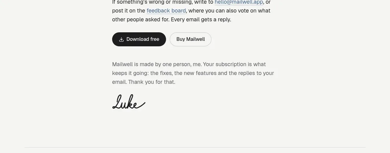
 Trial and purchase call to action
Mailwell · Call to action
Trial and purchase call to action
Mailwell · Call to action
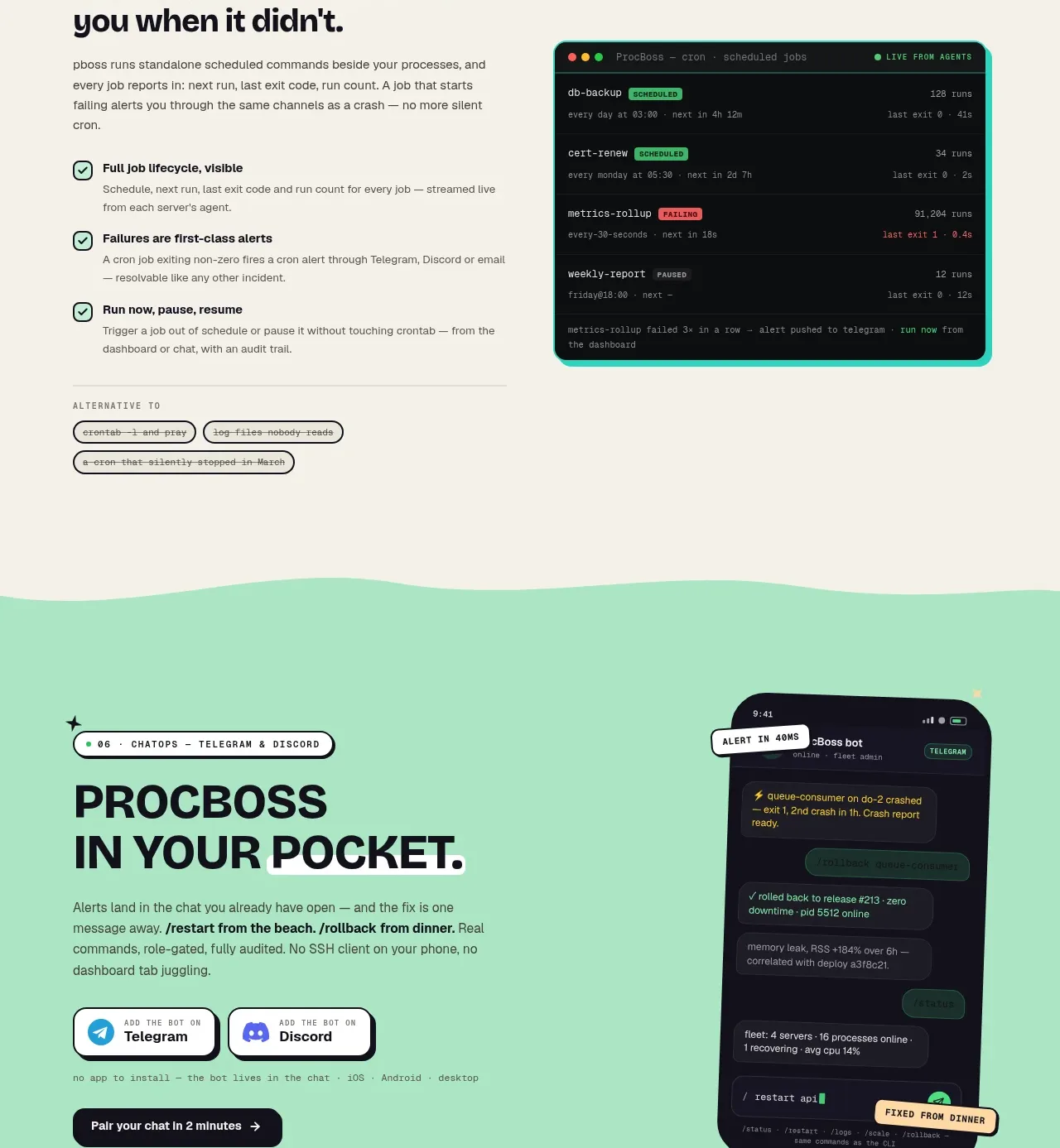
 Pocket alerts call to action
ProcBoss · Call to action
Pocket alerts call to action
ProcBoss · Call to action
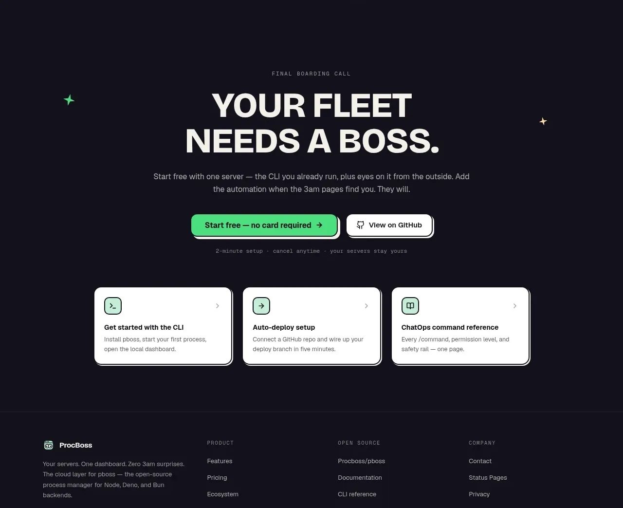 Dark final conversion band
ProcBoss · Call to action
Dark final conversion band
ProcBoss · Call to action
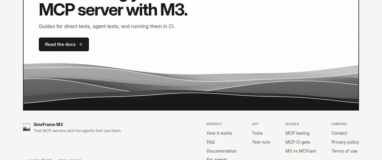
 Documentation call to action
SineFrame M3 · Call to action
Documentation call to action
SineFrame M3 · Call to action
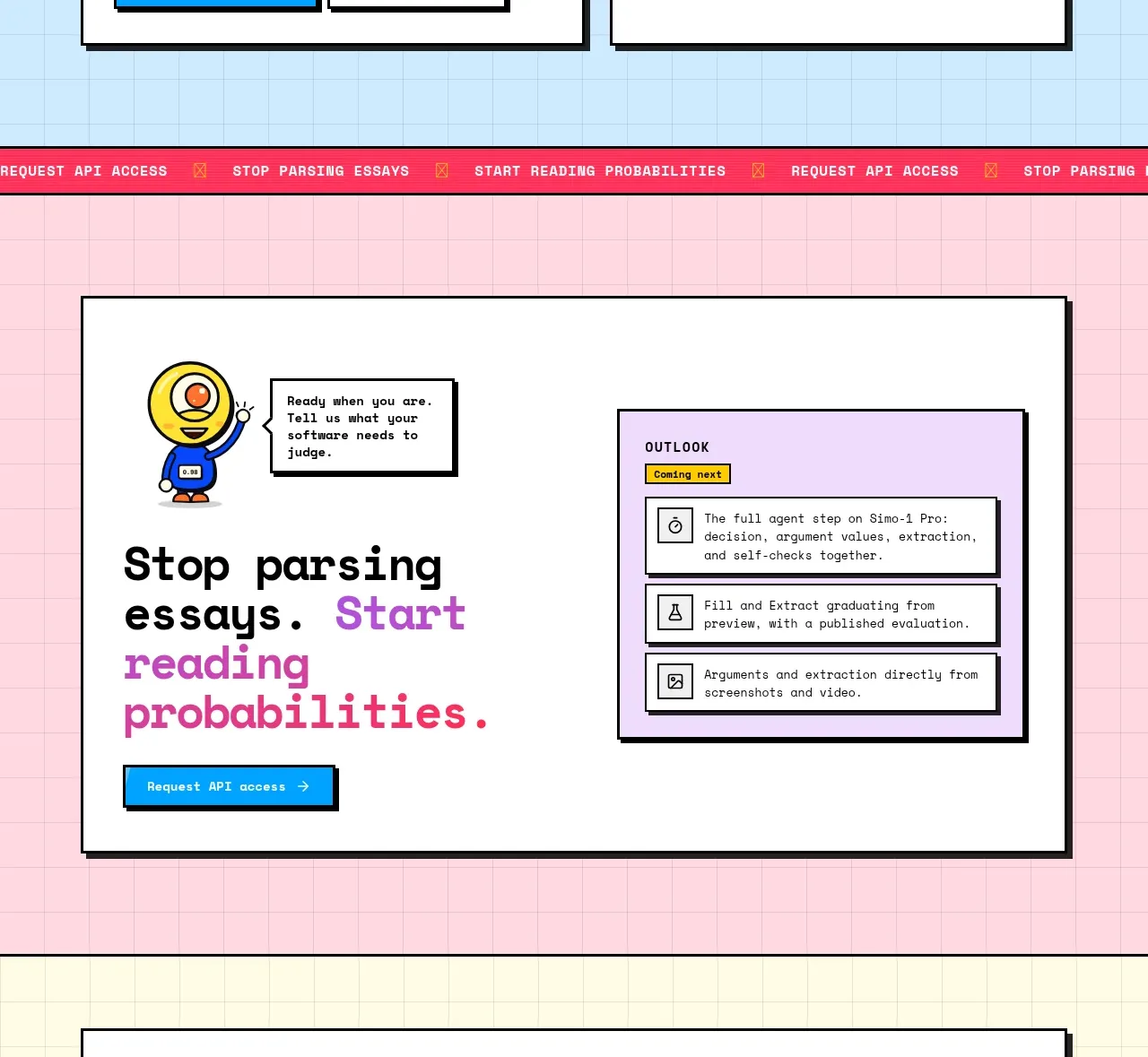
 Conversion call to action
Simo · Call to action
Conversion call to action
Simo · Call to action
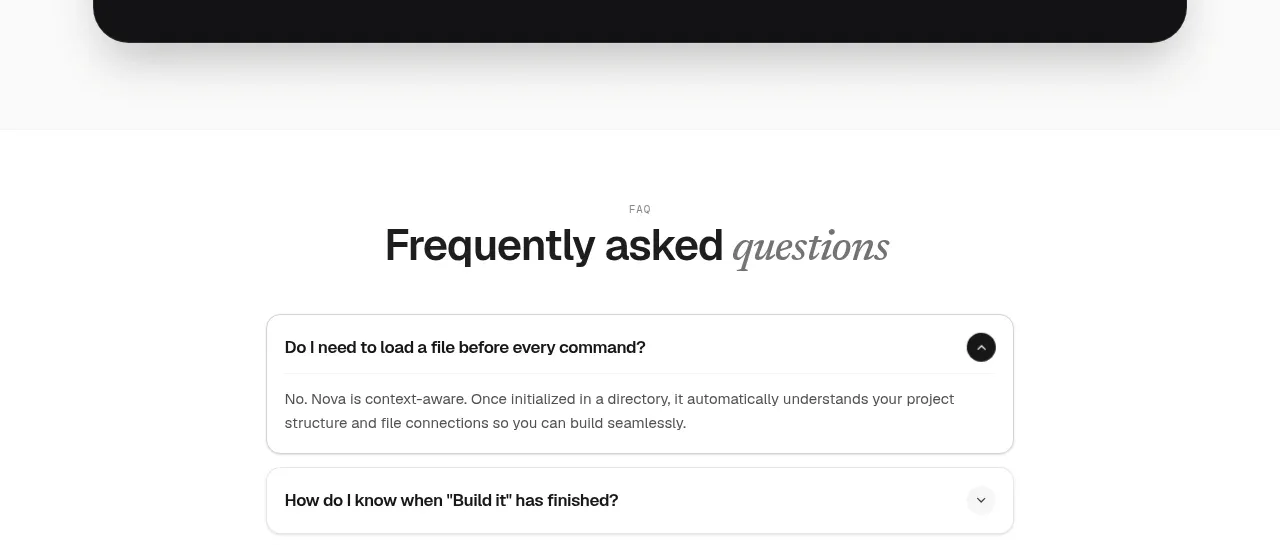
 Install command CTA
NOVA CLI v1.0 · Call to action
Install command CTA
NOVA CLI v1.0 · Call to action