 kage
kage
alkera.ai
Design analysis
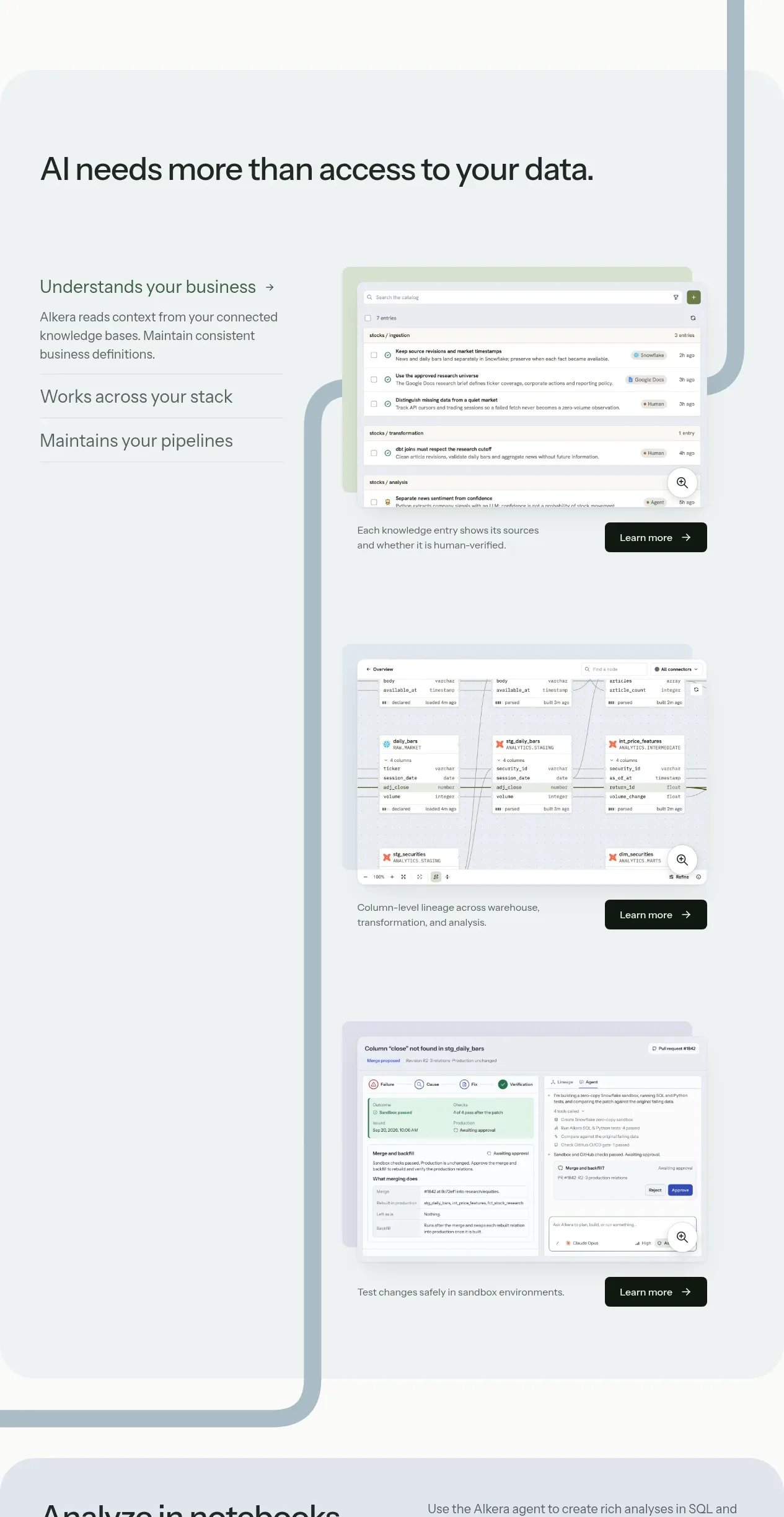
A pale blue-gray feature panel introduces the core product thesis, then presents three vertically sequenced capabilities with concise text on the left and large interface screenshots on the right. Repeated dark learn-more buttons and a connected line motif create continuity.
Prompt preview
## Reference images

Study these alongside the description below: hierarchy, rhythm, spacing, colour. Build for the product you are asked about, using this design language.

- Component: https://kage-design-assets.t3.tigrisfiles.io/components/databench-by-alkera/229e473d-7918-4538-a962-0aa359369c12-1791439388-3.webp
- Full page it was cut from: https://kage-design-assets.t3.tigrisfiles.io/screenshots/databench-by-alkera/229e473d-7918-4538-a962-0aa359369c12-1791439317723-full.webp
- Component on Kage: https://kage.design/component/databench-by-alkera-feature-grid

## Before you start
Ask the user which three product capabilities most strongly support their customer outcome, and ask for their brand palette and available product screenshots. Reframe the following pattern for that product.

Create a large rounded feature section on a very pale blue-gray background such as #edf4f6. Start with a bold left-aligned section heading around 36–42px, then organize three feature rows vertically. Each row should use a two-column grid: a narrow text column with a 20–22px feature title, a 15–17px explanation, and a subtle divider; and a larger right column containing a rounded product UI screenshot or authored UI mockup. Give each screenshot a soft colored halo, 14–18px radius, and a light shadow. Place a compact dark “learn more” style button near the lower right of each visual, with an arrow. Add one thin curved or stepped vertical accent line in a desaturated brand tone to visually connect the rows, but keep it secondary. Maintain at least 90px vertical spacing between rows and ensure the section is readable without relying on the images.

Never: use logos, product names, copy, illustrations, or imagery from the reference.
More components

 Privacy and optional intelligence
Mailwell · Feature grid
Privacy and optional intelligence
Mailwell · Feature grid
 Reliable, recoverable actions
Mailwell · Feature grid
Reliable, recoverable actions
Mailwell · Feature grid
 Unified account setup
Mailwell · Feature grid
Unified account setup
Mailwell · Feature grid
 Fast local workflow and calm reading
Mailwell · Feature grid
Fast local workflow and calm reading
Mailwell · Feature grid

 Cloud layer workflows
ProcBoss · Feature grid
Cloud layer workflows
ProcBoss · Feature grid
 Operational blind spots
ProcBoss · Feature grid
Operational blind spots
ProcBoss · Feature grid