 kage
kage
alkera.ai
Design analysis
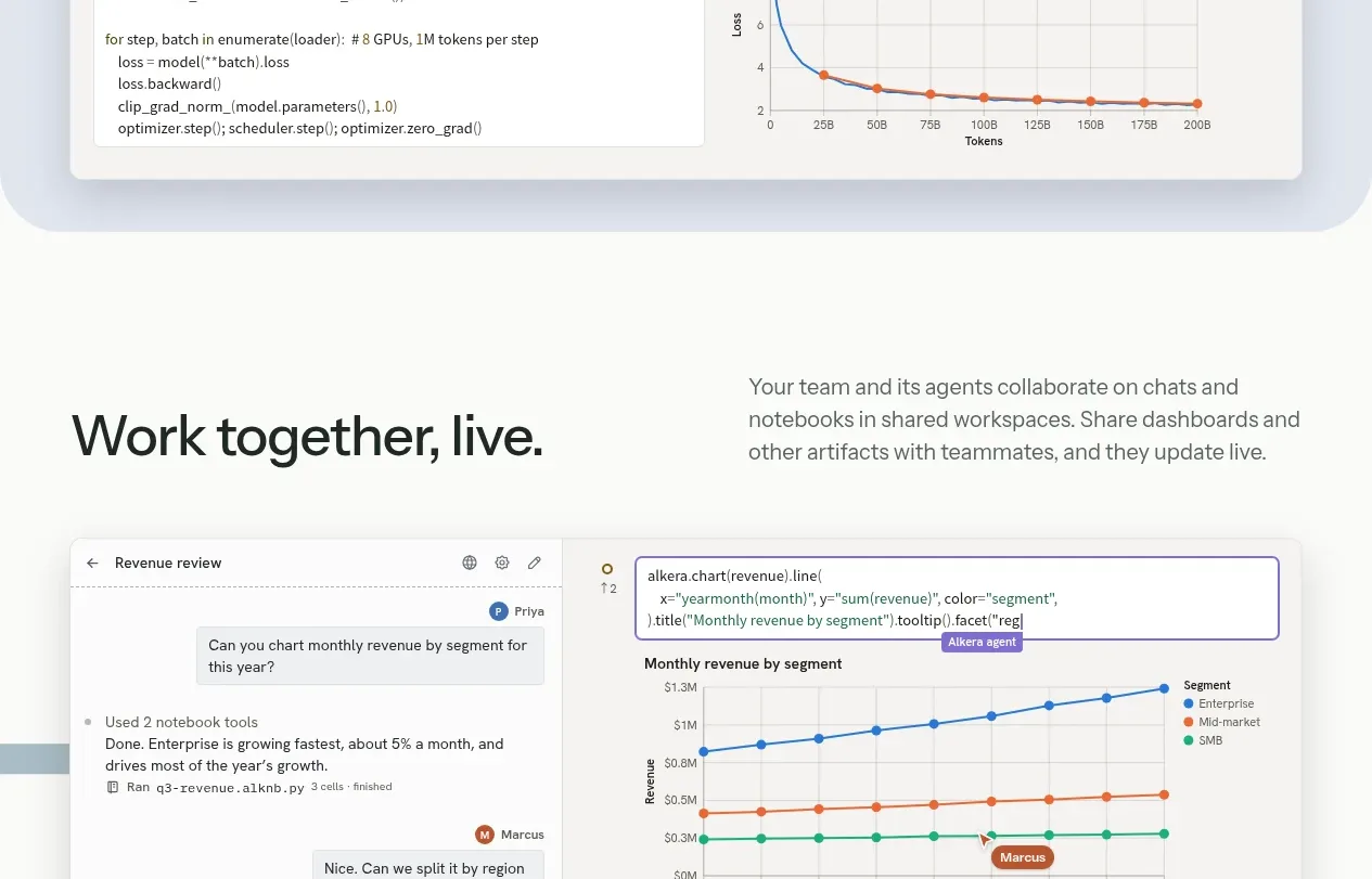
A second product capability uses the same pale panel language but focuses on a code-and-chart interface, clearly connecting technical infrastructure to a measurable result.
Prompt preview
## Reference images

Study these alongside the description below: hierarchy, rhythm, spacing, colour. Build for the product you are asked about, using this design language.

- Component: https://kage-design-assets.t3.tigrisfiles.io/components/databench-by-alkera/229e473d-7918-4538-a962-0aa359369c12-1791439389-5.webp
- Full page it was cut from: https://kage-design-assets.t3.tigrisfiles.io/screenshots/databench-by-alkera/229e473d-7918-4538-a962-0aa359369c12-1791439317723-full.webp
- Component on Kage: https://kage.design/component/databench-by-alkera-feature-grid-3

## Before you start
Ask the user what technical capability should be explained, what result it produces, and which original interface elements or screenshots are available. Apply the design principles to that product.

Create a compact feature band matching a broader SaaS product story. Use a two-column heading and description at the top, followed by a wide rounded UI card showing a code/configuration pane beside a metrics chart. Use a pale blue-gray background (#e8eef3), a white inner surface, thin #d7dee0 borders, 14px corners, and restrained shadow. The chart should have a clear title, axes, a simple two-series legend, and accessible colors; the code pane should use monospace typography and line spacing. Add a small status/capacity badge in the upper-right of the card. Keep the section practical and credible rather than decorative.

Never: use logos, product names, copy, illustrations, or imagery from the reference.
More components

 Privacy and optional intelligence
Mailwell · Feature grid
Privacy and optional intelligence
Mailwell · Feature grid
 Reliable, recoverable actions
Mailwell · Feature grid
Reliable, recoverable actions
Mailwell · Feature grid
 Unified account setup
Mailwell · Feature grid
Unified account setup
Mailwell · Feature grid
 Fast local workflow and calm reading
Mailwell · Feature grid
Fast local workflow and calm reading
Mailwell · Feature grid

 Cloud layer workflows
ProcBoss · Feature grid
Cloud layer workflows
ProcBoss · Feature grid
 Operational blind spots
ProcBoss · Feature grid
Operational blind spots
ProcBoss · Feature grid