 kage
kage
alkera.ai
Design analysis
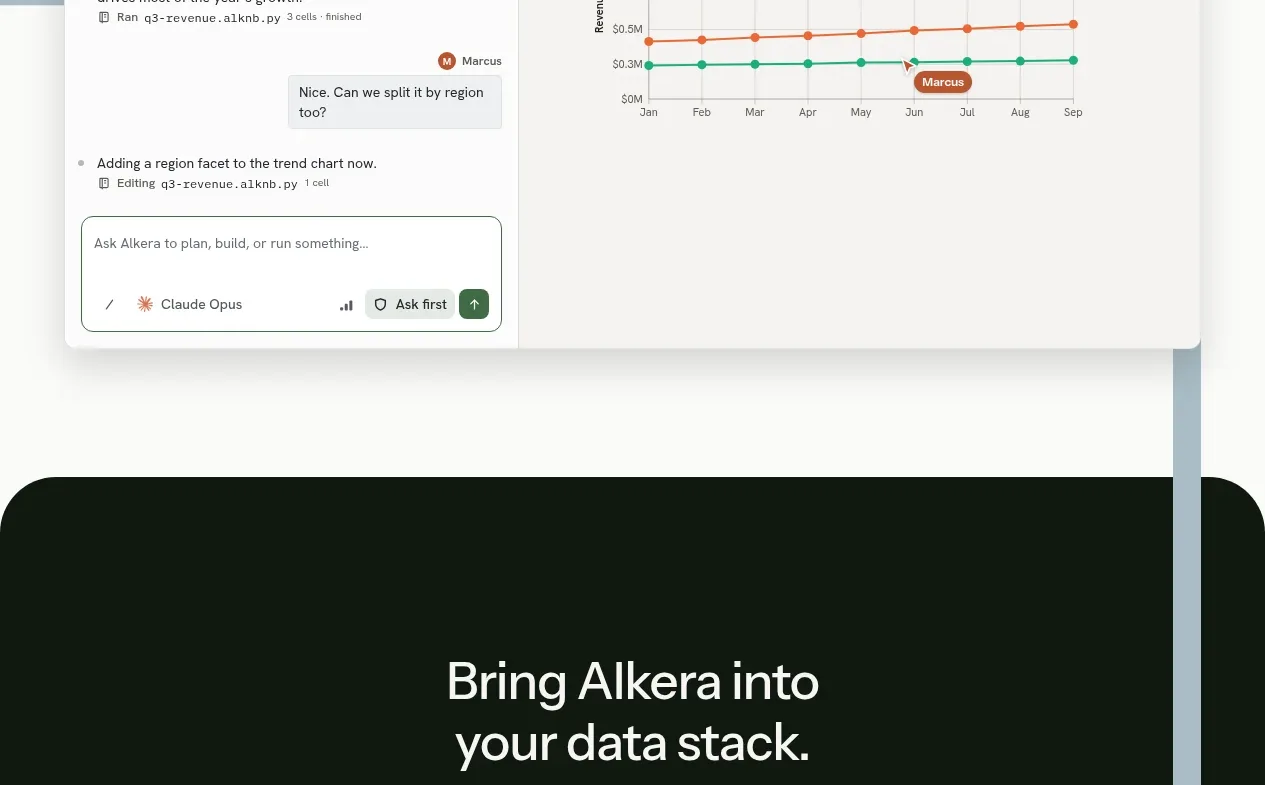
The collaboration section returns to a white background, pairing a strong headline and explanatory copy with a wide real-time workspace mockup containing conversation, code, and chart regions.
Prompt preview
## Reference images

Study these alongside the description below: hierarchy, rhythm, spacing, colour. Build for the product you are asked about, using this design language.

- Component: https://kage-design-assets.t3.tigrisfiles.io/components/databench-by-alkera/229e473d-7918-4538-a962-0aa359369c12-1791439389-6.webp
- Full page it was cut from: https://kage-design-assets.t3.tigrisfiles.io/screenshots/databench-by-alkera/229e473d-7918-4538-a962-0aa359369c12-1791439317723-full.webp
- Component on Kage: https://kage.design/component/databench-by-alkera-feature-grid-4

## Before you start
Ask the user who collaborates in their product, what live interaction should be demonstrated, and what brand voice and UI components they want. Build an original example around those answers.

Build a white-background collaboration feature section with a two-column intro: a large 36–42px headline on the left and a concise 16–18px paragraph on the right. Below, create a wide, softly elevated workspace mockup with three coordinated regions: a conversation/activity pane, an editable artifact or code pane, and a visualization or result pane. Show subtle presence indicators, message bubbles, or status labels to communicate real-time collaboration, but keep them small and useful. Use 12–16px radius, #e5e7e5 borders, a delicate shadow, and a dark green accent for active states. Include a compact assistant/action input if appropriate. Stack the panes gracefully on mobile.

Never: use logos, product names, copy, illustrations, or imagery from the reference.
More components

 Privacy and optional intelligence
Mailwell · Feature grid
Privacy and optional intelligence
Mailwell · Feature grid
 Reliable, recoverable actions
Mailwell · Feature grid
Reliable, recoverable actions
Mailwell · Feature grid
 Unified account setup
Mailwell · Feature grid
Unified account setup
Mailwell · Feature grid
 Fast local workflow and calm reading
Mailwell · Feature grid
Fast local workflow and calm reading
Mailwell · Feature grid

 Cloud layer workflows
ProcBoss · Feature grid
Cloud layer workflows
ProcBoss · Feature grid
 Operational blind spots
ProcBoss · Feature grid
Operational blind spots
ProcBoss · Feature grid