kage
kage
datafa.st

Design analysis
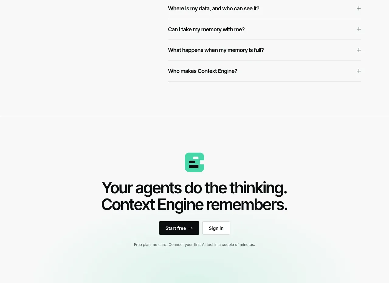
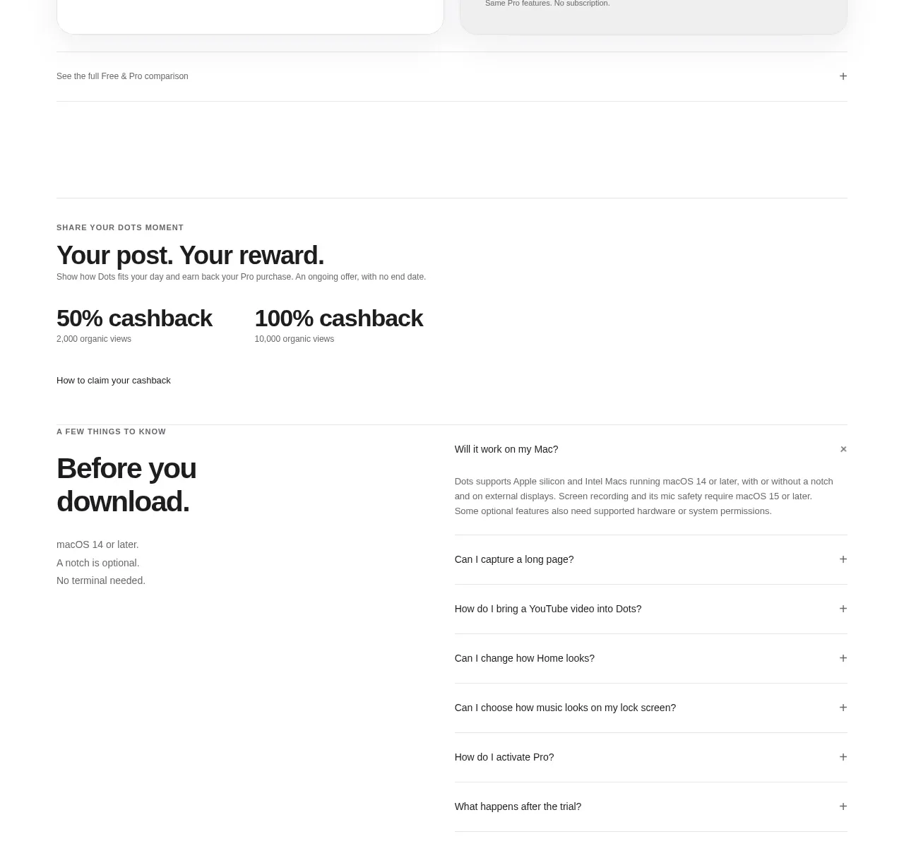
A narrow, centered FAQ list uses generous whitespace, soft borders, rounded rows, and understated plus controls to make a long set of questions feel calm and scannable. The component is intentionally lightweight, with emphasis on clear alignment and predictable expansion behaviour.
Prompt preview
## Reference images

Study these alongside the description below: hierarchy, rhythm, spacing, colour. Build for the product you are asked about, using this design language.

- Component: https://kage-design-assets.t3.tigrisfiles.io/components/datafa-st/3396b937-0925-4898-ae76-13fd2ccd1a9f-1789067844-10.webp
- Full page it was cut from: https://kage-design-assets.t3.tigrisfiles.io/screenshots/datafa-st/3396b937-0925-4898-ae76-13fd2ccd1a9f-1789067801-full.webp
- Component on Kage: https://kage.design/component/datafa-faq

# Build a minimal stacked FAQ accordion

## Before you start
Ask me what my product is, who it is for, and what my brand personality, colours, typography, and content structure are. Then apply the principles below to my product and brand rather than reproducing any reference literally.

## Goal
Create a focused FAQ section for a modern software product. It should feel quiet, premium, highly readable, and easy to scan. Use realistic questions supplied by the product owner, not placeholder lorem ipsum. The FAQ should work as a standalone section and sit comfortably within a larger marketing page.

## Design language

### Layout and alignment
- Use a centered content column rather than a full-width FAQ grid.
- Set the FAQ list to approximately 560–640px wide on desktop, with a fluid width of `calc(100% - 32px)` on small screens.
- Stack rows vertically with a small, consistent gap of roughly 8px.
- Align every question label to the left and every control to the right on one horizontal axis.
- Give each row generous horizontal padding, around 16px on mobile and 16–20px on desktop, with a minimum height of approximately 56px.
- Keep the surrounding section spacious: use about 64–96px of vertical padding on desktop and 48–64px on mobile.
- Do not add a prominent boxed panel behind the entire list unless it clearly fits the user's existing brand system.

### Typography hierarchy
- Use the product's typeface where available; otherwise use a clean sans-serif such as Inter, Geist, or system-ui.
- Question text should be medium-weight, around 15–16px, with a line height near 1.4.
- Use near-black text for questions, approximately `#202020` or `#242424`.
- If the section has a heading, keep it visually secondary to the page's main hero: 28–40px, semibold or bold, with restrained line height.
- Answers should be slightly smaller or equal in size to the question text, use a softer neutral such as `#5f5f5f`, and have comfortable line height around 1.55.

### Colour, borders, and shape
- Use a warm or neutral off-white page background, approximately `#faf9f7` or `#fbfaf9`, unless the user's brand calls for another surface.
- Give each closed row a white or subtly contrasting fill, approximately `#ffffff`.
- Use a very light gray border, approximately `#e7e7e5`, at 1px; avoid heavy shadows.
- Use a rounded radius of about 18–22px so each item reads as a soft pill-like card without becoming circular.
- If a shadow is needed, keep it barely visible: `0 1px 3px rgba(0,0,0,0.04)`.
- The plus icon and any expanded-state icon should use the same dark neutral as the question text, not an accent colour by default.

### Interaction and states
- Make each entire row clickable or keyboard-operable, not only the plus icon.
- Use semantic accessible disclosure buttons with `aria-expanded` and `aria-controls`.
- Closed state: show a plus icon aligned to the right.
- Open state: rotate the plus by 45 degrees or replace it with a minus, with a subtle 150–220ms ease transition.
- Reveal the answer below the question inside the same rounded item. Preserve the left alignment with the question and use 12–16px of separation from the label.
- Animate height and opacity carefully without causing layout jumps or trapping keyboard focus.
- Provide visible `:focus-visible` treatment with a clear outline or accent-colour ring.
- Support keyboard activation with Enter and Space, and ensure sufficient contrast and touch target size.
- Decide whether multiple items may remain open based on the user's content needs; default to allowing multiple open items because it is less disruptive for comparison.

### Responsive behaviour
- On narrow screens, let long questions wrap naturally while keeping the control pinned to the top-right or vertically centered in a stable way.
- Preserve at least 44px of effective touch target height.
- Keep the list readable without forcing horizontal scrolling.
- Ensure open answers do not become excessively wide; maintain the same content column.

## Implementation guidance
- Build it as a reusable data-driven component so questions and answers can be edited from an array or CMS response.
- Use semantic HTML and progressive enhancement where possible.
- Include at least 6–8 varied FAQ items to demonstrate scanning, wrapping, and expanded states.
- Show one expanded item in the demo only if it helps communicate the interaction; otherwise render all closed initially.
- Match the user's existing spacing scale, type scale, border treatment, and accent colour after asking about their brand.

## Never
- Never copy the reference site's logos, product names, brand language, questions, answers, or exact marketing copy.
- Never reuse proprietary illustrations, imagery, screenshots, testimonials, avatars, or decorative assets from the reference.
- Never make the list full-width by default, clutter it with unnecessary icons, or use heavy cards and dramatic shadows.
- Never sacrifice keyboard access, focus visibility, semantic disclosure behaviour, or mobile usability for visual similarity.