kage
kage
deno.com

Design analysis
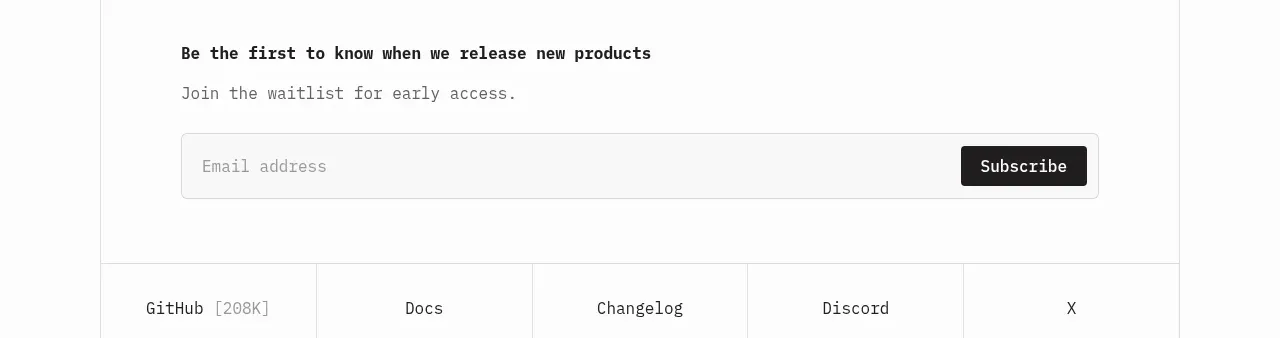
This developer-focused install form pairs a compact platform switcher with a high-contrast command block and one-click copy action. A second agent-oriented command block extends the same pattern for an alternate setup path, making the section useful without adding visual complexity.
Prompt preview
## Reference images

Study these alongside the description below: hierarchy, rhythm, spacing, colour. Build for the product you are asked about, using this design language.

- Component: https://kage-design-assets.t3.tigrisfiles.io/components/deno-com/32c2f827-c733-4746-82ec-fc83a363518f-1789073864-2.webp
- Full page it was cut from: https://kage-design-assets.t3.tigrisfiles.io/screenshots/deno-com/32c2f827-c733-4746-82ec-fc83a363518f-1789073825-full.webp
- Component on Kage: https://kage.design/component/deno-form

## Before you start
Ask what the user's product is, who it is for, and what brand, visual identity, and installation or setup flow it uses. Then apply the principles below to that product rather than reproducing this reference literally.

## Build this component
Create a centered developer installation section with two stacked, copyable command panels. The first panel should explain the primary installation path; the second should present an alternative workflow for delegating setup to a coding agent. Treat both panels as reusable form-like controls that can be adapted to different products, runtimes, platforms, and commands.

## Design language

### Layout and alignment
- Place the component in a wide, mostly white section with a narrow centered content column, approximately 640–700px wide on desktop.
- Center-align the main heading, supporting link, section heading, and descriptions.
- Use a clear vertical rhythm: heading first, then a small secondary link, then the first command panel, followed by a generous gap before the alternate workflow heading and panel.
- Keep each command panel full-width within the content column.
- Structure each panel as two stacked rows: an optional platform or context selector row above, and a dark command row below.
- On smaller screens, reduce horizontal padding and allow long commands to scroll horizontally rather than wrapping awkwardly.

### Typography hierarchy
- Use a modern sans-serif with a strong, compact display weight for headings and a neutral regular weight for supporting text.
- Make the primary heading prominent but not oversized, roughly 34–40px desktop with tight line height.
- Set section headings around 26–30px and use bold weight.
- Use muted 14–16px text for descriptions and links; make secondary links underlined to signal utility.
- Render commands in a monospace font around 15–16px, with enough line height for easy scanning.
- Keep platform labels and context hints small, approximately 12–14px, with subdued contrast.

### Colour
- Use a warm or neutral near-white page background, approximately `#ffffff` or `#fafafa`.
- Use near-black text such as `#111111` for headings.
- Use muted gray text around `#6b6b6b` for descriptions, links, and inactive labels.
- Make the command row a deep charcoal, approximately `#191a1e`, with near-white command text around `#f2f2f2`.
- Use one bright brand accent for the version badge or active state; a vivid mint or green such as `#65efb0` works well, but derive the exact hue from the user's brand.
- Highlight shell prompt characters or important command accents with the brand colour while keeping the command itself highly legible.

### Borders, radius, and elevation
- Give the outer command panel a thin light-gray border such as `#d8d8d8`.
- Use a restrained 7–9px corner radius on the overall panel; keep the panel feeling technical and precise rather than soft and card-like.
- Separate the selector row from the command row with a 1px border.
- Use a subtle shadow beneath the dark command area, for example `0 5px 12px rgba(0,0,0,0.10)`.
- Style the copy button as a compact outlined square with a translucent or dark border, approximately 34–38px in size, and a small 4–6px radius.

### Controls and interaction
- The platform selector should behave like a two-option segmented control. Show the active option with stronger contrast or a subtly different background; keep the inactive option quiet.
- If the product supports multiple operating systems, update the command when the user changes tabs and preserve the same panel dimensions.
- Position the copy control at the far right of the command row, vertically centered and always visible.
- On click, copy the current command and provide a brief visible confirmation such as a check icon, “Copied” label, or temporary state change; restore the default state after a short delay.
- Add keyboard focus styles with a clearly visible accent outline. Ensure tabs, copy buttons, and links are reachable in a logical order.
- Make the command text selectable and horizontally scrollable on narrow screens.
- Use descriptive accessible labels, such as “Copy installation command” and “Choose operating system.”

## Content guidance
- Use the user's real product terminology and supported platforms.
- Keep commands short enough to scan, but allow realistic long commands without damaging the layout.
- If there is a version or release identifier, place it in a compact accent badge adjacent to the primary heading rather than burying it in body copy.
- An optional small release-notes link can sit directly below the heading.

## Never
- Never use logos, product names, exact copy, commands, version numbers, labels, or brand assets from the reference.
- Never copy the reference's distinctive mascot, illustration, or imagery.
- Never assume the user's product is a runtime, package manager, or developer tool; adapt the interaction to its actual setup flow.
- Never make the command panels decorative only: they must be functional, selectable, and copyable.
- Never hide platform differences behind ambiguous labels or omit mobile keyboard and focus accessibility.