kage
kage
opencode.ai
Design analysis
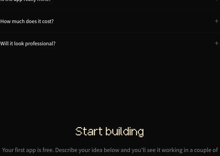
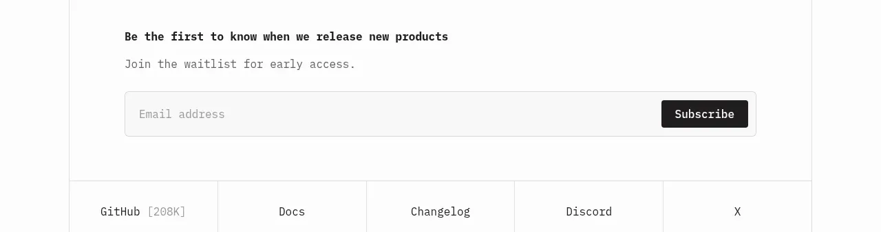
A simple waitlist band uses a clear promise, short supporting line, and a wide email field paired with a dark subscribe action.
Prompt preview
## Reference images

Study these alongside the description below: hierarchy, rhythm, spacing, colour. Build for the product you are asked about, using this design language.

- Component: https://kage-design-assets.t3.tigrisfiles.io/components/opencode-2-0/565a21f1-5840-46fe-9e23-a71210513fd4-1791957897-7.webp
- Full page it was cut from: https://kage-design-assets.t3.tigrisfiles.io/screenshots/opencode-2-0/565a21f1-5840-46fe-9e23-a71210513fd4-1791957827568-full.webp
- Component on Kage: https://kage.design/component/opencode-2-0-form

## Before you start
Ask what the signup is for, what incentive or expectation should be stated, and what brand styling the user's product uses. Then build this form for that context.

Create a low-friction email signup section. Put a bold 14–16px heading and one muted supporting line above a single horizontal form. Use a wide input with placeholder text, a dark submit button aligned inside or beside the field, and clear success/error messaging below without shifting the layout dramatically. Use #fafafa background, a 1px #dedede input border, 6px radius, near-black #202020 button, 13–14px monospace or technical labels, and 14–16px comfortable field height. Validate email accessibly, support Enter submission, show a loading state, and stack the controls on mobile.

Never: use the reference logo, product name, copy, illustrations, or imagery.