kage
kage
agentshrine.com

Design analysis
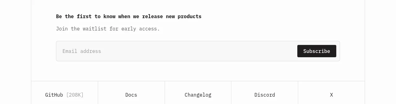
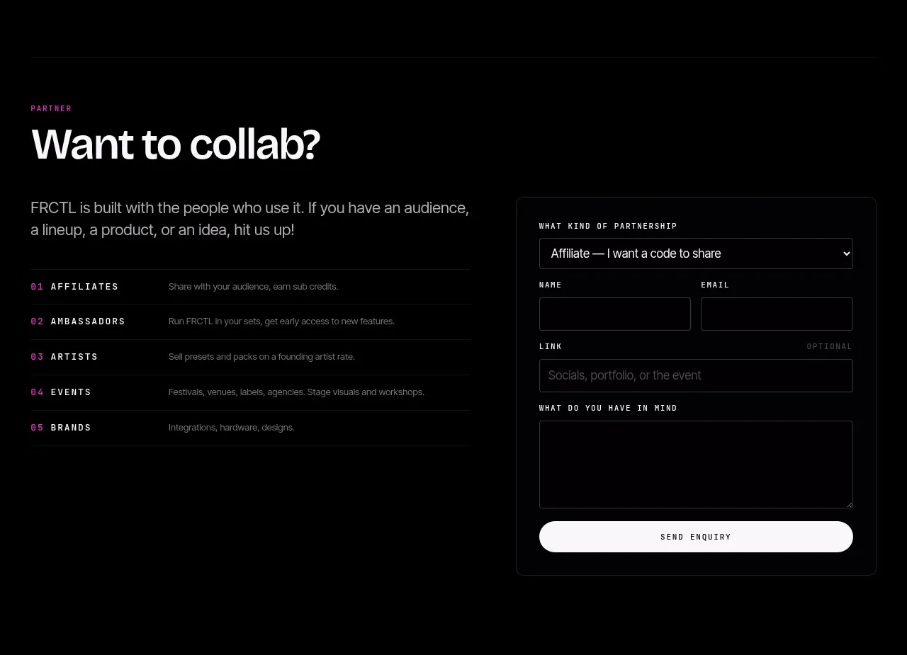
A small centered fallback CTA addresses users outside the primary platform. It pairs a reassuring sentence with an email field and compact submit button, keeping the final conversion path lightweight.
Prompt preview
## Reference images

Study these alongside the description below: hierarchy, rhythm, spacing, colour. Build for the product you are asked about, using this design language.

- Component: https://kage-design-assets.t3.tigrisfiles.io/components/shrine/ff477ea2-1694-4783-bdc4-4322fec31da4-1792130653-7.webp
- Full page it was cut from: https://kage-design-assets.t3.tigrisfiles.io/screenshots/shrine/ff477ea2-1694-4783-bdc4-4322fec31da4-1792130580085-full.webp
- Component on Kage: https://kage.design/component/shrine-form

## Before you start
Ask what fallback action the user's product should offer, what information is needed, and what brand voice and accessibility requirements apply. Then build the form using these principles.

- Use a centered, narrow form block with a clear heading, one reassuring sentence, and a single input plus primary submit button.
- Keep the form visually lightweight on the page: white or near-white background, dark text, muted helper copy, and a subtle border around controls.
- Use a horizontal input/button arrangement at larger widths and stack them on small screens. Inputs should have a comfortable height, visible label or accessible aria-label, and clear focus state.
- Use a modest radius around 5–8px, a restrained shadow only if needed, and a dark or brand-colored button with strong contrast.
- Include validation, loading, success, and error states without shifting surrounding content unexpectedly.

Never: use the reference's logo, product name, copy, illustrations, imagery, or exact visual assets.