kage
kage
navige.ai
Design analysis
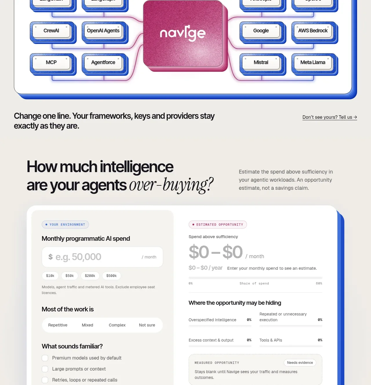
A calculator-style form pairs environment inputs on the left with a measured opportunity result on the right inside a large elevated white panel.
Prompt preview
## Reference images

Study these alongside the description below: hierarchy, rhythm, spacing, colour. Build for the product you are asked about, using this design language.

- Component: https://kage-design-assets.t3.tigrisfiles.io/components/navige/e3ee1ee4-7855-4062-a956-cf327122240e-1792130701-8.webp
- Full page it was cut from: https://kage-design-assets.t3.tigrisfiles.io/screenshots/navige/e3ee1ee4-7855-4062-a956-cf327122240e-1792130598253-full.webp
- Component on Kage: https://kage.design/component/navige-form

## Before you start
Ask what inputs the user's product needs, what estimate it can responsibly provide, and what evidence or disclaimer is required. Apply the principles below to that product rather than reproducing this reference.

Build a calculator section with a large two-column heading area: a bold question on the left and explanatory copy on the right. Below, place a large white card with a cobalt offset shadow and rounded 24px corners. The left column contains labeled inputs, segmented choices, and checkboxes for the user's current environment. The right column contains a muted estimate result, progress or breakdown rows, an evidence note, and a magenta primary action. Use #f5f4ef page background, white #ffffff card surfaces, #2457d6 accents, #c13b7a action colour, and #111217 text. Use 14–16px labels, 40–52px question typography, 12px helper text, 12–16px controls, and clear focus rings.

Validate fields inline, update estimates without blocking the user, explain assumptions, and keep the result clearly labelled as illustrative until evidence is available. Stack columns on mobile.

Never: use logos, product names, copy, illustrations, or imagery from the reference.