 kage
kage
diagramly.xyz
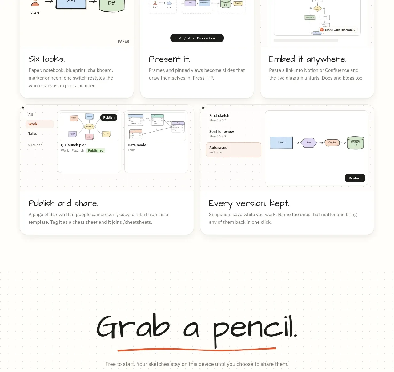
Design analysis
A section eyebrow and large heading introduce a varied card grid. Each card combines a small product vignette with a memorable benefit statement and short explanation, creating a scannable product tour.
Prompt preview
## Reference images

Study these alongside the description below: hierarchy, rhythm, spacing, colour. Build for the product you are asked about, using this design language.

- Component: https://kage-design-assets.t3.tigrisfiles.io/components/diagramly/9b8d5fcc-855c-4b01-a046-ef496ed19a9b-1792044171-2.webp
- Full page it was cut from: https://kage-design-assets.t3.tigrisfiles.io/screenshots/diagramly/9b8d5fcc-855c-4b01-a046-ef496ed19a9b-1792044070781-full.webp
- Component on Kage: https://kage.design/component/diagramly-feature-grid

## Before you start
Ask the user what product capabilities should be highlighted, which audience matters most, and what brand system to use. Then design an original feature showcase based on the rules below.

Build a product-tour section with a centered eyebrow and large hand-drawn-style heading, followed by a responsive masonry-like grid of six feature cards. Use a mixture of two-column and three-column cards so the layout feels editorial rather than repetitive. Each card should have a visual/product vignette on top and a title plus concise explanatory paragraph below.

### Design language
- Use a warm paper background near `#fcfbf7` with a faint dotted grid, dark text `#252522`, muted body text `#77756f`, and coral accent `#df5b3e`.
- Set the section heading in an expressive display face, approximately 44–62px desktop, with a small uppercase eyebrow in a compact sans-serif.
- Use a 14–18px grid gap and cards with white or slightly warmer surfaces, 1px border near `#e9e6de`, 18–22px radius, and a restrained soft shadow.
- Give each card a generous visual area with simplified original interface sketches, diagrams, checklists, metrics, version panels, or presentation frames. Keep visual treatments consistent but vary the content.
- Put card titles in a distinctive display face at roughly 22–28px; use 14–16px body copy with comfortable line height.
- The first row may use two wide cards, the middle row three smaller cards, and the final row two wide cards. On mobile, stack cards in a single column while preserving feature priority.
- Add subtle hover elevation or border-color transitions, but do not let interaction distract from reading.

### Never
- Never use logos, product names, copy, illustrations, or imagery from the reference.
- Never reproduce the reference card titles, exact interface vignettes, screenshot arrangements, or feature claims.
More components
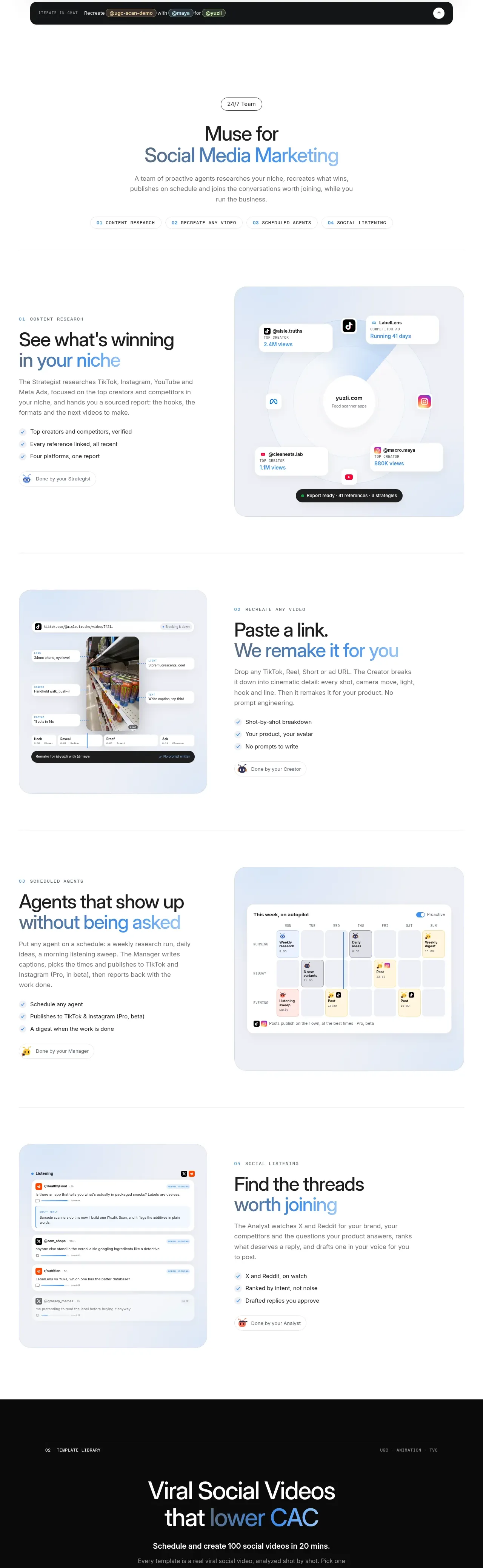
 Research and automation capabilities
AdAnt 2.0 · Feature grid
Research and automation capabilities
AdAnt 2.0 · Feature grid
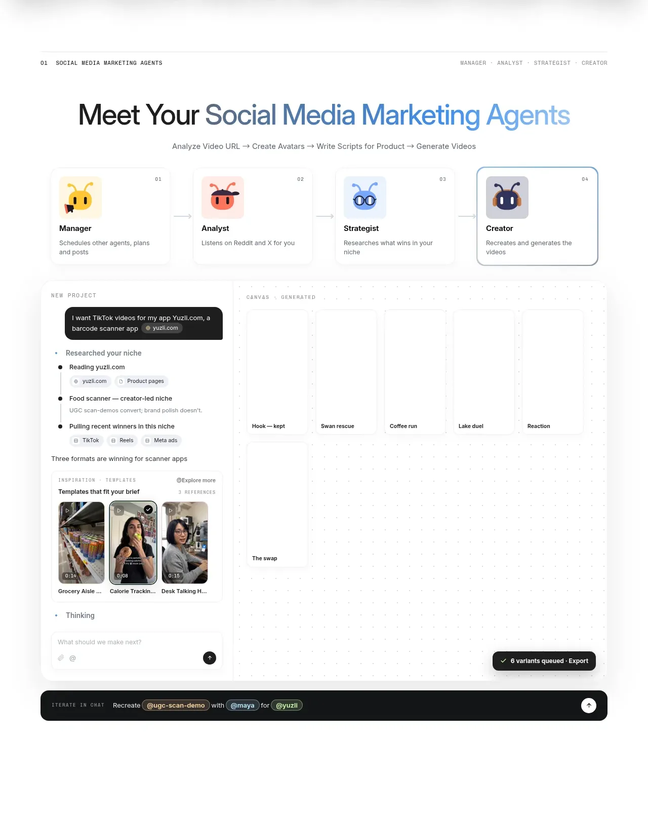 Agent team workspace
AdAnt 2.0 · Feature grid
Agent team workspace
AdAnt 2.0 · Feature grid
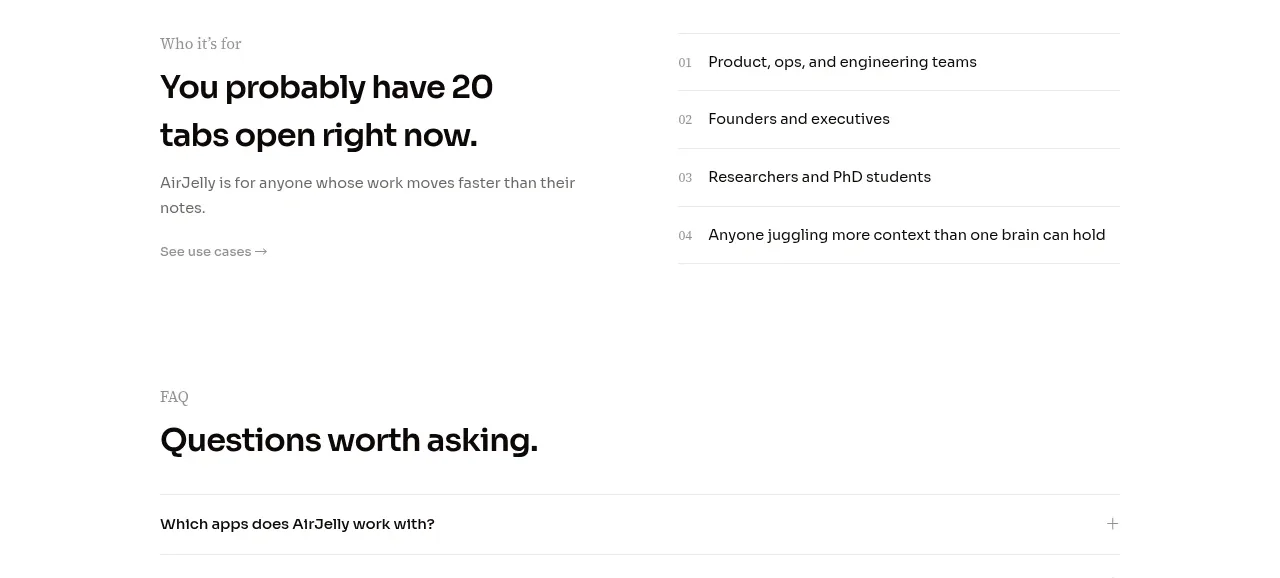
 Audience and use cases
AirJelly · Feature grid
Audience and use cases
AirJelly · Feature grid
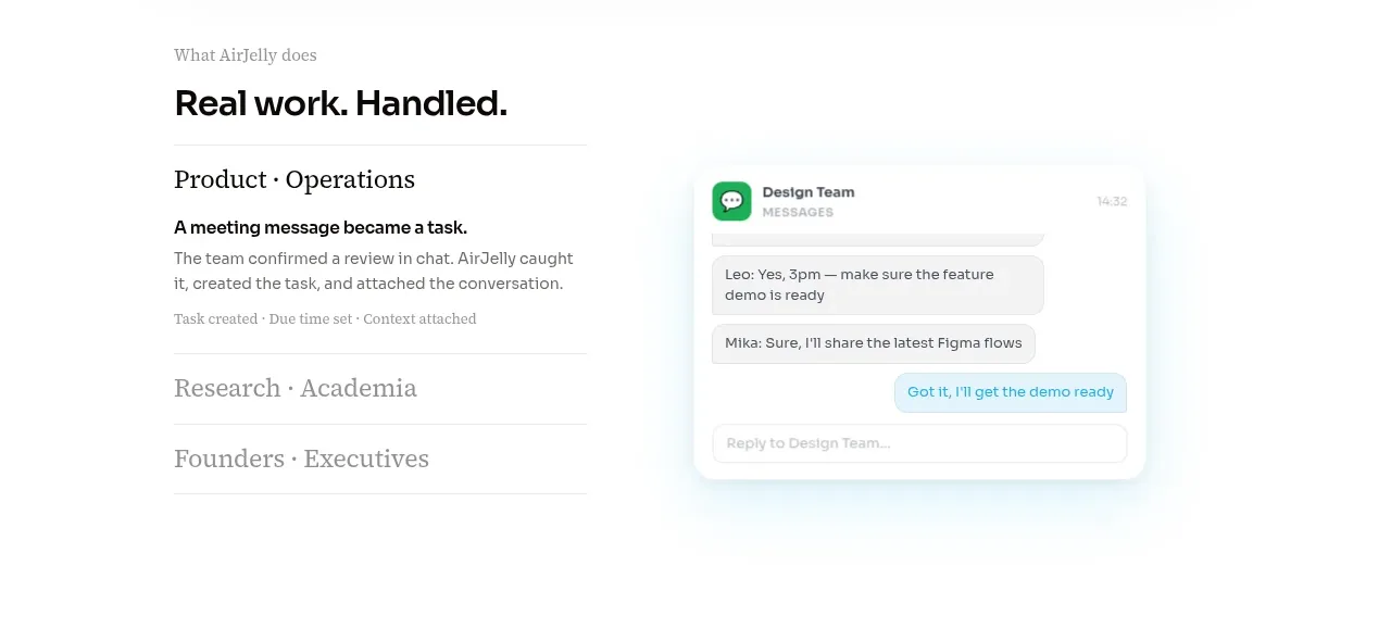 Real work handled showcase
AirJelly · Feature grid
Real work handled showcase
AirJelly · Feature grid
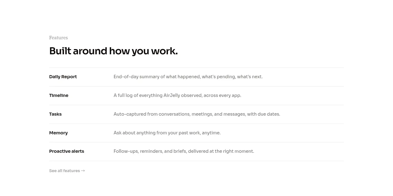 Feature capabilities list
AirJelly · Feature grid
Feature capabilities list
AirJelly · Feature grid
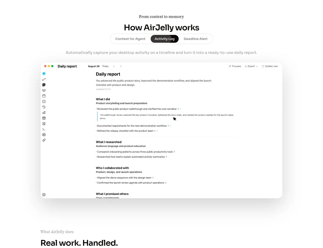 How the product works demo
AirJelly · Feature grid
How the product works demo
AirJelly · Feature grid