kage
kage
diagramly.xyz
Design analysis
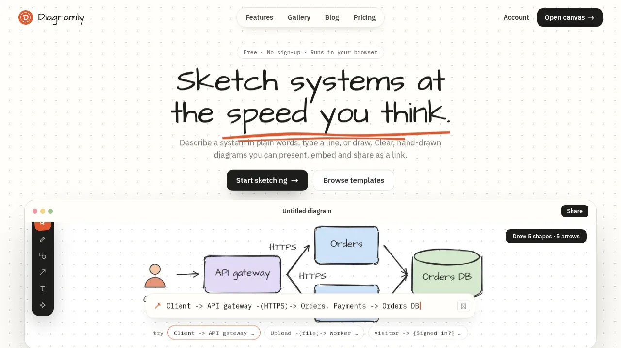
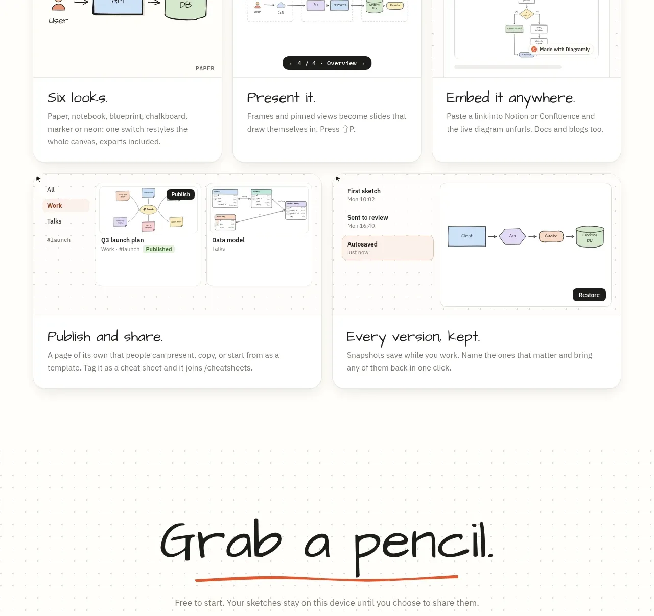
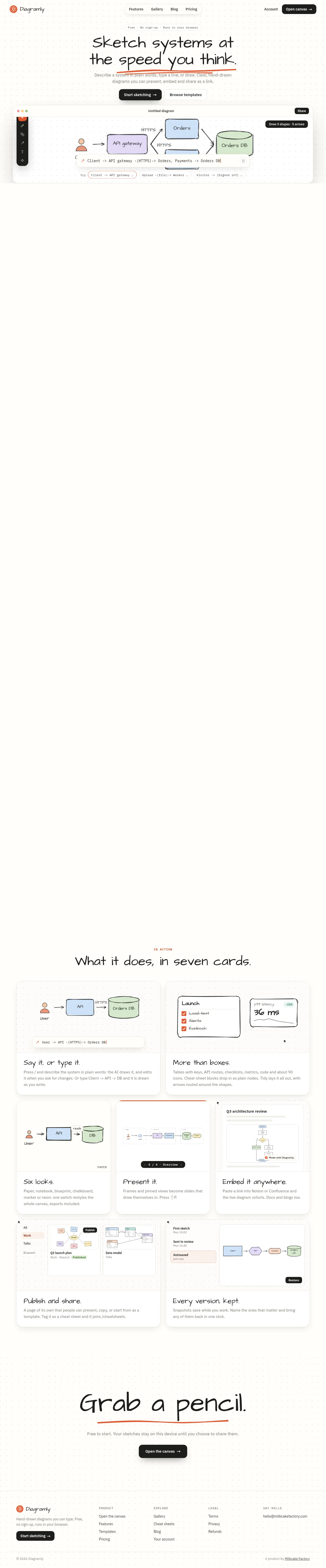
A spacious, paper-like landing page uses a faint dot grid, loose hand-drawn display type, and restrained black-and-white UI with orange marker accents. The hero is intentionally sparse around a large canvas mockup; after a long pause, the page shifts into a dense seven-card feature grid, then returns to a quiet dot-grid CTA and structured footer.
Prompt preview
## Reference images

Study these alongside the description below: hierarchy, rhythm, spacing, colour. Build for the product you are asked about, using this design language.

- Full page: https://kage-design-assets.t3.tigrisfiles.io/screenshots/diagramly/9b8d5fcc-855c-4b01-a046-ef496ed19a9b-1792044070781-full.webp
- Above the fold: https://kage-design-assets.t3.tigrisfiles.io/screenshots/diagramly/9b8d5fcc-855c-4b01-a046-ef496ed19a9b-1792044067075.webp
- Design on Kage: https://kage.design/designs/diagramly-landing-page

## Before you start
Ask the user what they are building, who it is for, and which brand assets they already have (name, colours, typefaces, logo, and any illustration or product-screen assets). Wait for their answers before designing. Apply everything below to that product, not to the reference product.

## Page structure
1. **Top navigation:** Place a compact logo area at the left, centered or lightly floating navigation links, and account/open-product actions at the right. Keep the bar narrow, quiet, and aligned to a wide content grid.
2. **Hero eyebrow:** Add a small pill or micro-label communicating the product’s low-friction positioning above the headline.
3. **Hero headline:** Center a large two-line hand-drawn-style headline with a slightly irregular baseline and an orange hand-marked underline beneath the key phrase.
4. **Hero explanation and actions:** Add a short muted paragraph, then pair a solid black primary button with a light outlined secondary button.
5. **Product canvas mockup:** Show a wide rounded browser-like diagram editor directly below the hero. Include a slim top bar, left vertical tool rail, dotted canvas, simple coloured diagram nodes, arrows, a share control, and a natural-language command/input strip so the product is understood visually.
6. **Long breathing space:** Preserve a deliberately large white interval after the hero mockup before the next content section; this creates a scroll pause and makes the feature section feel like a new chapter.
7. **Feature section heading:** Introduce the section with a tiny orange uppercase eyebrow and a centered hand-drawn headline stating the number of feature cards.
8. **Feature card grid, first row:** Use two wide cards. Each card has a dotted-grid product illustration on top, a fine divider, a handwritten-style title, and small gray explanatory copy below. Cover text-to-diagram input and richer diagram primitives/metrics.
9. **Feature card grid, second row:** Use three narrower cards with the same framed illustration-plus-copy structure. Show visual style switching, presentation/slideshow framing, and embedded/shared diagrams.
10. **Feature card grid, third row:** Use two wide cards again. Demonstrate publishing/sharing workflows and retained versions/history using miniature application UI scenes.
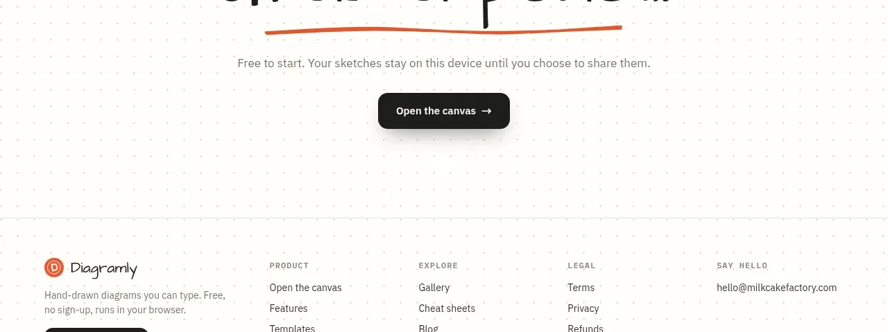
11. **Closing CTA:** Return to a broad dotted-paper band with a centered oversized hand-drawn headline, orange underline, one muted supporting sentence, and one black primary button.
12. **Footer:** Build a dotted-grid footer with the brand block and CTA at left, then grouped product, explore, and legal links, plus a contact column. Finish with a thin divider and small copyright/credit row.

## Design language
- Use a paper-white base, approximately `#fffefb`, with very pale gray dotted grid marks around `#e6e3dc`; let the grid appear in the hero, product mockups, feature illustrations, CTA, and footer rather than as a universal heavy texture.
- Build hierarchy through scale and spacing, not saturated colour: very large loose handwritten display type for hero and section headings, compact neutral sans-serif for navigation and body copy, and tiny uppercase labels with generous letter spacing for eyebrows.
- Treat the layout as editorial and spacious at the top: centered hero, generous vertical whitespace, then increase density in the feature-card region before opening the rhythm again for the closing CTA.
- Keep the palette restrained: near-black `#171717` for type and primary buttons, soft gray `#77736d` for supporting copy, white/off-white surfaces, and a warm orange-red accent around `#d95b35` for underlines, active marks, and small labels.
- Use hand-drawn irregularity selectively in headlines, diagram strokes, arrows, and mockup content; surrounding layout, navigation, and controls should remain precise enough to feel usable.
- Frame feature cards and the main canvas with thin warm-gray borders, large rounded corners around `18–24px`, white surfaces, and very soft low-contrast shadows. Avoid glossy gradients, deep shadows, and excessive glass effects.
- Make the cards feel like specimen sheets: illustration area first, then a clear divider and readable text block. Use consistent internal padding while varying card widths to create a two/three/two editorial rhythm.
- Represent product examples with simple outlined shapes, thin arrows, handwritten labels, pastel blue/green/lilac/orange fills, and miniature controls. Keep diagrams legible and sparse rather than turning them into decorative illustrations.
- Buttons should be compact, rounded, nearly black, white-labeled, and use a simple arrow affordance; secondary actions should be white with a thin border. Provide clear hover states through slight lift, darker border, or subtle shadow rather than colour shifts.
- Keep motion understated: cards may rise by a few pixels on hover, dotted backgrounds should remain static, and product mockups can use gentle entrance reveals. Do not add distracting parallax or looping animation.
- On smaller screens, collapse navigation into a simple menu, stack hero actions, preserve the canvas mockup’s horizontal composition with safe overflow or a responsive crop, and change the feature grid to one column while retaining the illustration/text order.

## Never
- Do not reuse Diagramly’s logo, wordmark, product name, tagline, copy, exact diagram content, illustrations, icon set, or screenshots.
- Do not present the result as Diagramly or imply affiliation with it.
- Create original brand assets, content, diagrams, and product examples for the user’s product while preserving only the reusable layout and visual principles.