 kage
kage
diewithme.co
Design analysis
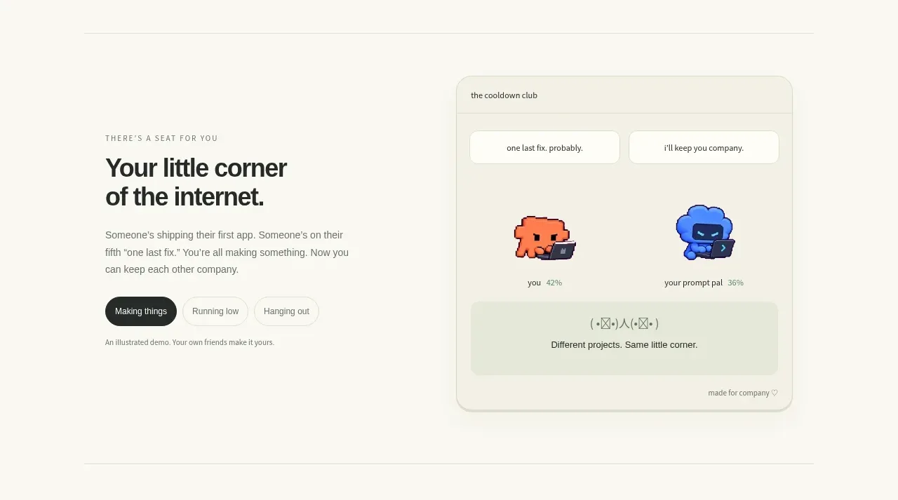
A two-column introduction pairs a clear editorial message on the left with a large rounded product preview on the right, making the emotional promise tangible.
Prompt preview
## Reference images

Study these alongside the description below: hierarchy, rhythm, spacing, colour. Build for the product you are asked about, using this design language.

- Component: https://kage-design-assets.t3.tigrisfiles.io/components/die-with-me/0682dea9-a1fa-4b17-a0ad-c426bf87c57f-1789711343-2.webp
- Full page it was cut from: https://kage-design-assets.t3.tigrisfiles.io/screenshots/die-with-me/0682dea9-a1fa-4b17-a0ad-c426bf87c57f-1789711263535-full.webp
- Component on Kage: https://kage.design/component/die-with-feature-grid

## Before you start
Ask what the user's product does and what emotional promise its brand should make. Use the rules below to invent an original section for it.

Create a split feature section inside a centered max-width container. Put a small uppercase eyebrow, strong two-line heading, descriptive paragraph, and a compact segmented control or category pill row in the left column. Put a large rounded product preview/card in the right column. The preview should feel like a believable interface artifact, using a pale sage/cream surface around `#eff0df`, soft border `#d9dbca`, radius 16–20px, and a very subtle shadow. Maintain an asymmetric but balanced layout, with the text column slightly narrower than the visual column. Use dark charcoal typography (`#242622`), muted copy (`#73766c`), and a single dark active pill. On small screens, stack the visual below the text.

Never: use logos, product names, copy, illustrations, or imagery from the reference.
More components

 AI-powered helpdesk feature section
intercom.com · Feature grid
AI-powered helpdesk feature section
intercom.com · Feature grid
 Integrations and ecosystem section
intercom.com · Feature grid
Integrations and ecosystem section
intercom.com · Feature grid
 AI agent capabilities section
intercom.com · Feature grid
AI agent capabilities section
intercom.com · Feature grid
 Unified support experience overview
intercom.com · Feature grid
Unified support experience overview
intercom.com · Feature grid

 Core invoicing capabilities
sendinvo.com · Feature grid
Core invoicing capabilities
sendinvo.com · Feature grid
 Audience and trade types
sendinvo.com · Feature grid
Audience and trade types
sendinvo.com · Feature grid