 kage
kage
diewithme.co
Design analysis
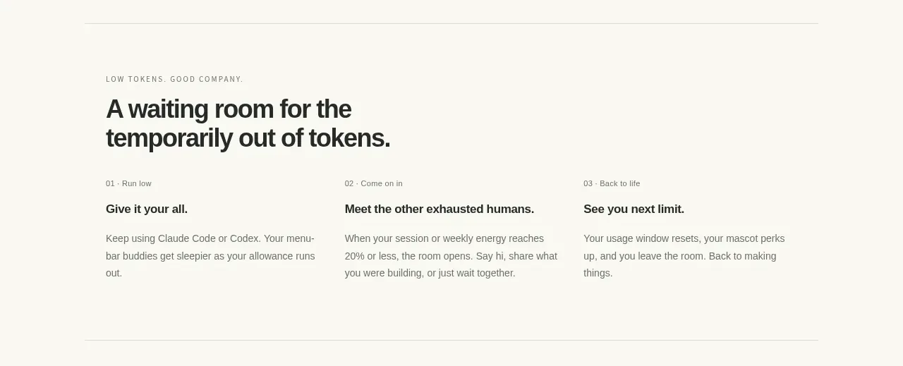
Three evenly spaced columns explain the product loop as a simple progression, with numbered labels, bold subheads, and concise supporting copy.
Prompt preview
## Reference images

Study these alongside the description below: hierarchy, rhythm, spacing, colour. Build for the product you are asked about, using this design language.

- Component: https://kage-design-assets.t3.tigrisfiles.io/components/die-with-me/0682dea9-a1fa-4b17-a0ad-c426bf87c57f-1789711343-3.webp
- Full page it was cut from: https://kage-design-assets.t3.tigrisfiles.io/screenshots/die-with-me/0682dea9-a1fa-4b17-a0ad-c426bf87c57f-1789711263535-full.webp
- Component on Kage: https://kage.design/component/die-with-feature-grid-2

## Before you start
Ask what workflow or journey the user's product helps people complete. Then adapt this pattern with original terminology and content.

Build a three-column explanatory section with a short eyebrow and a large heading above the columns. Each column should have a tiny sequential index, a bold one-line title, and two to four lines of muted explanatory text. Use a generous grid gap, left alignment, and a thin divider above or below the section to establish rhythm. Typography should be a clean sans-serif: small uppercase labels with letter spacing, headings in near-black `#242622`, and body text in gray `#74776e`. Keep the section airy rather than card-heavy; do not enclose each step in a separate box. Make the layout responsive by stacking the steps vertically on narrow screens.

Never: use logos, product names, copy, illustrations, or imagery from the reference.
More components

 AI-powered helpdesk feature section
intercom.com · Feature grid
AI-powered helpdesk feature section
intercom.com · Feature grid
 Integrations and ecosystem section
intercom.com · Feature grid
Integrations and ecosystem section
intercom.com · Feature grid
 AI agent capabilities section
intercom.com · Feature grid
AI agent capabilities section
intercom.com · Feature grid
 Unified support experience overview
intercom.com · Feature grid
Unified support experience overview
intercom.com · Feature grid

 Core invoicing capabilities
sendinvo.com · Feature grid
Core invoicing capabilities
sendinvo.com · Feature grid
 Audience and trade types
sendinvo.com · Feature grid
Audience and trade types
sendinvo.com · Feature grid