 kage
kage
diewithme.co
Design analysis
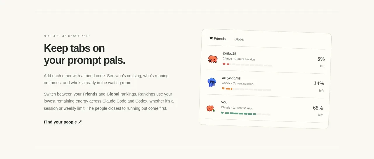
A reversed split layout explains connection and discovery beside a tilted rankings-style interface card, giving the abstract social feature a concrete visual anchor.
Prompt preview
## Reference images

Study these alongside the description below: hierarchy, rhythm, spacing, colour. Build for the product you are asked about, using this design language.

- Component: https://kage-design-assets.t3.tigrisfiles.io/components/die-with-me/0682dea9-a1fa-4b17-a0ad-c426bf87c57f-1789711344-4.webp
- Full page it was cut from: https://kage-design-assets.t3.tigrisfiles.io/screenshots/die-with-me/0682dea9-a1fa-4b17-a0ad-c426bf87c57f-1789711263535-full.webp
- Component on Kage: https://kage.design/component/die-with-feature-grid-3

## Before you start
Ask what social, collaboration, or community behavior the user's product supports. Apply the same communication strategy with an original interface concept.

Create a two-column feature section with the interface preview on the right and editorial text on the left. Use a small eyebrow, a compact two-line heading, explanatory paragraphs, and a text link with an arrow-style affordance. The visual should be a slightly rotated or offset rounded dashboard card, with a cream background `#fbfaf5`, hairline border `#d8d8cd`, subtle shadow, and a few rows showing people/items, statuses, and progress values. Keep the preview legible but subordinate to the heading. Use careful baseline alignment and plenty of whitespace. Add a reduced-motion alternative so the tilt is removed for users who prefer reduced motion.

Never: use logos, product names, copy, illustrations, or imagery from the reference.
More components

 AI-powered helpdesk feature section
intercom.com · Feature grid
AI-powered helpdesk feature section
intercom.com · Feature grid
 Integrations and ecosystem section
intercom.com · Feature grid
Integrations and ecosystem section
intercom.com · Feature grid
 AI agent capabilities section
intercom.com · Feature grid
AI agent capabilities section
intercom.com · Feature grid
 Unified support experience overview
intercom.com · Feature grid
Unified support experience overview
intercom.com · Feature grid

 Core invoicing capabilities
sendinvo.com · Feature grid
Core invoicing capabilities
sendinvo.com · Feature grid
 Audience and trade types
sendinvo.com · Feature grid
Audience and trade types
sendinvo.com · Feature grid