 kage
kage
diewithme.co
Design analysis
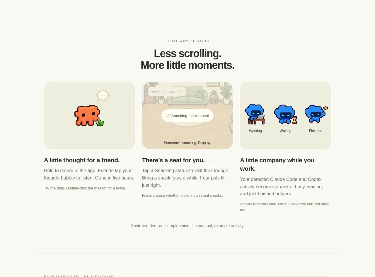
A centered heading introduces three adjacent visual cards, each followed by a bold benefit and supporting copy, turning product behaviors into memorable moments.
Prompt preview
## Reference images

Study these alongside the description below: hierarchy, rhythm, spacing, colour. Build for the product you are asked about, using this design language.

- Component: https://kage-design-assets.t3.tigrisfiles.io/components/die-with-me/0682dea9-a1fa-4b17-a0ad-c426bf87c57f-1789711344-5.webp
- Full page it was cut from: https://kage-design-assets.t3.tigrisfiles.io/screenshots/die-with-me/0682dea9-a1fa-4b17-a0ad-c426bf87c57f-1789711263535-full.webp
- Component on Kage: https://kage.design/component/die-with-feature-grid-4

## Before you start
Ask what three distinctive moments or use cases define the user's product. Build an original gallery around those moments.

Build a three-column feature gallery. Center a small eyebrow and two-line heading above three equal cards. Each card should have a soft tinted visual panel with radius 18px, a very subtle border, and an original UI vignette or abstract illustration; use a restrained palette such as cream `#f4f3e6`, pale green `#e7eadb`, and a muted accent chosen for the brand. Below each visual, place a bold benefit title, a short paragraph, and optionally a tiny secondary note. Keep card imagery height consistent and align the text baselines. Add hover elevation or a slight visual shift only if it supports discovery, and ensure the content remains understandable without the visuals.

Never: use logos, product names, copy, illustrations, or imagery from the reference.
More components

 AI-powered helpdesk feature section
intercom.com · Feature grid
AI-powered helpdesk feature section
intercom.com · Feature grid
 Integrations and ecosystem section
intercom.com · Feature grid
Integrations and ecosystem section
intercom.com · Feature grid
 AI agent capabilities section
intercom.com · Feature grid
AI agent capabilities section
intercom.com · Feature grid
 Unified support experience overview
intercom.com · Feature grid
Unified support experience overview
intercom.com · Feature grid

 Core invoicing capabilities
sendinvo.com · Feature grid
Core invoicing capabilities
sendinvo.com · Feature grid
 Audience and trade types
sendinvo.com · Feature grid
Audience and trade types
sendinvo.com · Feature grid