 kage
kage
diewithme.co
Design analysis
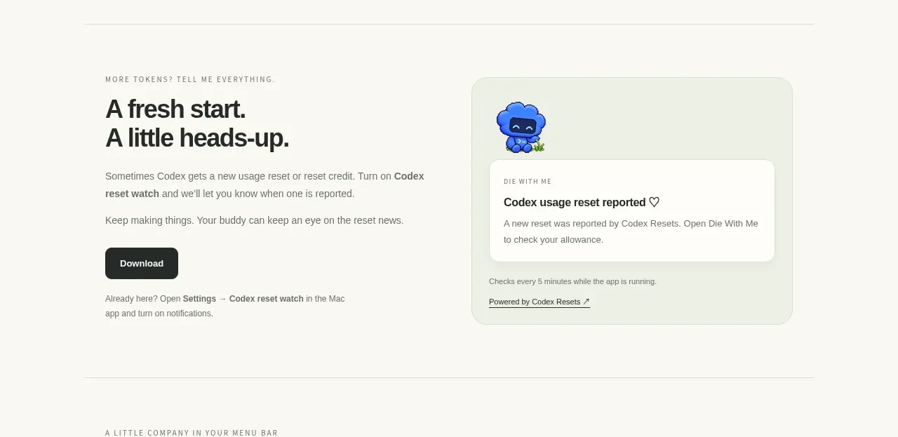
A reassuring split section explains an important product state on the left and shows a notification-style preview on the right, reducing uncertainty through timely feedback.
Prompt preview
## Reference images

Study these alongside the description below: hierarchy, rhythm, spacing, colour. Build for the product you are asked about, using this design language.

- Component: https://kage-design-assets.t3.tigrisfiles.io/components/die-with-me/0682dea9-a1fa-4b17-a0ad-c426bf87c57f-1789711344-6.webp
- Full page it was cut from: https://kage-design-assets.t3.tigrisfiles.io/screenshots/die-with-me/0682dea9-a1fa-4b17-a0ad-c426bf87c57f-1789711263535-full.webp
- Component on Kage: https://kage.design/component/die-with-feature-grid-5

## Before you start
Ask what important status, reminder, or lifecycle event the user's product needs to communicate. Then design an original explanation and preview.

Create a split feature section with editorial content on the left: eyebrow, strong heading, two concise paragraphs, and a dark primary action. On the right, show a rounded notification or status panel on a pale tinted surface around `#edf1e5`, with a small contextual visual, a white inner message card, clear status title, and muted metadata. Use charcoal `#242622`, gray `#73766c`, thin borders around `#d9dbcf`, and 16px corner radii. The message should feel calm and useful rather than alarming. Keep the action hierarchy clear and make the notification preview decorative but semantically labeled for screen readers.

Never: use logos, product names, copy, illustrations, or imagery from the reference.
More components

 AI-powered helpdesk feature section
intercom.com · Feature grid
AI-powered helpdesk feature section
intercom.com · Feature grid
 Integrations and ecosystem section
intercom.com · Feature grid
Integrations and ecosystem section
intercom.com · Feature grid
 AI agent capabilities section
intercom.com · Feature grid
AI agent capabilities section
intercom.com · Feature grid
 Unified support experience overview
intercom.com · Feature grid
Unified support experience overview
intercom.com · Feature grid

 Core invoicing capabilities
sendinvo.com · Feature grid
Core invoicing capabilities
sendinvo.com · Feature grid
 Audience and trade types
sendinvo.com · Feature grid
Audience and trade types
sendinvo.com · Feature grid