 kage
kage
diewithme.co
Design analysis
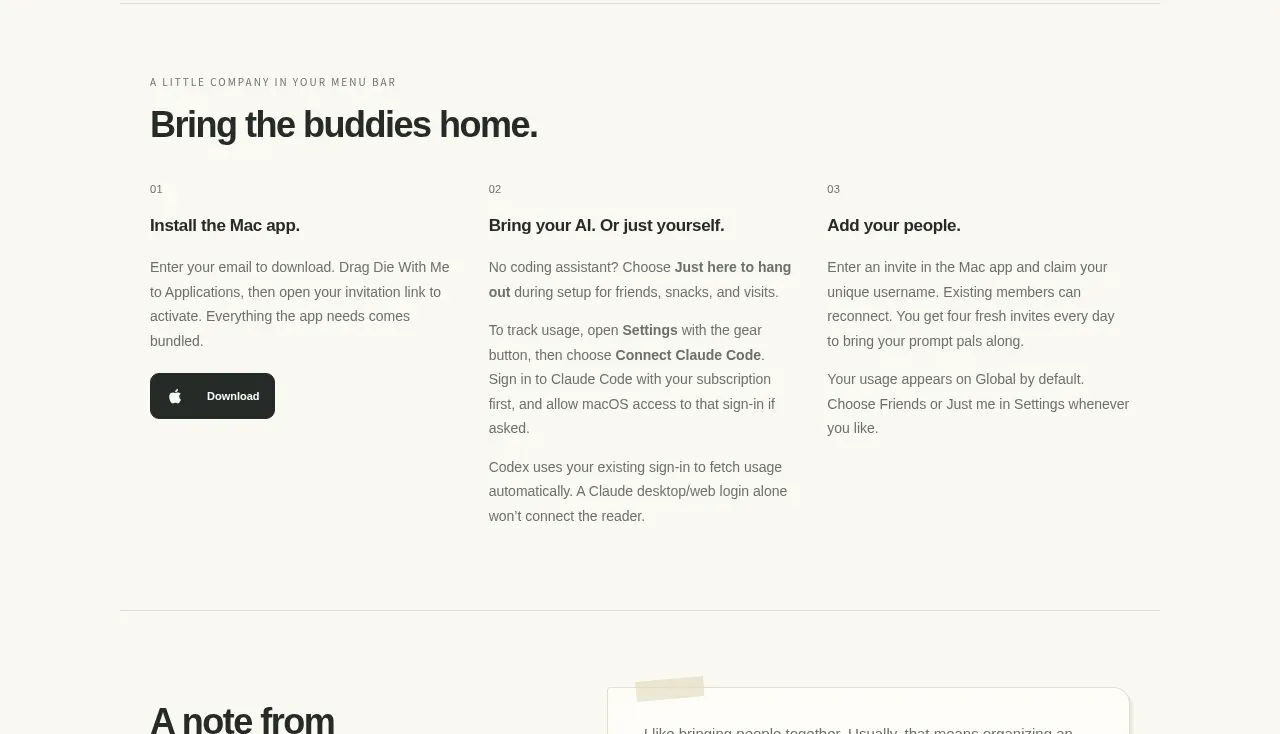
A three-column onboarding section makes setup approachable by pairing sequential labels with plain-language explanations and one prominent download action.
Prompt preview
## Reference images

Study these alongside the description below: hierarchy, rhythm, spacing, colour. Build for the product you are asked about, using this design language.

- Component: https://kage-design-assets.t3.tigrisfiles.io/components/die-with-me/0682dea9-a1fa-4b17-a0ad-c426bf87c57f-1789711344-7.webp
- Full page it was cut from: https://kage-design-assets.t3.tigrisfiles.io/screenshots/die-with-me/0682dea9-a1fa-4b17-a0ad-c426bf87c57f-1789711263535-full.webp
- Component on Kage: https://kage.design/component/die-with-feature-grid-6

## Before you start
Ask what the user's first-run setup requires and what audience needs the most reassurance. Adapt this structure with original steps.

Build a three-column onboarding/instructions section with an eyebrow and a strong heading above the grid. Each column has a small numeric label, a bold step title, several short paragraphs, and optionally one primary download or start button in the first column. Use generous column spacing, no heavy cards, and a subtle horizontal rule to frame the section. Keep the reading order explicit for screen readers. Use a warm off-white background, near-black headings `#242622`, muted gray body text `#74776e`, and one dark button with 10px radius. Make the columns stack cleanly on mobile.

Never: use logos, product names, copy, illustrations, or imagery from the reference.
More components

 AI-powered helpdesk feature section
intercom.com · Feature grid
AI-powered helpdesk feature section
intercom.com · Feature grid
 Integrations and ecosystem section
intercom.com · Feature grid
Integrations and ecosystem section
intercom.com · Feature grid
 AI agent capabilities section
intercom.com · Feature grid
AI agent capabilities section
intercom.com · Feature grid
 Unified support experience overview
intercom.com · Feature grid
Unified support experience overview
intercom.com · Feature grid

 Core invoicing capabilities
sendinvo.com · Feature grid
Core invoicing capabilities
sendinvo.com · Feature grid
 Audience and trade types
sendinvo.com · Feature grid
Audience and trade types
sendinvo.com · Feature grid