kage
kage
diewithme.co
Design analysis
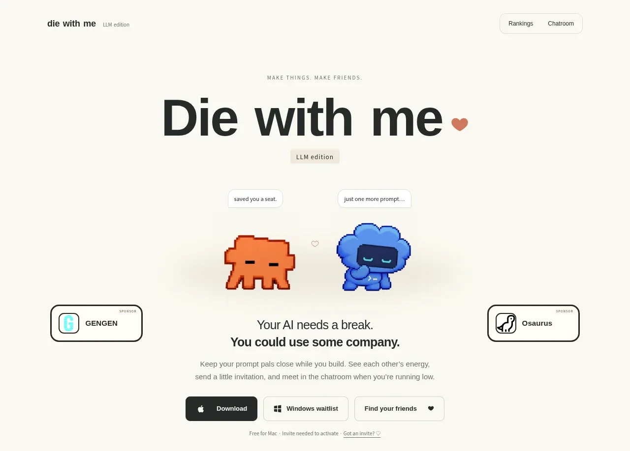
The hero combines a tiny eyebrow, oversized title, character visual, supporting statement, sponsor cards, and a compact download/action row into one expressive first impression.
Prompt preview
## Reference images

Study these alongside the description below: hierarchy, rhythm, spacing, colour. Build for the product you are asked about, using this design language.

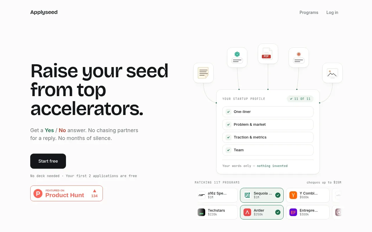
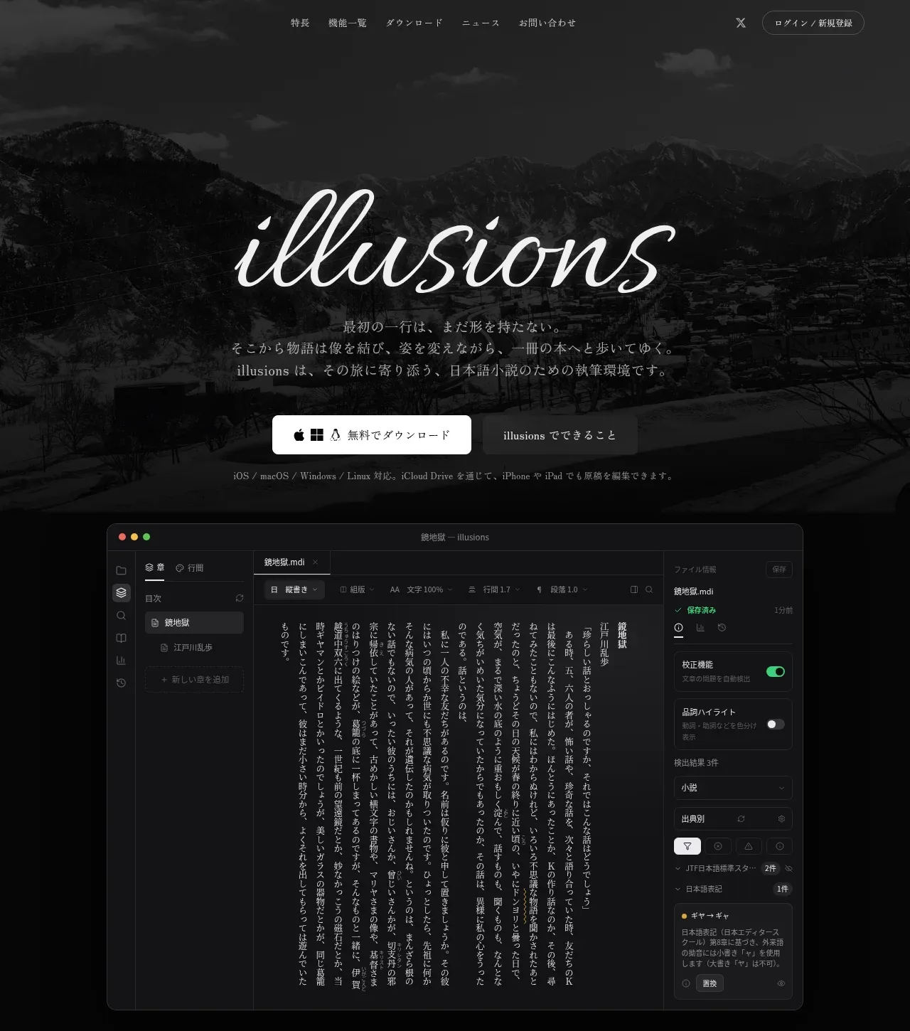
- Component: https://kage-design-assets.t3.tigrisfiles.io/components/die-with-me/0682dea9-a1fa-4b17-a0ad-c426bf87c57f-1789711343-1.webp
- Full page it was cut from: https://kage-design-assets.t3.tigrisfiles.io/screenshots/die-with-me/0682dea9-a1fa-4b17-a0ad-c426bf87c57f-1789711263535-full.webp
- Component on Kage: https://kage.design/component/die-with-hero

## Before you start
Ask what the user's product is, who it serves, and what brand personality should guide the art direction. Apply these principles to that product and create original content.

Build a centered hero section beneath the navigation with a warm paper-like background near `#f8f7f1`. Start with a small uppercase eyebrow, then a very large bold headline with tight line-height and one small accent detail in a contrasting coral tone such as `#d97b5e`. Place a friendly, original product visual or character scene below the title, with small floating labels that feel like interface notes. Follow it with a concise two-line value proposition, a short supporting paragraph, and a horizontal action group: one dark primary button, one pale secondary button, and one lightweight tertiary action. Keep content centered, use generous vertical spacing, and make sponsor/partner badges secondary with thin dark outlines and rounded corners. Buttons should support hover, focus, and pressed states.

Never: use logos, product names, copy, illustrations, or imagery from the reference.