kage
kage
diewithme.co
Design analysis
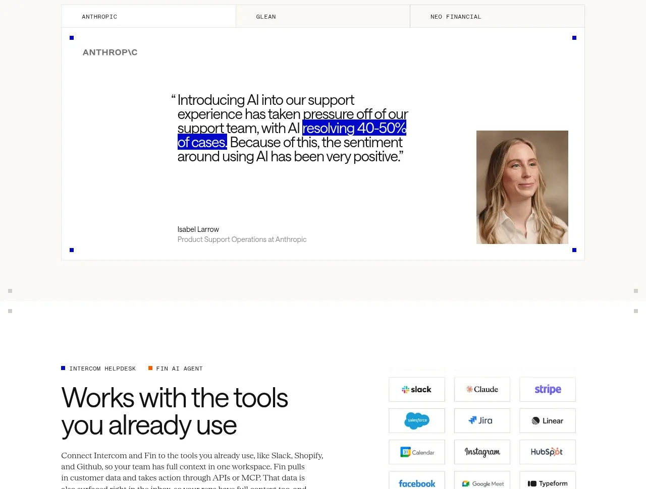
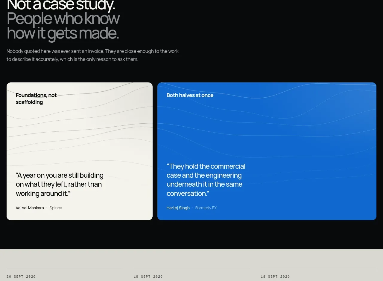
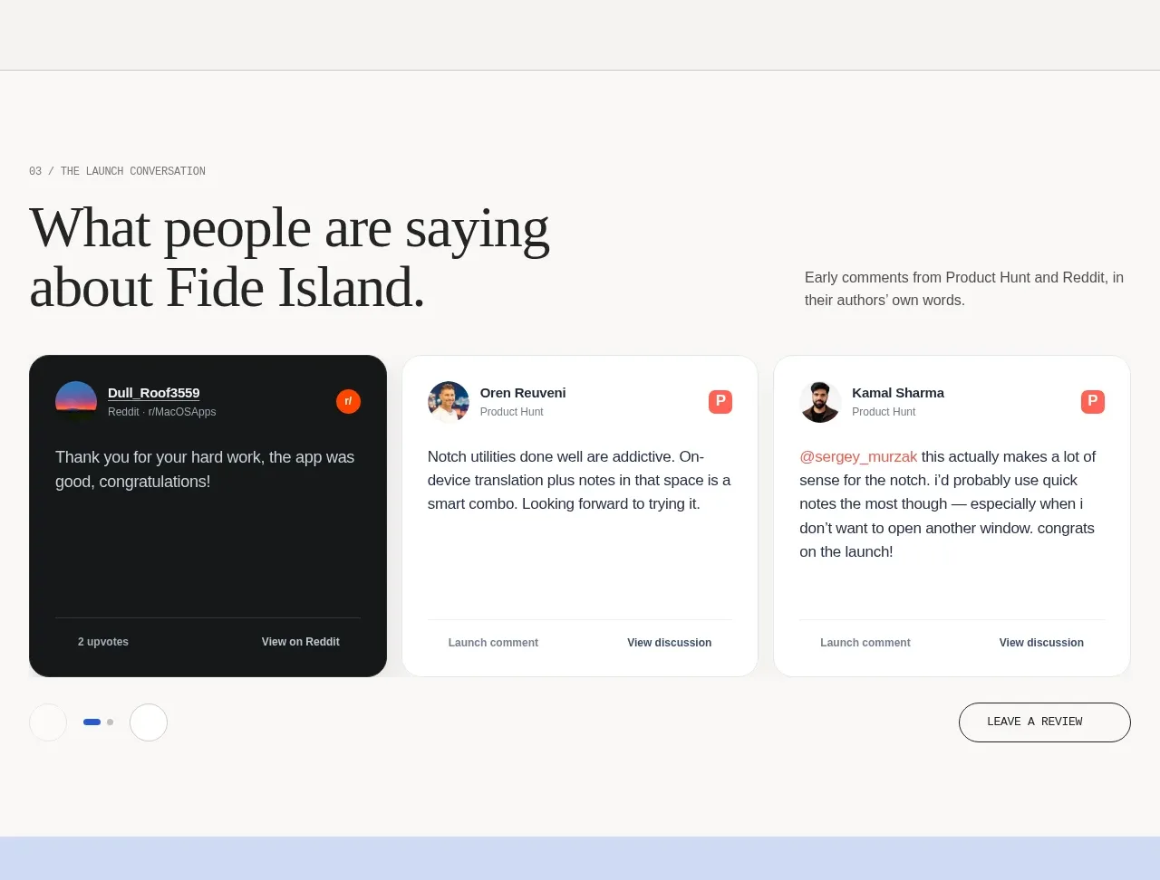
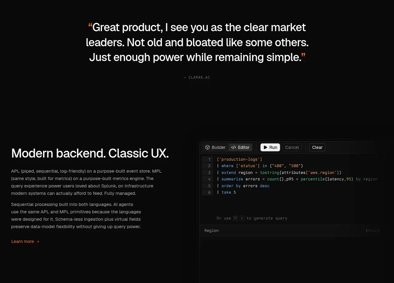
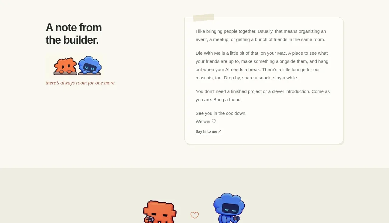
An editorial testimonial section balances a personal heading and small character mark against a large letter-like note card, creating trust without feeling corporate.
Prompt preview
## Reference images

Study these alongside the description below: hierarchy, rhythm, spacing, colour. Build for the product you are asked about, using this design language.

- Component: https://kage-design-assets.t3.tigrisfiles.io/components/die-with-me/0682dea9-a1fa-4b17-a0ad-c426bf87c57f-1789711345-8.webp
- Full page it was cut from: https://kage-design-assets.t3.tigrisfiles.io/screenshots/die-with-me/0682dea9-a1fa-4b17-a0ad-c426bf87c57f-1789711263535-full.webp
- Component on Kage: https://kage.design/component/die-with-testimonials

## Before you start
Ask whether the user's product has a founder story, customer perspective, or editorial message worth sharing. Use an original voice and content.

Create a personal testimonial/editorial section in a two-column layout. The left side has a large heading, a small supporting visual or abstract mark, and a short italic sign-off. The right side is a white letter-like card with rounded corners around 16px, a subtle border `#deded4`, a very soft shadow, and several short paragraphs of readable text plus a small closing link. Add a tiny tape-like accent or decorative detail only if it fits the brand. Maintain a calm cream canvas, high legibility, generous line-height, and an intimate tone. On mobile, place the note after the heading and keep the card width fluid.

Never: use logos, product names, copy, illustrations, or imagery from the reference.