kage
kage
dockfix.app
Design analysis
A light editorial section opens with an announcement headline and supporting paragraph, then presents product improvements as a disciplined two-column list of titled rows and explanatory copy.
Prompt preview
## Reference images

Study these alongside the description below: hierarchy, rhythm, spacing, colour. Build for the product you are asked about, using this design language.

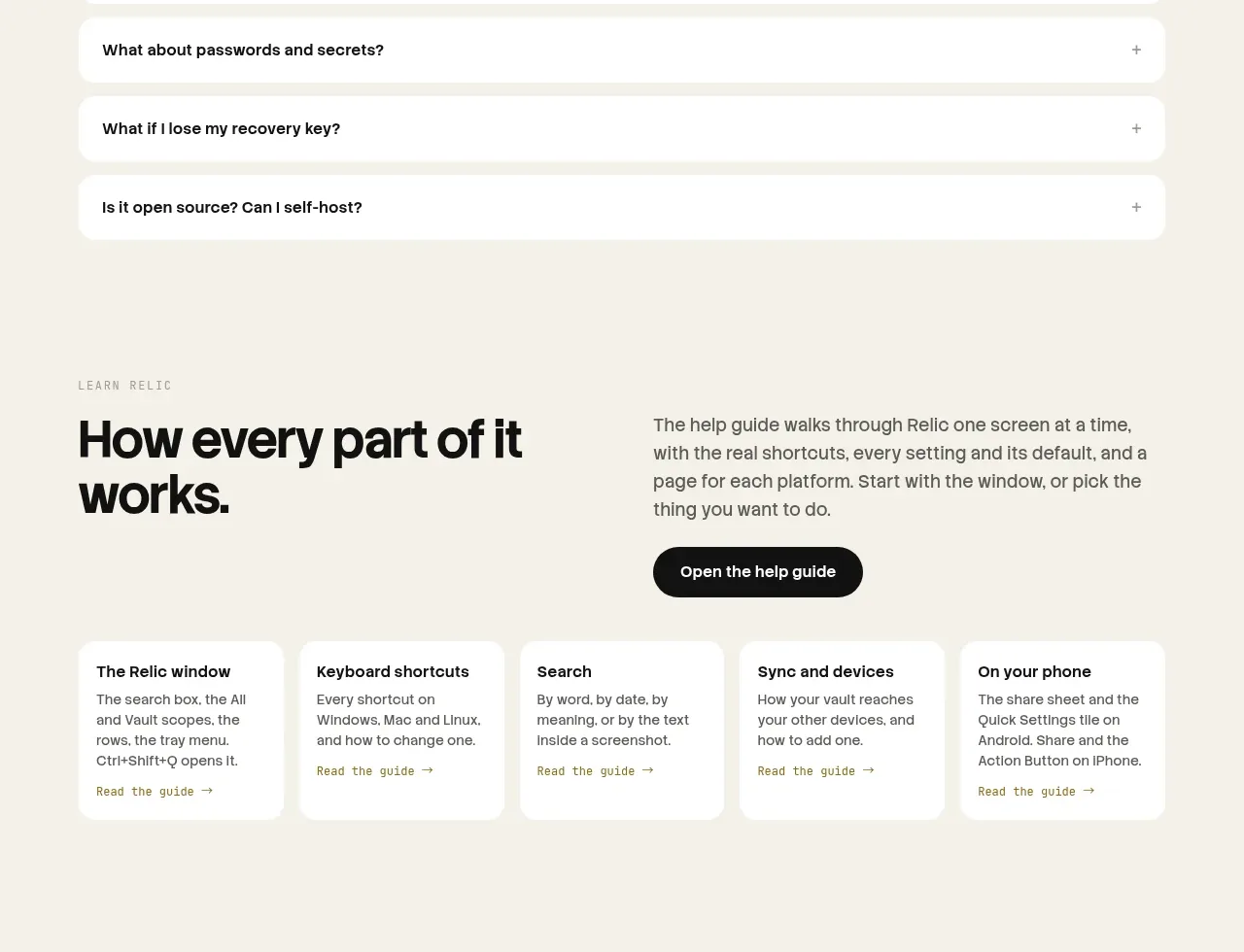
- Component: https://kage-design-assets.t3.tigrisfiles.io/components/dockfix-5-0/2c092be4-cae6-431a-8bc7-3fef5352fd95-1789279442-3.webp
- Full page it was cut from: https://kage-design-assets.t3.tigrisfiles.io/screenshots/dockfix-5-0/2c092be4-cae6-431a-8bc7-3fef5352fd95-1789279362906-full.webp
- Component on Kage: https://kage.design/component/dockfix-5-0-feature-grid

## Before you start
Ask what the user's product is, who it is for, and what their brand personality and visual identity are. Apply the principles below to that product rather than reproducing this reference.

Design a light, editorial feature section on a warm off-white background (#f1f1ea). Start with a small uppercase eyebrow, then a large left-aligned announcement heading paired with a narrow supporting paragraph on the right, separated by a fine vertical rule. Follow with a clear section heading and a two-column list of feature rows: bold, compact feature names on the left and readable explanations on the right. Use thin low-contrast horizontal rules (#deded6), 28–42px row padding, a 12-column or 30/70 split, and black/dark-charcoal type (#161515). Keep the hierarchy quiet and premium rather than card-heavy. Add subtle hover treatment to rows if they are interactive, but preserve accessibility and keyboard focus.

Never: use logos, product names, copy, illustrations or imagery from the reference.