 kage
kage
dreamscalelabs.com
Design analysis
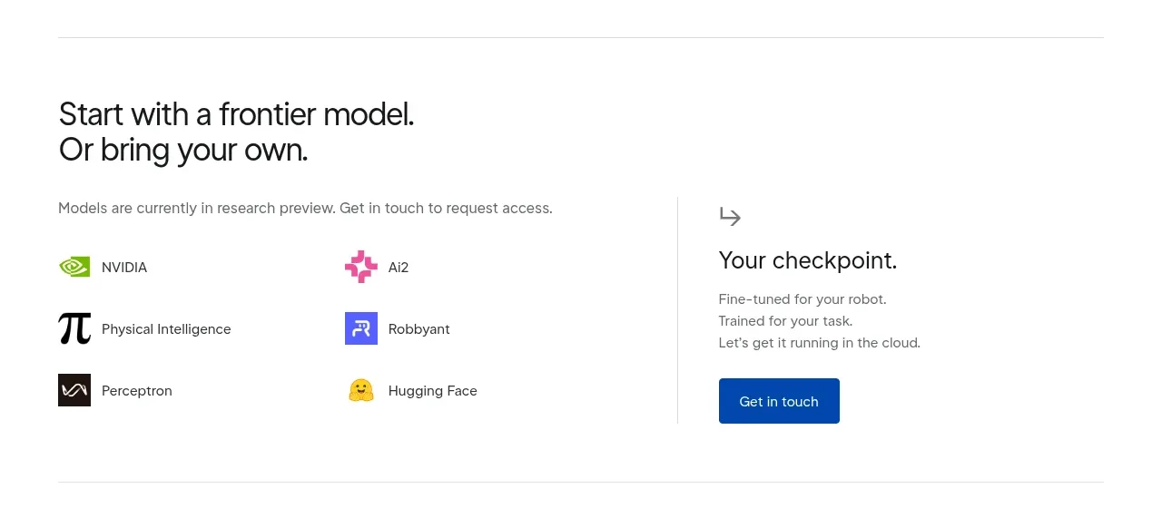
A model-selection section combines an ecosystem list on the left with a separated access/contact panel on the right. The divider and repeated small entries create order while the final button supplies a clear next step.
Prompt preview
## Reference images

Study these alongside the description below: hierarchy, rhythm, spacing, colour. Build for the product you are asked about, using this design language.

- Component: https://kage-design-assets.t3.tigrisfiles.io/components/dreamscale-labs/1997d92a-7a08-4743-8853-9f94160e0cd8-1792130788-6.webp
- Full page it was cut from: https://kage-design-assets.t3.tigrisfiles.io/screenshots/dreamscale-labs/1997d92a-7a08-4743-8853-9f94160e0cd8-1792130510959-full.webp
- Component on Kage: https://kage.design/component/dreamscale-labs-feature-grid-3

## Before you start
Ask the user which integrations, models, providers, or ecosystem partners are actually relevant, and what access action the user should take. Use neutral placeholders until they answer.

Create a two-column ecosystem section. Start with a concise 28–32px heading and a 13px supporting sentence. Below it, render a two-column list of six compact integration rows with small abstract monochrome or brand-colored icons, 13px labels, and consistent 20–24px row spacing. Place a vertical divider around the midpoint and a right-side access panel with a small arrow icon, 20–23px heading, two or three short lines of explanatory text, and a deep-blue filled button. Keep the palette white, near-black #151719, muted gray #70767b, blue #0757ad, plus restrained accent colors only where they clarify categories. Use a thin bottom divider and responsive stacking; remove the vertical divider when stacked.

Never: use logos, product names, copy, illustrations, or imagery from the reference.
More components

 Data-to-action engine
Salience · Feature grid
Data-to-action engine
Salience · Feature grid
 Actionable alert workflow
Salience · Feature grid
Actionable alert workflow
Salience · Feature grid
 Trust proof and core outcomes
Salience · Feature grid
Trust proof and core outcomes
Salience · Feature grid
 Three-step implementation flow
Salience · Feature grid
Three-step implementation flow
Salience · Feature grid
 What analytics misses
Salience · Feature grid
What analytics misses
Salience · Feature grid

 Workflow features and capabilities
CrewTower Mod for Claude Code · Feature grid
Workflow features and capabilities
CrewTower Mod for Claude Code · Feature grid