 kage
kage
duolingo.com

Design analysis
A slim horizontal selector provides quick access to several learning categories, with colorful icon chips and arrows indicating horizontal navigation.
Prompt preview
## Reference images

Study these alongside the description below: hierarchy, rhythm, spacing, colour. Build for the product you are asked about, using this design language.

- Component: https://kage-design-assets.t3.tigrisfiles.io/components/duolingo-com/3a8c78c9-bd82-49c8-8251-8e9f7b022530-1789146268-2.webp
- Full page it was cut from: https://kage-design-assets.t3.tigrisfiles.io/screenshots/duolingo-com/3a8c78c9-bd82-49c8-8251-8e9f7b022530-1789146240317-full.webp
- Component on Kage: https://kage.design/component/duolingo-tabs

## Before you start
Ask what categories, modes, or product areas the user's product needs, then apply the principles below to that product rather than copying the reference.

Build a compact horizontally scrollable tab strip between major sections. Use a white background, a thin top and bottom border (#E5E5E5), evenly spaced tab labels, small colorful rounded-square icons, and left/right controls on wide screens. Keep labels in small uppercase or semibold text, use muted gray for inactive states, and use the brand accent for the active indicator or icon. On mobile, allow swipe scrolling without wrapping. Make every tab keyboard navigable and visibly focused.

Never: use logos, product names, copy, illustrations, or imagery from the reference.
More components

 Directory filters and sorting
The Brains · Tabs & steps
Directory filters and sorting
The Brains · Tabs & steps
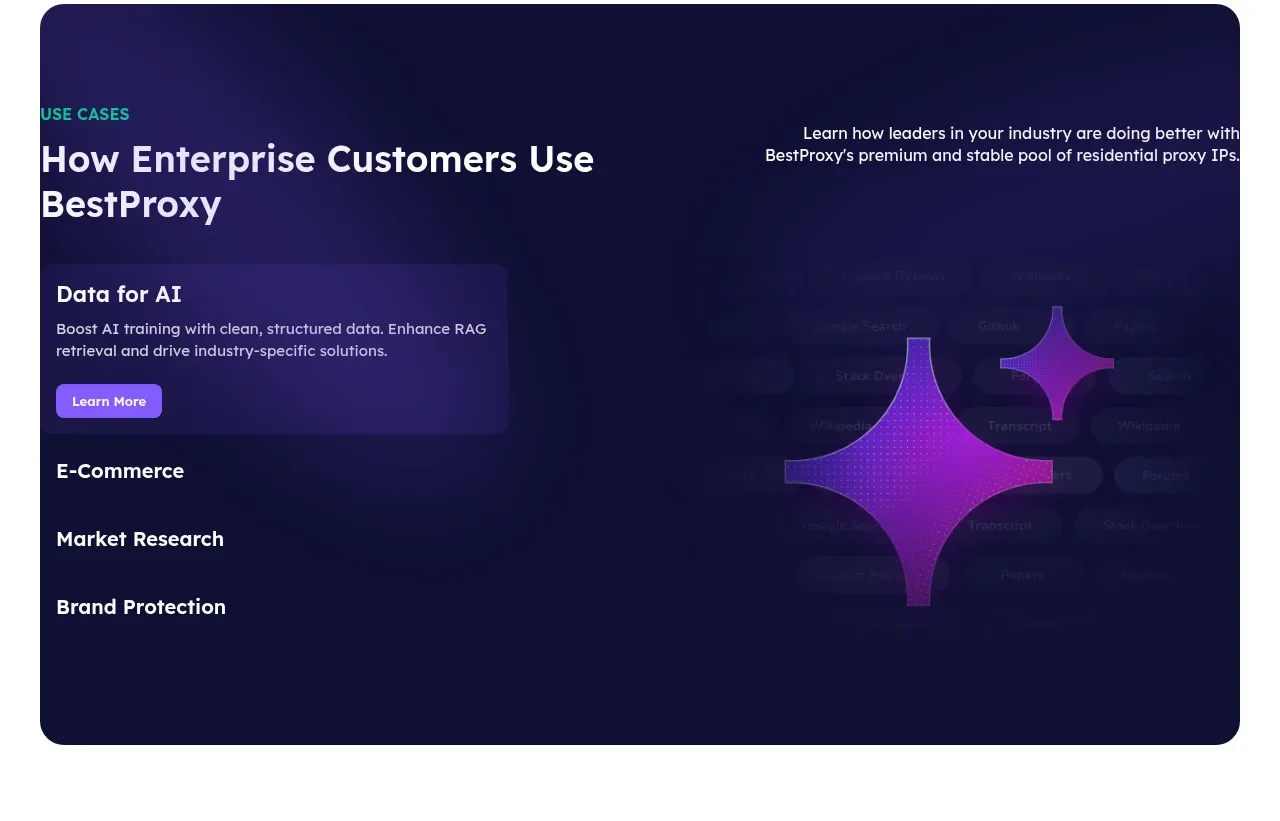
 Enterprise use cases
bestproxy.com · Tabs & steps
Enterprise use cases
bestproxy.com · Tabs & steps
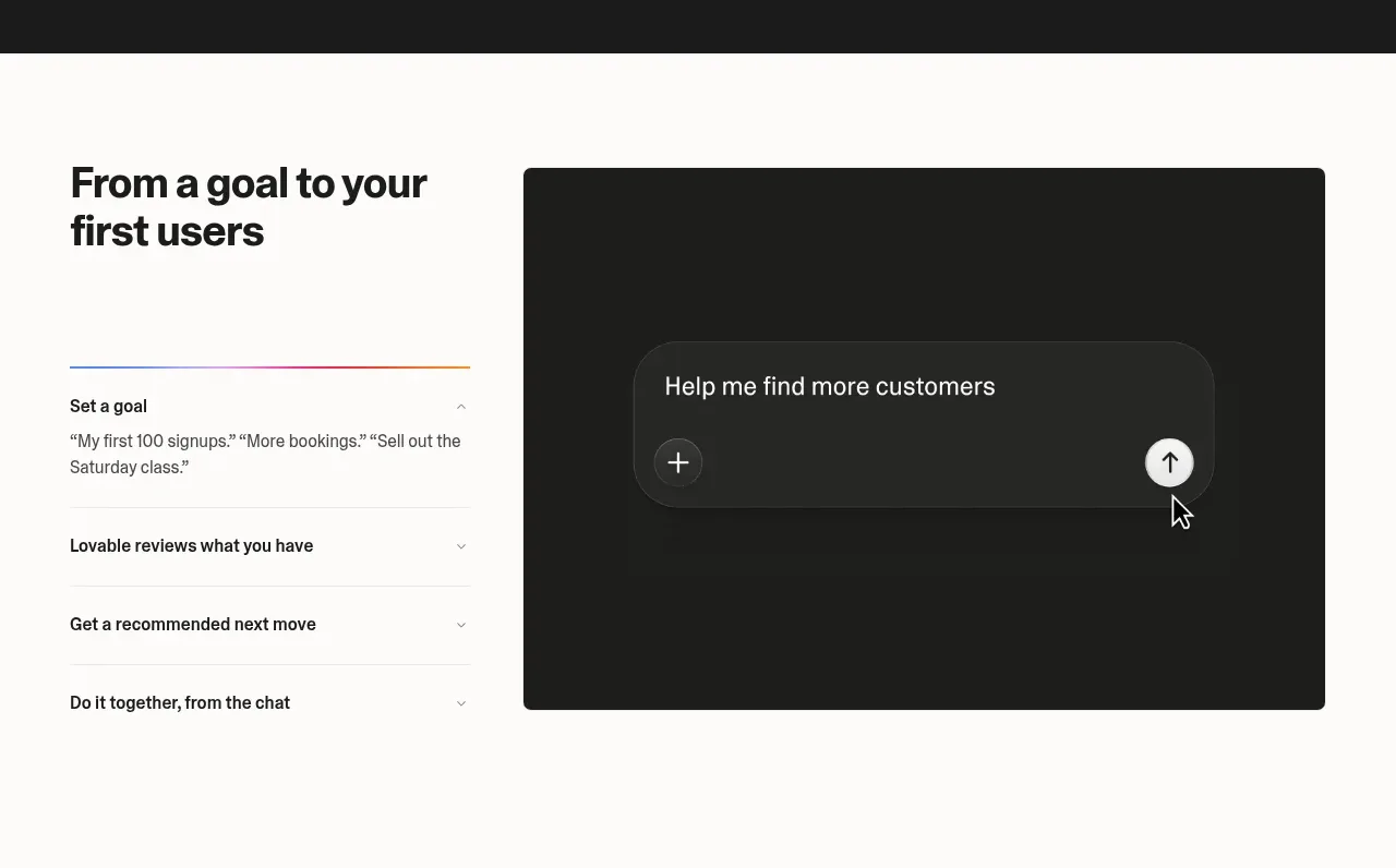
 Goal-to-first-users assistant
Lovable Growth Tools · Tabs & steps
Goal-to-first-users assistant
Lovable Growth Tools · Tabs & steps
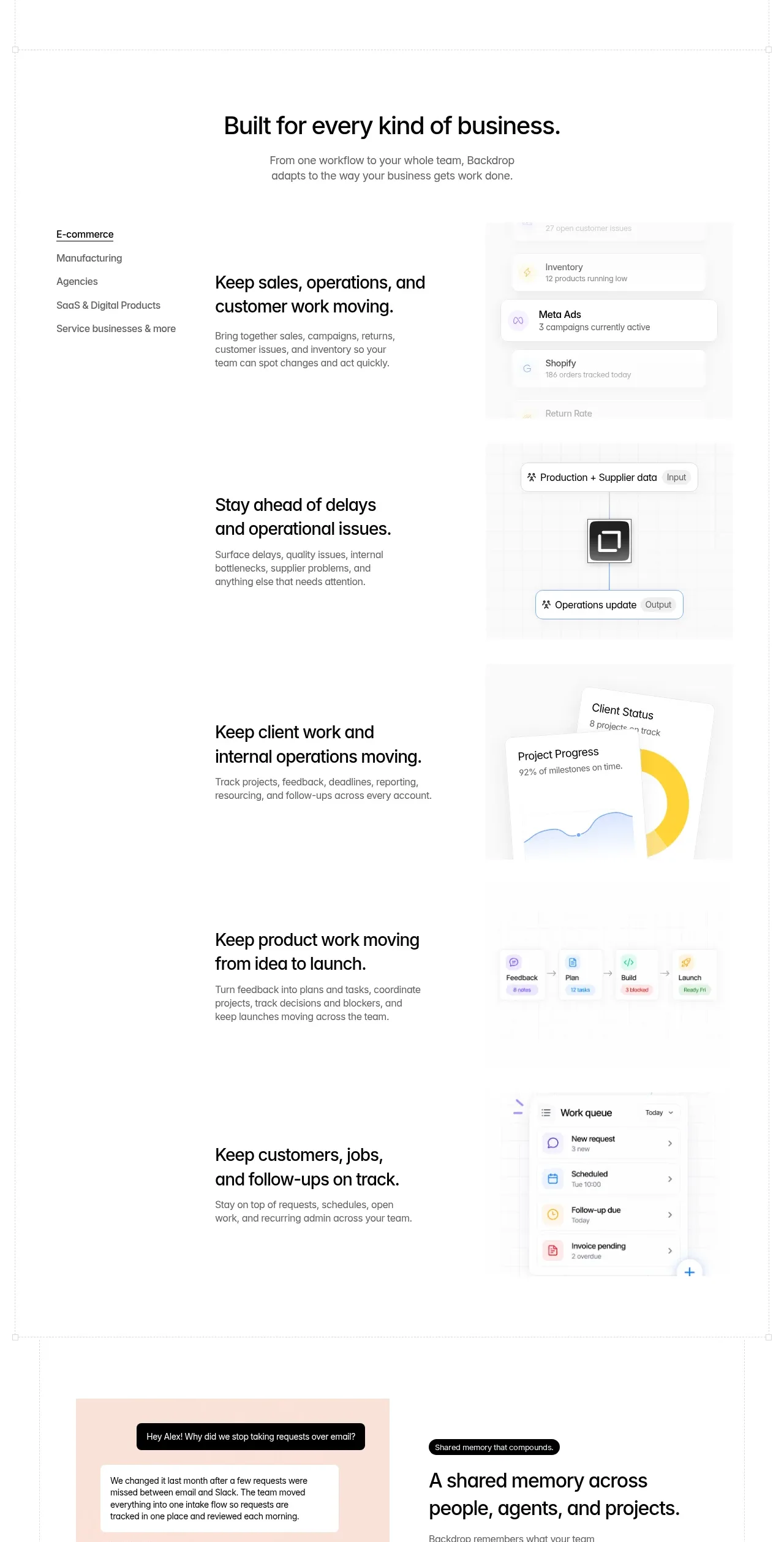
 Business use cases tabs
Backdrop · Tabs & steps
Business use cases tabs
Backdrop · Tabs & steps
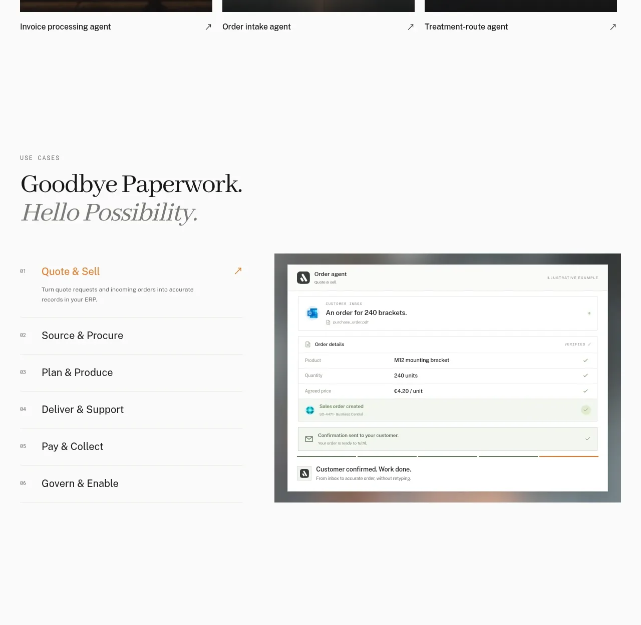
 Workflow stages with product preview
Lleverage · Tabs & steps
Workflow stages with product preview
Lleverage · Tabs & steps
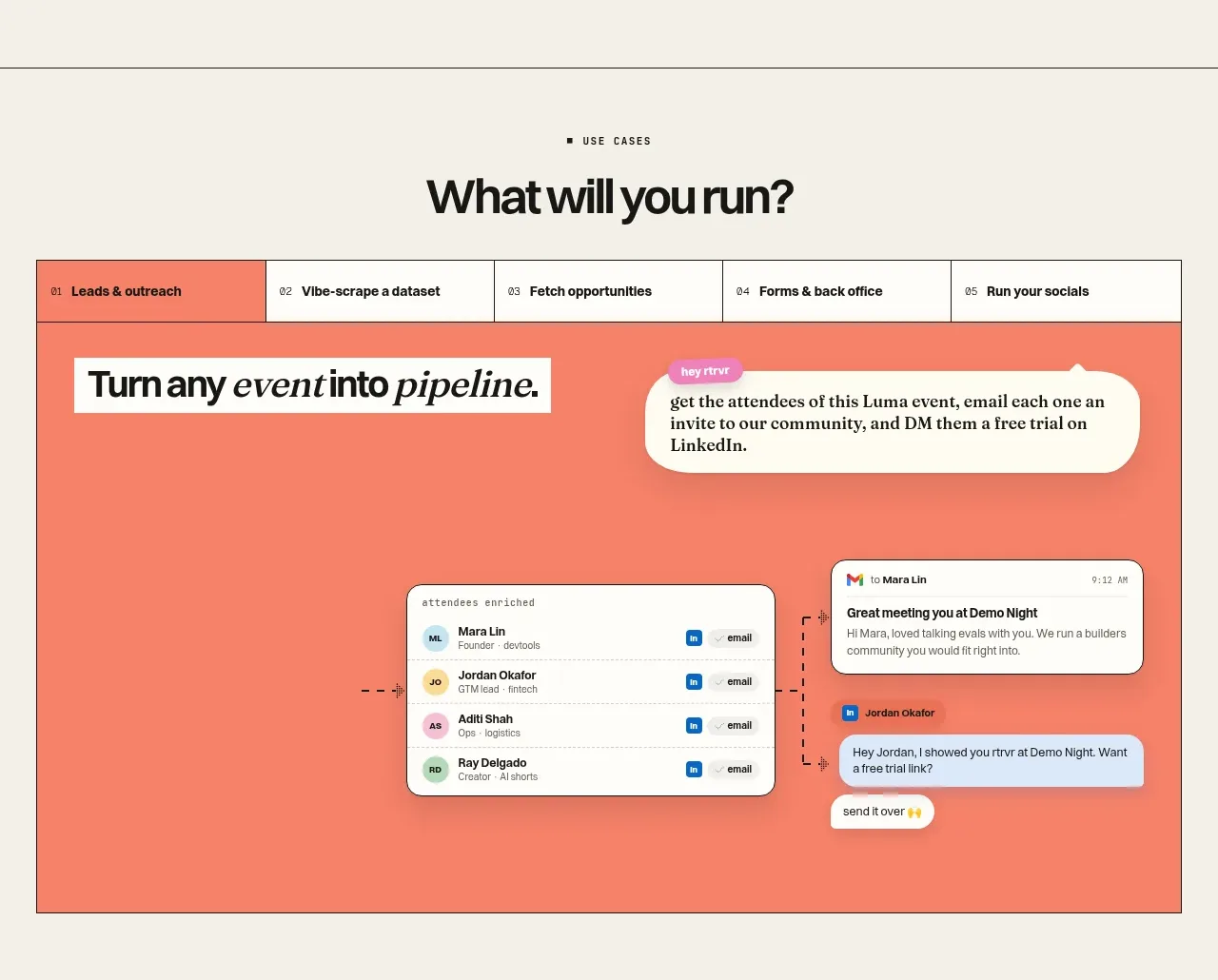
 Use-case selector and interactive showcase
Retriever AI · Tabs & steps
Use-case selector and interactive showcase
Retriever AI · Tabs & steps